
Great circles with sf in R
March 20, 2022 | Milos Popovic
Recently I discovered that Russia is the world’s top wheat exporter, and that Ukraine is among the top 5 exporters. If it weren’t for the ongoing Russian-Ukrainian war it would have been just another trivia. But the raging war threatens to disrupt wheat exports to populous countries and cause major upheaval that we haven’t witnessed since the eruption of the so-called Arab Spring in the Middle East and North Africa (MENA).
Two weeks ago I created a map of major wheat exporters from Russia and Ukraine in Europe that went viral as soon as I posted it on Twitter.
🇷🇺Russia is the world's top wheat exporter while 🇺🇦Ukraine is in the top 5 exporters
— Milos Popovic (@milos_agathon) March 5, 2022
My map shows wheat imports from these two countries in Europe in 2020, according to UN Comtrade data. #wheat #food #RussianUkrainianWar #Russia #Ukraine #dataviz #rstats #maps pic.twitter.com/Iz4bSa8sQX
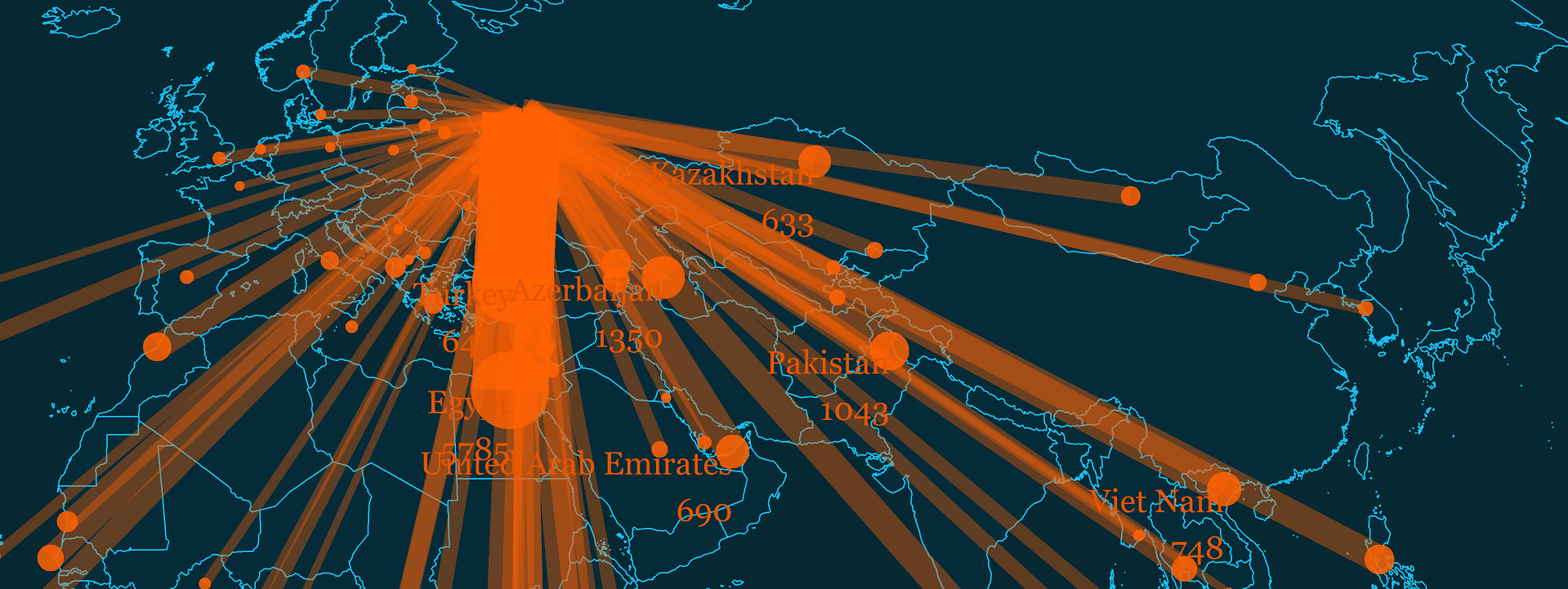
This type of map is called great circles. That’s because it depicts the shortest distance between two points on the globe. While the level of curvature varies depending on the projection of the map, great circles are an effective visual to show land routes or flights.
In this tutorial, we’ll use the great circle map to connect world capitals of countries that import wheat from Russia with Moscow, the capital of Russia. This way, we’ll visualize countries that are potentially more or less vulnerable to sudden disruptions in wheat imports from Russia.
We’ll query the data from the Comtrade API. If you have no prior experience with using APIs in R, I got you covered here and here. 🤙
The Comtrade database portal offers free access to official international trade statistics with extensive information on trade volumes of various goods and services for every country in the world 😮.
Query Comtrade API data
We start off by calling to rescue a couple essential libraries such as httr for retreiving the API data via GET function; tidyverse and sf for spatial analysis and data wrangling; giscoR for the spatial file of Europe; and CoordinateCleaner for the coordinates of the world’s capitals.
windowsFonts(georg = windowsFont('Georgia'))

libs <- c("httr", "tidyverse", "sf", "giscoR", "classInt",
  "CoordinateCleaner")

installed_libs <- libs %in% rownames(installed.packages())
if (any(installed_libs == F)) {
  install.packages(libs[!installed_libs])
}

invisible(lapply(libs, library, character.only = T))
At the very outset, we write a query in the html format and send it to Comtrade database. In doing so, we follow a few simple guidelines from this link.
In our query, we design parameters to get the table from the Comtrade API on all countries importing wheat from Russia for the last available year. Since wheat is a good, we definitely want data on commodities (type=C) on an annual basis (freq=A) and using the harmonized system (px=HS) for reporting trade volume. Likewise, we would like the most recently available period so we also include ps=now. In terms of the reporting countries, we want them all (r=all) and we need Russia as the partner country (p=643). Our preferred trade category are imports so we write rg=1. Finally, we would like to use data on wheat and meslin denoted by cc=1001 and in csv format (fmt=csv).
Once we received the desired table from the API, we transform its contents into a dataframe and select the reporting country name and ISO3 code as well as the quantity of wheat imports in kilograms.
get_wheatDF <- function(res, data, wheat_df) {
  res <- GET("http://comtrade.un.org/api/get?type=C&freq=A&px=HS&ps=now&r=all&p=643&rg=1&cc=1001&fmt=csv")
  data <- content(res, 'text')
  wheat_df <- read.csv(text = data) %>%
    dplyr::select(c(10:11, 26)) %>%
    rename(iso3 = Reporter.ISO)
  return(wheat_df)
}
Below is the snapshot of our table 🤩.
     Reporter iso3        Qty
1    Albania  ALB  153184600
2 Azerbaijan  AZE 1349822820
3    Armenia  ARM  349353853
4     Brazil  BRA  237590400
5   Bulgaria  BGR    9347280
6    Myanmar  MMR    4182780
Fetch capitals
We need origin points for every country in order to make great circles. This could be either country centroids or capitals. In this tutorial, we choose to toy with capitals for a change.
Let’s get coordinates for every world capital via the CoordinateCleaner library. Since this dataset includes several coordinates for every capital we filter only one set of coordinates by country.
get_capitals_coords <- function(cities, capitals) {
  data(countryref)

  towns <- countryref

  capitals <- towns %>%
    filter(!is.na(capital)) %>%
    group_by(iso3, capital) %>%
    summarise_at(vars(capital.lon, capital.lat), max) %>%
    rename(long = capital.lon, lat = capital.lat)

  return(capitals)
}
Here’s the table! 🥳
# A tibble: 6 x 4
# Groups:   iso3 [6]
  iso3  capital            long   lat
  <chr> <fct>             <dbl> <dbl>
1 ABW   Oranjestad       -70.0  12.5
2 AFG   Kabul             69.2  34.5
3 AGO   Luanda            13.2  -8.83
4 AIA   The Valley       -63.0  18.2
5 ALB   Tirana            19.8  41.3
6 AND   Andorra la Vella   1.52 42.5
Create starting/ending points
Our next step is to create starting/ending points. Our ending points will be all the reporting countries excluding Russia, which will be the starting point. We will create two objects in the below function. The first is a dataframe of coordinates for every reporting country. This will be used to create great circles in the section below. The second object is the spatial points object, which we will use to make bubbles at the endings of our great circles.
get_end_coords <- function(wheat_df, capitals, end, end_coords) {

  wheat_df <- get_wheatDF()
  capitals <- get_capitals_coords()

  end <- capitals %>%
    filter(iso3!="RUS") %>%
    rename(end_lat = lat, end_long = long)

  end_coords <- end %>%
    sf::st_as_sf(coords = c("end_long","end_lat")) %>%
    sf::st_set_crs(4326) %>%
    left_join(wheat_df, by = "iso3")  %>%
    filter(!is.na(Qty))

  return(list(end, end_coords))
}
Let’s also create the starting points and put them together with ending points.
For the starting point we extend the number of rows to the maximum number of the reporting countries and put everything together.
get_coords <- function(capitals, end, start, cap) {

  end <- get_end_coords(end)[[1]]
  capitals <- get_capitals_coords()

  start <- capitals %>%
    filter(iso3=="RUS") %>%
    rename(start_lat = lat, start_long = long) %>%
    group_by(iso3) %>%
    slice(rep(1:max(nrow(end)), each=max(nrow(end)))) %>%
    ungroup() %>%
    dplyr::select(start_long, start_lat)

  cap <- as.data.frame(cbind(start, end))

  return(cap)
}
And below is the glimpse of the new table! We have starting and ending coordinates for every reporting country on the globe.
start_long start_lat iso3          capital end_long end_lat
1       37.6     55.75  ABW       Oranjestad   -70.03   12.52
2       37.6     55.75  AFG            Kabul    69.18   34.52
3       37.6     55.75  AGO           Luanda    13.22   -8.83
4       37.6     55.75  AIA       The Valley   -63.05   18.22
5       37.6     55.75  ALB           Tirana    19.82   41.32
6       37.6     55.75  AND Andorra la Vella     1.52   42.50
Generate great circles
It’s time we connect the dots. We need a matrix of all possible combinations involving our starting/ending coordinates.
First, we select the starting/ending columns and transform them into a list of lists through transpose(). Each list within a list is composed of ending points and their associated starting points. Next, we flatten this list of lists into a single list of all possible combinations of starting/ending coordinates using map(~ matrix(flatten_dbl(.), nrow = 2, byrow = T)). Finally, we flatten the list once more but this time we turn every component into a linestring and transform each object into sf object.
We join the newly minted lines sf object with our wheat import data on iso3 field and remove reporting countries that imported no wheat from Russia.
get_great_circles <- function(wheat_df, coords, lines) {

  wheat_df <- get_wheatDF()
  coords <- get_coords()

  lines <- coords %>%
    select(start_long,
      start_lat,
      end_long,
      end_lat) %>%
    transpose() %>%
    map(~ matrix(flatten_dbl(.), nrow = 2, byrow = TRUE)) %>%
    map(st_linestring) %>%
    st_sfc(crs = 4326) %>%
    st_sf(geometry = .) %>%
    bind_cols(coords) %>%
    select(iso3, capital, geometry) %>%
    left_join(wheat_df, by = "iso3") %>%
    filter(!is.na(Qty))

  return(lines)
}
Get world sf object
We are almost ready to make our great circle map. But we first need to import the world shapefile that will serve as a base layer.
get_world <- function(world_shp) {

  world_shp <- giscoR::gisco_get_countries(
    year = "2016",
    epsg = "4326",
    resolution = "10",
    ) %>%
    subset(NAME_ENGL!="Antarctica") # get rid of Antarctica

  return(world_shp)
}
Plotting great circles with sf
It’s mapping time, folks 🥳! In the chunk below, we will first load the world sf object and define Robinson projection. Check here for the key advantages and disvantages of this projection. Then we load the ending coordinates and arrange them by trade volume in descending fashion. We make this step because the map will show top 10 importers from Russia. Finally, we load lines.
world_shp <- get_world()

  crsROBINSON <- "+proj=robin +lon_0=0w"

  pnts <- get_end_coords(end)[[2]] %>%
    group_by(Reporter) %>%
    arrange(desc(Qty))

  lines <- get_great_circles()
Next, we will plot the world map, lines and ending points. Note that I divided trade volume by 1 million in order to normalize the values; this yields thousands of tonnes. You’ll also notice that we pass alpha in the aesthetics for lines object; this will make higher trade volumes more visible on the map. Finally, we take only the top 10 wheat importers in the first line.
ggplot(pnts[1:10, ]) +
    geom_sf(data=world_shp,
      fill="#063140",
      color="#18BFF2",
      size=0.2,
      alpha=.35) +
    geom_sf(data=lines,
      aes(size=Qty/1000000, alpha=Qty/1000000),
      fill="#ff6103",
      color="#ff6103") +
    geom_sf(data=pnts,
      aes(size=Qty/1000000),
      fill="#ff6103",
      color="#ff6103",
      alpha = .85,
      stroke=.25) +
We show the top 10 wheat importers and again normalize the trade volume. We also offset the labels both on the x and y axes using nudge_x and nudge_y. We make this step to make the labels more visible in the sea of lines. Feel free to adjust these parameters as you see fit!
    geom_sf_text(
    aes(
      label = paste0(Reporter, "\n", round(Qty/1000000, 0))),
      size=3,
      vjust=1,
      hjust=1,
      family = "georg",
      color="#E65602",
      alpha=1,
      nudge_x = c(.5, .5, 1),
      nudge_y = c(-.5, -.5, 0)) +
    coord_sf(crs = crsROBINSON, expand = FALSE) +
    labs(
      y="",
      subtitle="",
      x = "",
      title="Wheat imports from Russia in 2020",
      caption="©2022 Milos Popovic https://milospopovic.net\nSource: United Nations. 2022. UN comtrade
      http://comtrade.un.org")+
In this chunk, we define the alpha and size of bubbles and/or lines on our map.
scale_size(
      name = "thousands of tonnes",
      range = c(1, 10),
      breaks = scales::pretty_breaks(6))+
    scale_alpha(range = c(.35, .85)) +
    guides(
      alpha="none",
      color="none",
      fill="none",
      size=guide_legend(
      override.aes = list(fill = NULL, alpha=.85, color="#ff6103"),
      direction = "horizontal",
      keyheight = unit(1.15, units = "mm"),
      keywidth = unit(15, units = "mm"),
      title.position = 'top',
      title.hjust = 0.5,
      label.hjust = .5,
      nrow =1,
      byrow = T,
      reverse = F,
      label.position = "top"
        )
      )
Aaaand here is the whole code, including the theme parameters!
map_great_circles <- function(world_shp, crsROBINSON, p) {

  world_shp <- get_world()

  crsROBINSON <- "+proj=robin +lon_0=0w"

  pnts <- get_end_coords(end)[[2]] %>%
    group_by(Reporter) %>%
    arrange(desc(Qty))

  lines <- get_great_circles()

  p <-
    ggplot(pnts[1:10, ]) +
    geom_sf(data=world_shp,
      fill="#063140",
      color="#18BFF2",
      size=0.2,
      alpha=.35) +
    geom_sf(data=lines,
      aes(size=Qty/1000000, alpha=Qty/1000000),
      fill="#ff6103",
      #alpha=.35
      color="#ff6103") +
    geom_sf(data=pnts,
      aes(size=Qty/1000000),
      fill="#ff6103",
      color="#ff6103",
      alpha = .85,
      stroke=.25) +
    geom_sf_text(
    aes(
      label = paste0(Reporter, "\n", round(Qty/1000000, 0))),
      size=3,
      vjust=1,
      hjust=1,
      family = "georg",
      color="#E65602",
      alpha=1,
      nudge_x = c(.5, .5, 1),
      nudge_y = c(-.5, -.5, 0)) +
    coord_sf(crs = crsROBINSON, expand = FALSE) +
    labs(
      y="",
      subtitle="",
      x = "",
      title="Wheat imports from Russia in 2020",
      caption="©2022 Milos Popovic https://milospopovic.net\nSource: United Nations. 2022. UN comtrade
      http://comtrade.un.org")+
    scale_size(
      name = "thousands of tonnes",
      range = c(1, 10),
      breaks = scales::pretty_breaks(6))+
    scale_alpha(range = c(.35, .85)) +
    guides(
      alpha="none",
      color="none",
      fill="none",
      size=guide_legend(
      override.aes = list(fill = NULL, alpha=.85, color="#ff6103"),
      direction = "horizontal",
      keyheight = unit(1.15, units = "mm"),
      keywidth = unit(15, units = "mm"),
      title.position = 'top',
      title.hjust = 0.5,
      label.hjust = .5,
      nrow =1,
      byrow = T,
      reverse = F,
      label.position = "top"
        )
      ) +
    theme_minimal() +
    theme(text = element_text(family = "georg"),
      plot.background = element_rect(fill = "#052833", color = NA),
      panel.background = element_rect(fill = "#052833", color = NA),
      legend.background = element_rect(fill = "#052833", color = NA),
      legend.position = c(.55, -.05),
      panel.border = element_blank(),
      panel.grid.minor = element_blank(),
      panel.grid.major = element_line(color = "#052833", size = 0.1),
      plot.title = element_text(size=22, color="#ff6103", hjust=0.5, vjust=1),
      plot.subtitle = element_text(size=11, color="#7a2b41", hjust=0.5, vjust=0, face="bold"),
      plot.caption = element_text(size=8, color="grey80", hjust=0.15, vjust=0),
      axis.title.x = element_text(size=10, color="grey20", hjust=0.5, vjust=-6),
      legend.text = element_text(size=9, color="#ff6103"),
      legend.title = element_text(size=10, color="#ff6103"),
      strip.text = element_text(size=20, color="#ff6103", face="bold"),
      plot.margin = unit(c(t=1, r=-2, b=.5, l=-2), "lines"),
      axis.title.y = element_blank(),
      axis.ticks = element_blank(),
      axis.text.x = element_blank(),
      axis.text.y = element_blank())

  return(p)
}
One thing that stands out is that Egypt and Turkey are by far the biggest importers of Russian wheat. Other importers include mostly non-Western, populous countries.

In this tutorial, I showed you how to access Comtrade Database to fetch data on wheat imports, clean it up, and make a cool map of great circles. You could toy with this code to plot other goods/services from the database.
Feel free to check the full code here, clone the repo and reproduce, reuse and modify the code as you see fit.
I’d be happy to hear your view on how this map could be improved or extended to other geographic realms. To do so, please follow me on Twitter, Instagram or Facebook.