
Using API to make maps in R
January 30, 2022 | Milos Popovic
There’s been a new kid in programming town and their name is API. In reality, API goes by the terrifying name of Application Programming Interface. It’s a web interface used to communicate with servers and access data for free in raw format. APIs allow you to retrieve data in a quick and safe way without banging your head against brick wall with poorly formatted csv files. This makes it an ideal solution for data analysis, visualization or app development. Here you can find literally thousands of public APIs from which you can retrieve raw data on, for example, NBA stats, weather conditions or travel feeds.
The good news is that APIs are built around the HTTP protocol, which means that we can use programming language like R to fetch some cool data 😎. So, in this tutorial, we’ll dive into the World Health Organization API, Global Health Observatory (GHO), the host to over 2k indicators on environment, health and safety. Incredible! 😲
APIs in R
We start off by loading usual culprits for data wrangling and visualization with two newcomers: httr and jsonlite. We’ll use the former to make a request to the WHO server and retrieve info about the available indicators, while the latter will come in handy to parse info from the returned JSON file.
if(!require("httr")) install.packages("httr")
if(!require("jsonlite")) install.packages("jsonlite")
if(!require("sf")) install.packages("sf")
if(!require("tidyverse")) install.packages("tidyverse")
if(!require("grid")) install.packages("grid")
if(!require("gridExtra")) install.packages("gridExtra")
if(!require("giscoR")) install.packages("giscoR")
if(!require("classInt")) install.packages("classInt")

library(httr, quietly=T) #send request to API
library(jsonlite, quietly=T) #JSON parser and generator
library(tidyverse, quietly=T) #data wrangling
library(sf, quietly=T) #geospatial analysis
library(grid, quietly=T) #make grid
library(gridExtra, quietly=T) #make grid
library(giscoR, quietly=T) #shapefile of Europe
library(classInt, quietly=T) #bins

windowsFonts(georg = windowsFont('Georgia'))
To make a request, we’ll use GET() followed by an url of the the GHO portal. We received a file with info on all the indicators, including the date of access as well as data type and size.
res <- GET("https://ghoapi.azureedge.net/api/Indicator")
res

Response [https://ghoapi.azureedge.net/api/Indicator]
  Date: 2022-01-30 09:57
  Status: 200
  Content-Type: application/json; odata.metadata=minimal; odata.streaming=true; charset=utf-8
  Size: 295 kB
At this stage, we only have a list of indicators. The list is composed of two elements and one of them, value, seems to store the indicator code and name.
indicators <- fromJSON(rawToChar(res$content))
str(indicators)

List of 2
 $ @odata.context: chr "https://ghoapi.azureedge.net/api/$metadata#Indicator"
 $ value         :'data.frame':	2251 obs. of  3 variables:
  ..$ IndicatorCode: chr [1:2251] "AIR_10" "AIR_11" "AIR_12" "AIR_13" ...
  ..$ IndicatorName: chr [1:2251] "Ambient air pollution  attributable DALYs per 100'000 children under 5 years" "Household air pollution attributable deaths" "Household air pollution attributable deaths in children under 5 years" "Household air pollution attributable deaths per 100'000 capita" ...
  ..$ Language     : chr [1:2251] "EN" "EN" "EN" "EN" ...
Let’s extract the value component and store it into a new object data. Note that data is not a list anymore, but a dataframe. This provides a neat overview of the indicators avaiable at the GHO Portal.
data <- indicators$value
head(data)
>   IndicatorCode
1        AIR_10
2        AIR_11
3        AIR_12
4        AIR_13
5        AIR_14
6        AIR_15
                                                                    IndicatorName
1    Ambient air pollution  attributable DALYs per 100'000 children under 5 years
2                                     Household air pollution attributable deaths
3           Household air pollution attributable deaths in children under 5 years
4                  Household air pollution attributable deaths per 100'000 capita
5 Household air pollution  attributable deaths per 100'000 children under 5 years
6                                      Household air pollution attributable DALYs
  Language
1       EN
2       EN
3       EN
4       EN
5       EN
6       EN
There are 2251 indicators and we’ll explore traffic death rate, as it’s the hottest topic in road safety. We use grep to filter indicators that include “road traffic death” in their name. Then we select rows in our data that match this condition. We’ll be using the Estimated road traffic death rate (per 100 000 population) dataframe from the list of available dataframes.
rtd <- grep("road traffic death", data$IndicatorName, perl=T)
sel_rows <- data[rtd,]
sel_rows

IndicatorCode                                                IndicatorName
1084        RS_196                      Estimated number of road traffic deaths
1085        RS_198   Estimated road traffic death rate (per 100 000 population)
1089        RS_208            Attribution of road traffic deaths to alcohol (%)
1104        RS_246 Distribution of road traffic deaths by type of road user (%)
     Language
1084       EN
1085       EN
1089       EN
1104       EN
In the final step, we go back to the beginning of this tutorial and request the traffic data using GET() followed by an url of the indicator.
You may wonder why we took all those intermediary steps only to return to the beginning. The aim was to show you how to access and filter the whole list of available GHO indicators programmatically in R instead of going through the glossary on the website. Naturally, next time you might want to select a specific indicator at the outset and the previous chunks will help you do so in a straightforward way. You might also find more detailed instructions on how to use the GHO API here.
traffic_deaths <- GET("https://ghoapi.azureedge.net/api/RS_198")
traffic_d <- fromJSON(rawToChar(traffic_deaths$content))
Data wrangling
We just need to make a few more transformations before map-making. First, let’s grab the value element from our traffic_d list and inspect the dataframe.
td <- traffic_d$value
head(td)
        Id IndicatorCode SpatialDimType SpatialDim TimeDimType TimeDim Dim1Type
1 25257658        RS_198        COUNTRY        AFG        YEAR    2017      SEX
2 25257659        RS_198        COUNTRY        AFG        YEAR    2004      SEX
3 25257660        RS_198        COUNTRY        AFG        YEAR    2000      SEX
4 25257661        RS_198        COUNTRY        AFG        YEAR    2011      SEX
5 25257662        RS_198        COUNTRY        AFG        YEAR    2017      SEX
6 25257663        RS_198        COUNTRY        AFG        YEAR    2002      SEX
  Dim1 Dim2Type Dim2 Dim3Type Dim3 DataSourceDimType DataSourceDim
1 FMLE       NA   NA       NA   NA                NA            NA
2  MLE       NA   NA       NA   NA                NA            NA
3  MLE       NA   NA       NA   NA                NA            NA
4  MLE       NA   NA       NA   NA                NA            NA
5  MLE       NA   NA       NA   NA                NA            NA
6  MLE       NA   NA       NA   NA                NA            NA
             Value NumericValue      Low     High Comments
1    6.0 [5.2-6.8]      5.99219  5.17048  6.81715       NA
2 22.8 [19.0-26.5]     22.76968 19.01817 26.51513       NA
3 22.3 [18.3-26.2]     22.26858 18.34848 26.19614       NA
4 21.9 [18.6-25.3]     21.90351 18.55693 25.25520       NA
5 23.8 [20.5-27.0]     23.76755 20.50830 27.03967       NA
6 22.7 [18.8-26.5]     22.65267 18.80891 26.48972       NA
                           Date TimeDimensionValue        TimeDimensionBegin
1 2021-02-09T16:20:04.763+01:00               2017 2017-01-01T00:00:00+01:00
2 2021-02-09T16:20:04.793+01:00               2004 2004-01-01T00:00:00+01:00
3  2021-02-09T16:20:04.81+01:00               2000 2000-01-01T00:00:00+01:00
4  2021-02-09T16:20:04.84+01:00               2011 2011-01-01T00:00:00+01:00
5 2021-02-09T16:20:04.857+01:00               2017 2017-01-01T00:00:00+01:00
6 2021-02-09T16:20:04.887+01:00               2002 2002-01-01T00:00:00+01:00
           TimeDimensionEnd
1 2017-12-31T00:00:00+01:00
2 2004-12-31T00:00:00+01:00
3 2000-12-31T00:00:00+01:00
4 2011-12-31T00:00:00+01:00
5 2017-12-31T00:00:00+01:00
6 2002-12-31T00:00:00+01:00
Ooops, it seems there are a bunch of columns and that the data is organized on the country-sex-year level. We only need info on both sexes for every country and most recent year.
So let’s first filter the dataframe to include figures for both sexes denoted as “BTSX”. Then we’ll select only ISO3 (SpatialDim), year (SpatialDim), mean point estimate of traffic deaths (NumericValue) as well as lower and upper bounds. Next, we’ll group by ISO3 code and take only the last available year via slice(which.max(TimeDim)). Finally, we’ll rename the columns to more familiar names.
td <- td %>%
	  filter(Dim1 == "BTSX") %>%
	  select(SpatialDim, TimeDim, NumericValue, Low, High) %>%
	  group_by(SpatialDim) %>%
	  slice(which.max(TimeDim)) %>%
	  rename(ISO3 = SpatialDim,
         year = TimeDim,
         value = NumericValue)
And here is the dataframe!
head(td)
# A tibble: 6 x 5
# Groups:   ISO3 [6]
  ISO3   year value   Low  High
  <chr> <int> <dbl> <dbl> <dbl>
1 AFG    2019 15.9  13.7   18.0
2 AFR    2019 27.2  21.9   32.6
3 AGO    2019 26.1  19.9   32.4
4 ALB    2019 11.7  10.8   12.6
5 AMR    2019 15.3  12.7   18.2
6 ARE    2019  8.91  7.65  10.1
Mapping
Let’s fetch the national map of Europe using giscoR
europe <- giscoR::gisco_get_countries(
  year = "2016",
  epsg = "4326",
  resolution = "10",
  region = "Europe"
)
Next thing is to define the WGS84 and Lambert projections. We’ll use the WGS84 projection to create the bounding box and then convert it to Lambert projection, which is more suitable for mapping Europe.
crsLONGLAT <- "+proj=longlat +datum=WGS84 +no_defs"
crsLAEA <- "+proj=laea +lat_0=52 +lon_0=10 +x_0=4321000 +y_0=3210000 +datum=WGS84 +units=m +no_defs"


bb <- st_sfc(
  st_polygon(list(cbind(
    c(-10.6600, 33.00, 33.00, -10.6600, -10.6600),
    c(32.5000, 32.5000, 71.0500, 71.0500, 32.5000)
    ))),
  crs = crsLONGLAT)

laeabb <- st_transform(bb, crs = crsLAEA)
b <- st_bbox(laeabb)
In the following chunk, we combine the traffic accident dataframe with our Europe spatial object.
c <- right_join(td, europe, by=c("ISO3"="ISO3_CODE")) %>%
     st_as_sf() %>%
     st_transform(crs = crsLAEA)
As usual, we’ll define our breaks using Jenks breaks and provide a customized palette.
# bins
brk <- round(classIntervals(c$value,
              n = 6,
              style = 'equal')$brks, 0)

# define the color palette
cols = rev(c('#05204d', '#004290', '#6458ae', '#dd98d1', '#eab0a2'))
newcol <- colorRampPalette(cols)
ncols <- 7
cols2 <- newcol(ncols)
vmin <- min(c$value, na.rm=T)
vmax <- max(c$value, na.rm=T)
We’re almost ready to make our map! But there is one more thing left and that’s annotating the country polygons with traffic death rate figures. Ideally, we want the figures to be placed in the middle of each country. We run a simple function st_centroid() that calculates the centroids.
cents <- c %>% st_centroid() %>%
  as_Spatial() %>%
  as.data.frame()
However, France and Russia have a much larger territory and their centroids end up misplaced on the map. So, we got to calculate their centroids using the coordinates of a more convenient place, i.e. their capitals. Both Paris and Moscow will be visible in the map. We first declare the WGS84 coordinates for the two capitals and then transform them into Lambert projection. Finally, we replace the old coordinate values for Paris and Moscow in the centroid dataframe.
moscow <- data.frame(long = 37.61556, lat = 55.75222)
paris <- data.frame(long = 2.3488, lat = 48.85341)

mc <- st_as_sf(x = moscow,
           coords = c("long", "lat"),
           crs = 4326) %>%
     st_transform(crs = crsLAEA) %>%
     as_Spatial() %>%
     as.data.frame()

pa <- st_as_sf(x = paris,
           coords = c("long", "lat"),
           crs = 4326) %>%
     st_transform(crs = crsLAEA) %>%
     as_Spatial() %>%
     as.data.frame()

#plug into centroids
cn <- cents %>%
  mutate(coords.x1=ifelse(CNTR_ID=="RU", mc$coords.x1,coords.x1),
         coords.x2=ifelse(CNTR_ID=="RU", mc$coords.x2,coords.x2)) %>%
  mutate(coords.x1=ifelse(CNTR_ID=="FR", pa$coords.x1,coords.x1),
         coords.x2=ifelse(CNTR_ID=="FR", pa$coords.x2,coords.x2))
In the chunk below, we use the spatial data with info on traffic road death rate and limit the view to a bounding box. We transform the spatial polygons into Lambert projection. After providing the colors and breaks we move to printing the values for every country.
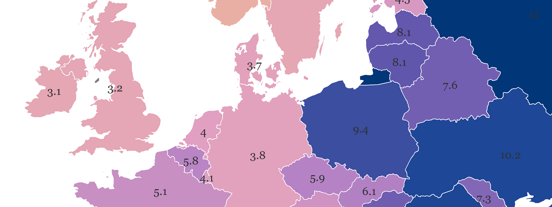
p1 <-
ggplot() +
geom_sf(data = c,
  aes(fill=value),
  color="white",
  size=0.25) +
coord_sf(crs = crsLAEA,
  xlim = c(b["xmin"], b["xmax"]),
  ylim = c(b["ymin"], b["ymax"])) +
labs(y="",
    subtitle="",
    x = "",
    title="Estimated road traffic death rate (2019)",
    caption="©2022 Milos Popovic https://milospopovic.net\nSource: WHO")+
scale_fill_gradientn(name="deaths per 100,000 people",
                       colours=cols2,
                       breaks=brk,
                       labels=brk,
					   limits = c(min(brk),max(brk)))+
geom_text(data = cn,
    aes(coords.x1, coords.x2,
      label=round(value, 1)),
      size=2.75,
      color="grey20",
      family="georg") +
guides(fill=guide_legend(
            direction = "horizontal",
            keyheight = unit(1.15, units = "mm"),
            keywidth = unit(12, units = "mm"),
            title.position = 'top',
            title.hjust = 0.5,
            label.hjust = .5,
            nrow = 1,
            byrow = T,
            reverse = F,
            label.position = "bottom"
          )
    ) +
theme_minimal() +
theme(text = element_text(family = "georg"),
panel.background = element_blank(),
legend.background = element_blank(),
legend.position = c(.45, .02),
panel.border = element_blank(),
panel.grid.minor = element_blank(),
panel.grid.major = element_blank(),
plot.title = element_text(size=16, color='#6458ae', hjust=0.5, vjust=0),
plot.subtitle = element_text(size=14, color='#ac63a0', hjust=0.5, vjust=0),
plot.caption = element_text(size=7, color="grey60", hjust=0.5, vjust=10),
axis.title.x = element_text(size=10, color="grey20", hjust=0.5, vjust=-6),
legend.text = element_text(size=9, color="grey20"),
legend.title = element_text(size=10, color="grey20"),
strip.text = element_text(size=12),
plot.margin     =   unit(c(t=1, r=-2, b=-1, l=-2),"lines"),
axis.title.y = element_blank(),
axis.ticks = element_blank(),
axis.text.x = element_blank(),
axis.text.y = element_blank())
And, here is the output! The values are printed and they show up as envisaged. Except for Albania, Croatia, and Greece, which we’ll fix in a moment. We also notice that the values higher than 9 are barely visible. So, let’s fix the misplaced labels and increase the visibility of other labels.

We’ll overwrite our previous ggplot2 object and start off with a quick fix for Albania, Croatia, and Greece. The reason why we first modify the labels for these individual countries is that filtering by value will include these countries even if we explicitly declare that we want them out by country code or name. Toying with the value for vjust and hjust allows us to move the value labels.
p1 <-
ggplot() +
geom_sf(data = c,
  aes(fill=value),
  color="white",
  size=0.25) +
coord_sf(crs = crsLAEA,
  xlim = c(b["xmin"], b["xmax"]),
  ylim = c(b["ymin"], b["ymax"])) +
labs(y="",
    subtitle="",
    x = "",
    title="Estimated road traffic death rate (2019)",
    caption="©2022 Milos Popovic https://milospopovic.net\nSource: WHO")+
scale_fill_gradientn(name="deaths per 100,000 people",
                       colours=cols2,
                       breaks=brk,
                       labels=brk,
					   limits = c(min(brk),max(brk)))+
geom_text(data = filter(cn, CNTR_ID=="HR"),
    aes(coords.x1, coords.x2,
      label=round(value, 1)),
      size=2.75,
      vjust=-1.5,
      color="grey20",
      family="georg") +
geom_text(data = filter(cn, CNTR_ID=="EL"),
    aes(coords.x1, coords.x2,
      label=round(value, 1)),
      size=2.75,
      hjust=1.5,
      color="grey20",
      family="georg") +
geom_text(data = filter(cn, CNTR_ID=="AL"),
    aes(coords.x1, coords.x2,
      label=round(value, 1)),
      size=2.75,
      hjust=1.5,
      color="grey20",
      family="georg") +
guides(fill=guide_legend(
            direction = "horizontal",
            keyheight = unit(1.15, units = "mm"),
            keywidth = unit(12, units = "mm"),
            title.position = 'top',
            title.hjust = 0.5,
            label.hjust = .5,
            nrow = 1,
            byrow = T,
            reverse = F,
            label.position = "bottom"
          )
    ) +
theme_minimal() +
theme(text = element_text(family = "georg"),
panel.background = element_blank(),
legend.background = element_blank(),
legend.position = c(.45, .02),
panel.border = element_blank(),
panel.grid.minor = element_blank(),
panel.grid.major = element_blank(),
plot.title = element_text(size=16, color='#6458ae', hjust=0.5, vjust=0),
plot.subtitle = element_text(size=14, color='#ac63a0', hjust=0.5, vjust=0),
plot.caption = element_text(size=7, color="grey60", hjust=0.5, vjust=10),
axis.title.x = element_text(size=10, color="grey20", hjust=0.5, vjust=-6),
legend.text = element_text(size=9, color="grey20"),
legend.title = element_text(size=10, color="grey20"),
strip.text = element_text(size=12),
plot.margin     =   unit(c(t=1, r=-2, b=-1, l=-2),"lines"),
axis.title.y = element_blank(),
axis.ticks = element_blank(),
axis.text.x = element_blank(),
axis.text.y = element_blank())

print(p1)

It looks much better! Now let’s make the labels more visible for the countries with high values and create the final version.
p2 <-
p1 +
geom_text(data = filter(cn, !CNTR_ID%in%c("AL", "HR", "EL") & value < 9),
    aes(coords.x1, coords.x2,
      label=round(value, 1)),
      size=2.75,
      color="grey20",
      family="georg") +
geom_text(data = filter(cn, !CNTR_ID%in%c("AL", "HR", "EL") & value >= 9),
    aes(coords.x1, coords.x2,
      label=round(value, 1)),
      size=2.75,
      color="grey80",
      family="georg")

print(p2)

In this tutorial, I showed you a few data tricks that would hopefully help you use APIs to kick off your own dataviz projects. First, I showed you how to easily fetch a dataframe from the GHO portal without downloading and loading a csv file into R. Second, you’ve learned to position labels on your map using geom_text.
Feel free to check the full code here, clone the repo and reproduce, reuse and modify the code as you see fit. The road from here is wide open as I showed you how to map only 1 out of over 2000 indicators from the GHO Portal. With a slight modification of this code, you’ll be able to produce a myriad of maps and all that programmatically in R instead of spending your precious time on manually downloading the data.
I’d be happy to hear your view on how this map could be improved or extended to other geographic realms. To do so, please follow me on Twitter, Instagram or Facebook.