Population of Egypt
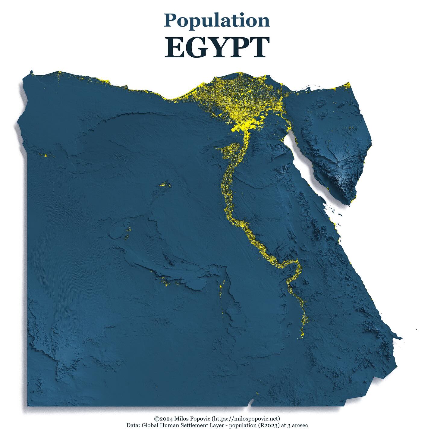
A stunning 3D relief map of Egypt showing population distribution along the Nile River, highlighting how settlement patterns follow the river valley.
Explore Forge3DShowing 385 maps
Need a report-ready 3D visual from your own geodata? Explore Forge3D.
Explore Forge3DForge3D pathway
A stunning 3D relief map of Egypt showing population distribution along the Nile River, highlighting how settlement patterns follow the river valley.
Explore Forge3D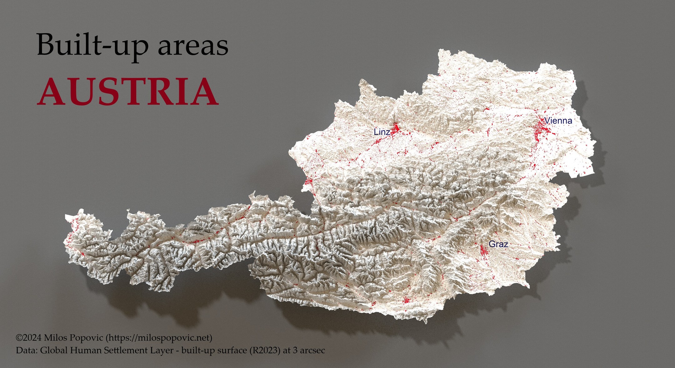
A 3D relief map of Austria highlighting built-up urban areas in red, with major cities Vienna, Linz, and Graz labeled.
Explore Forge3D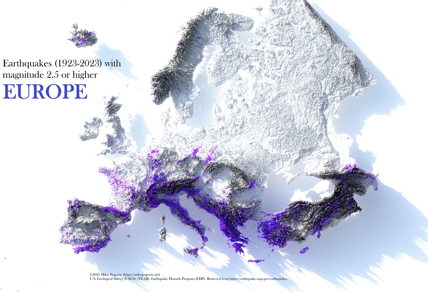
A 3D relief map of Europe showing earthquake locations over 100 years, with seismic activity concentrated along tectonic boundaries in southern Europe.
Explore Forge3D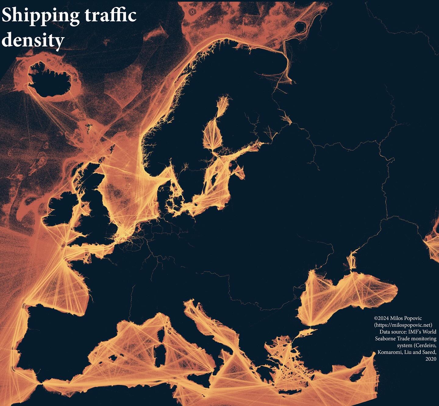
A striking visualization showing shipping lane density with glowing lines on a dark background, revealing the arteries of global trade around Europe.
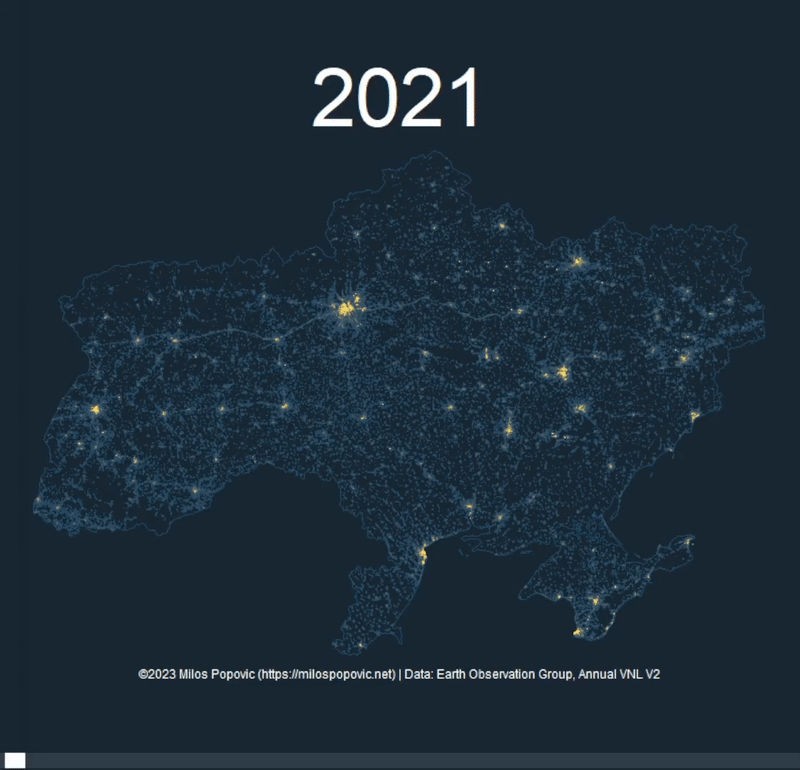
A compelling animated visualization of Ukraine's nightlight emissions, highlighting urban centers and infrastructure patterns.
A striking 3D population map that immediately communicates how the Nile defines where people live in Egypt, with population shown in yellow against blue terrain.
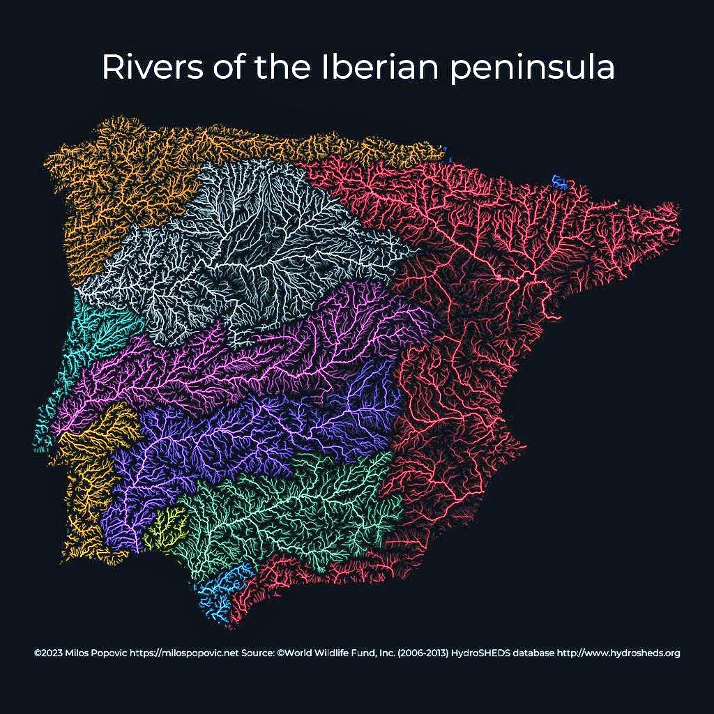
A striking river basin map that uses color to differentiate watersheds while the dark background makes the blue river lines pop dramatically.
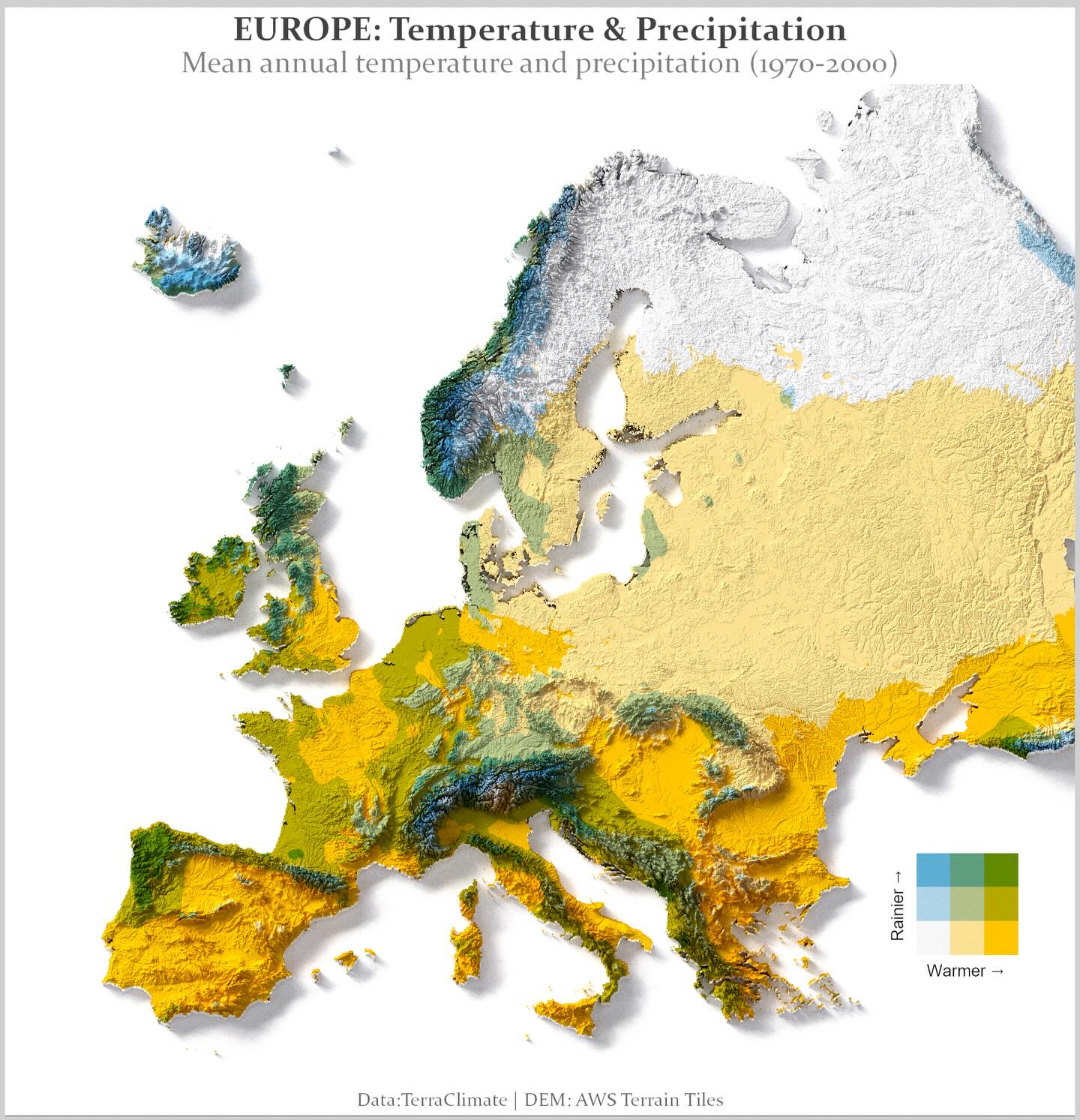
An elegant bivariate choropleth map that reveals climate patterns across Europe - from warm dry Mediterranean to cold wet Scandinavia - in a single view.
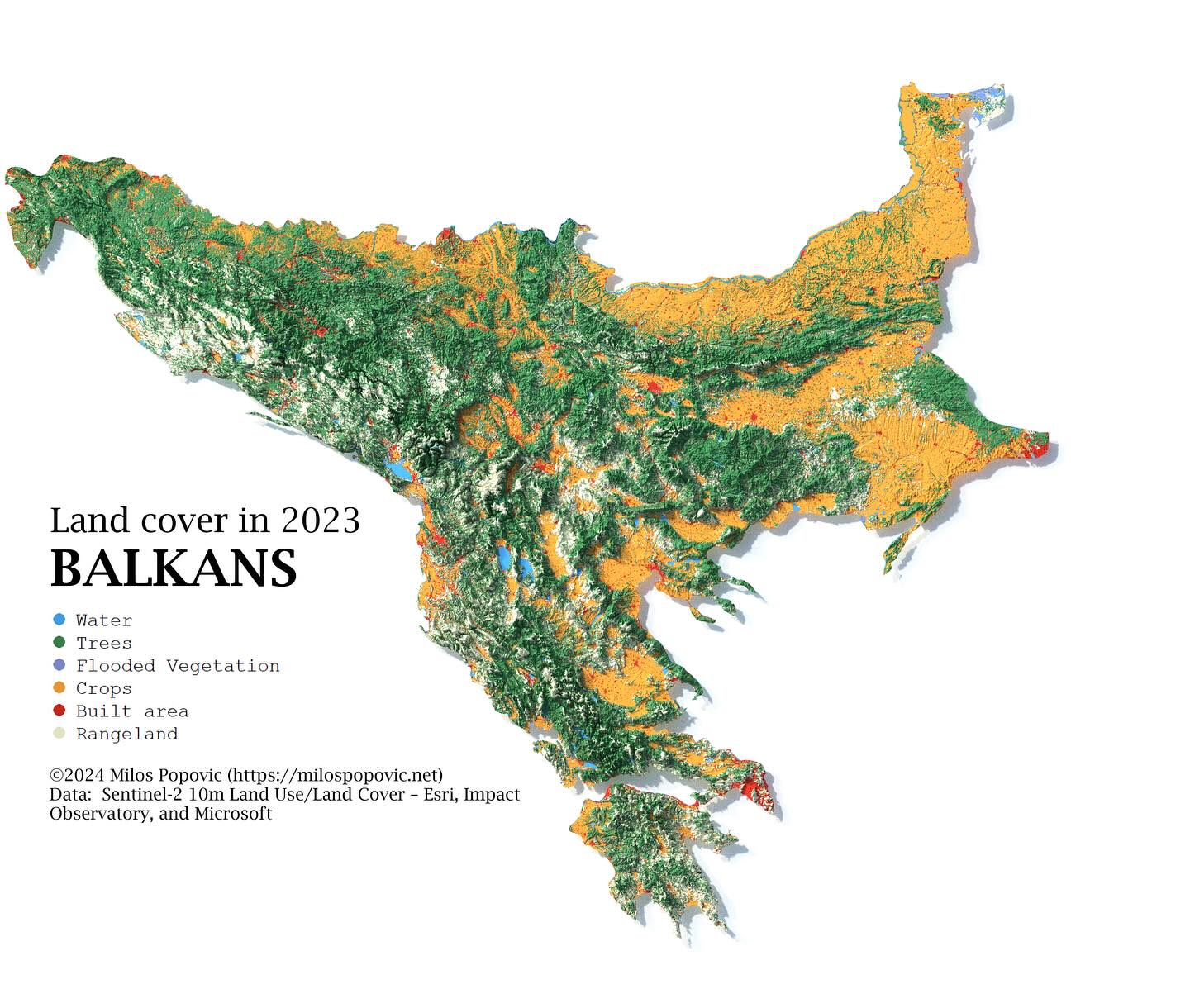
A comprehensive land cover map that clearly distinguishes between forests, agricultural land, urban areas, and water bodies across the entire Balkans region.
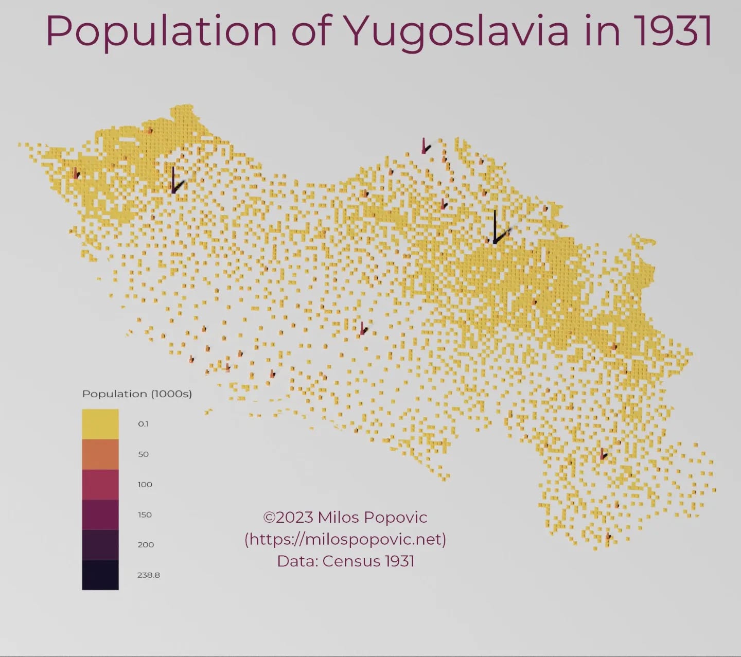
Interactive exploration of the 1931 Yugoslav Census showing ethnic and religious composition across the Kingdom of Yugoslavia.
Serbian language version of the interactive 1931 Yugoslav Census visualization.
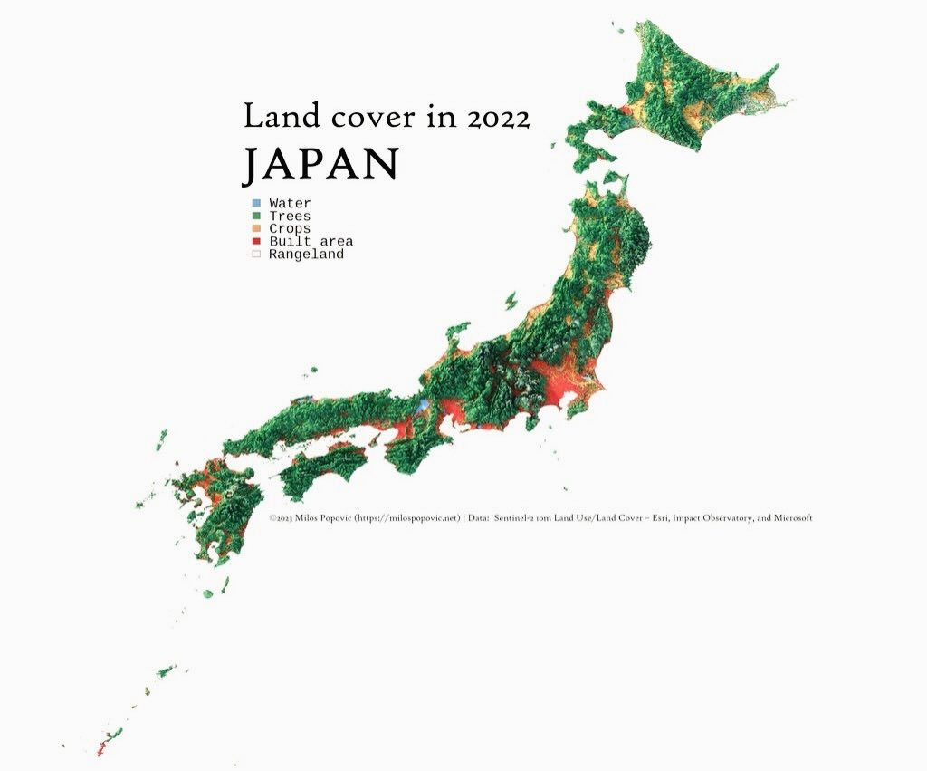
A land cover map of Japan showing the distribution of water, trees, crops, built areas, and rangeland across the Japanese archipelago.
A 3D relief map of Austria highlighting built-up urban areas in red, with major cities Vienna, Linz, and Graz labeled.
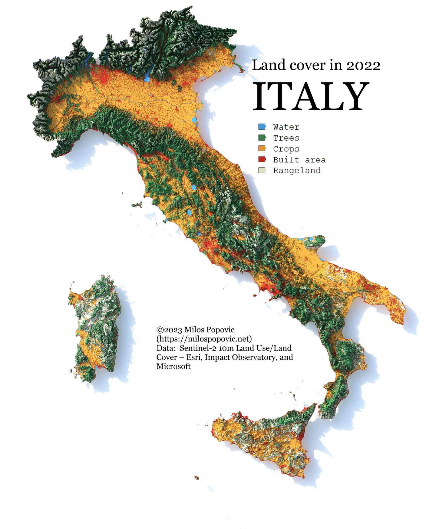
A land cover map of Italy showing the distribution of water, trees, crops, built areas, and rangeland across the Italian peninsula and islands.
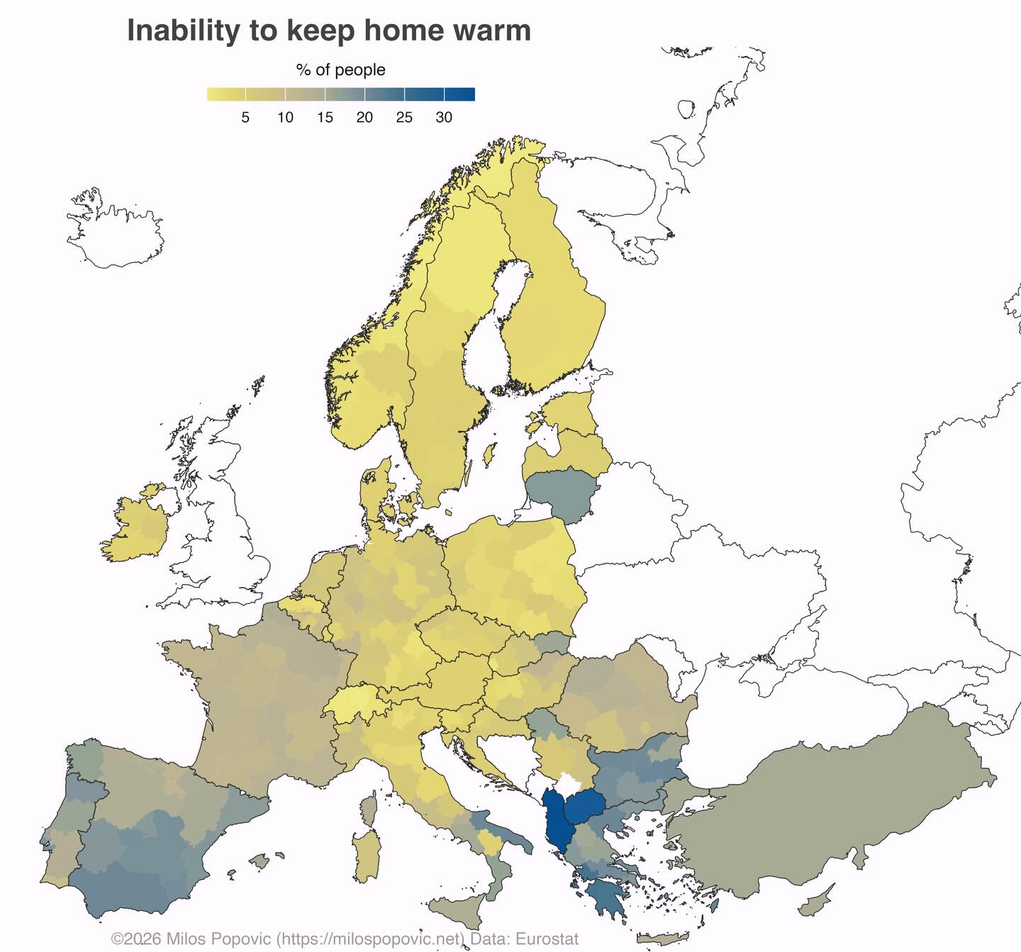
A choropleth map of Europe showing the percentage of people unable to keep their homes warm, with regional variations across EU member states.
A 3D relief map of Europe showing earthquake locations over 100 years, with seismic activity concentrated along tectonic boundaries in southern Europe.
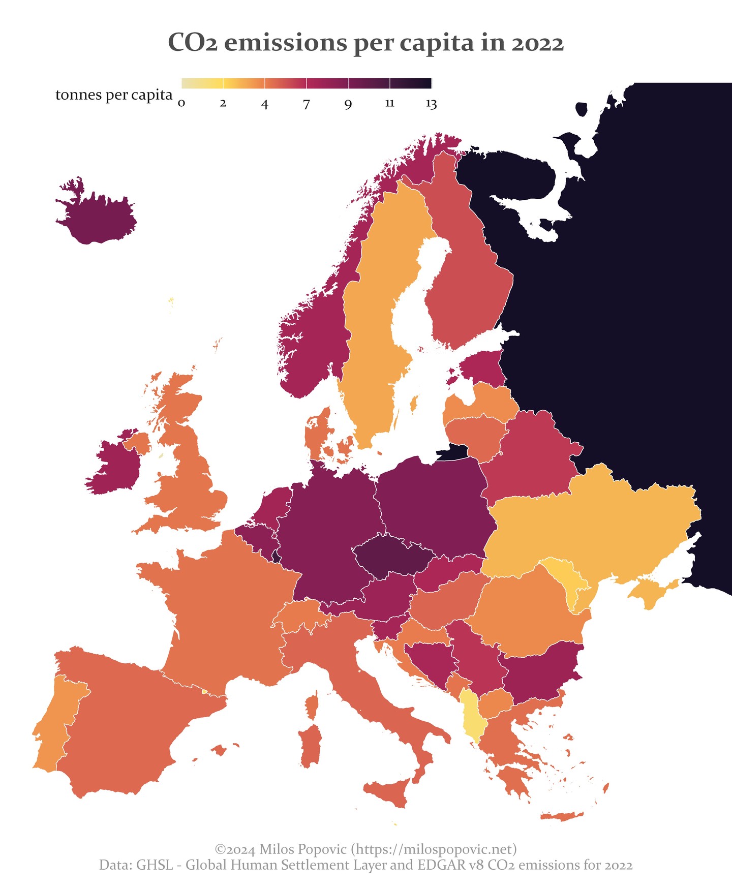
A choropleth map of Europe showing CO2 emissions per capita in tonnes, with variations across countries.
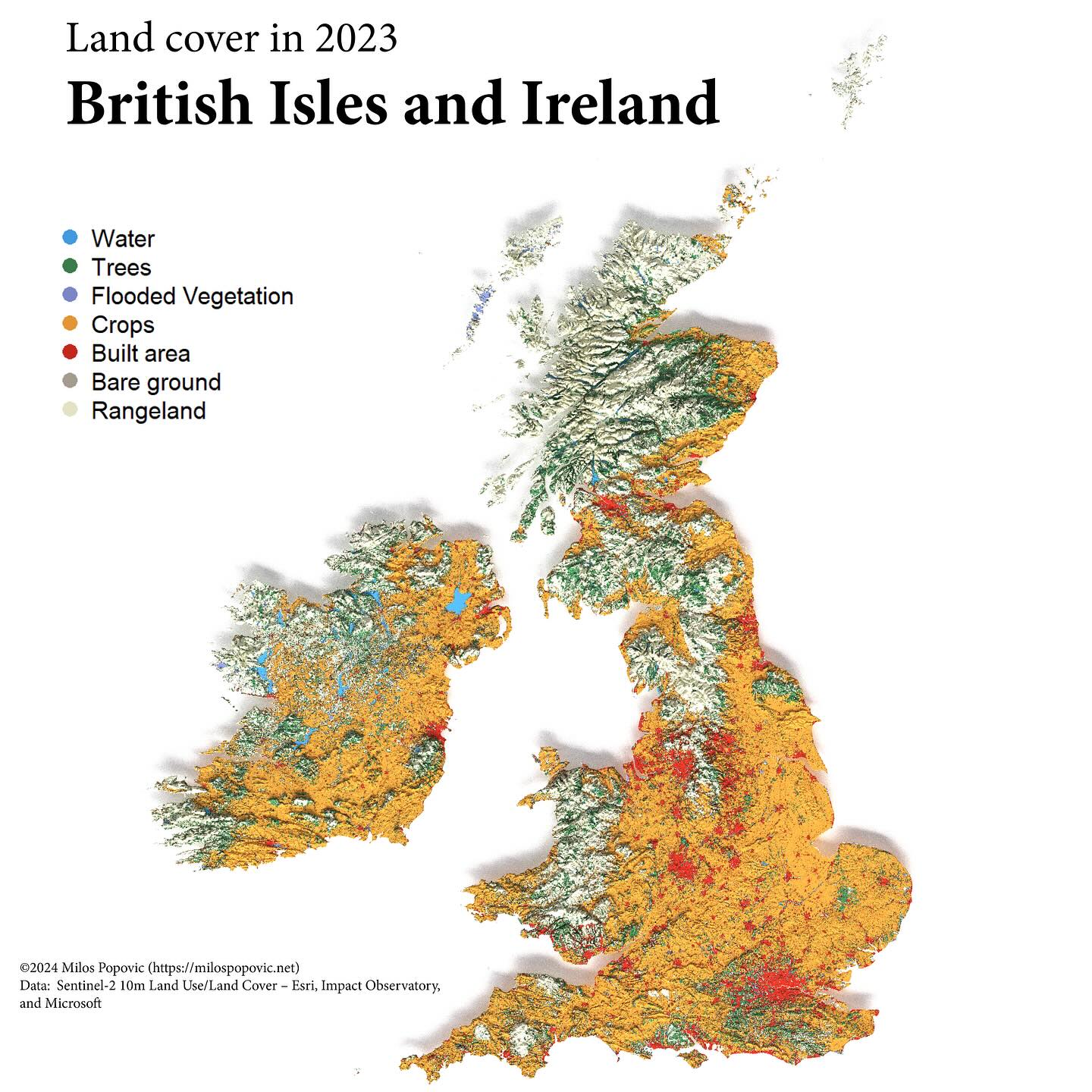
A land cover map of the British Isles showing water, trees, flooded vegetation, crops, built areas, bare ground, and rangeland distribution.
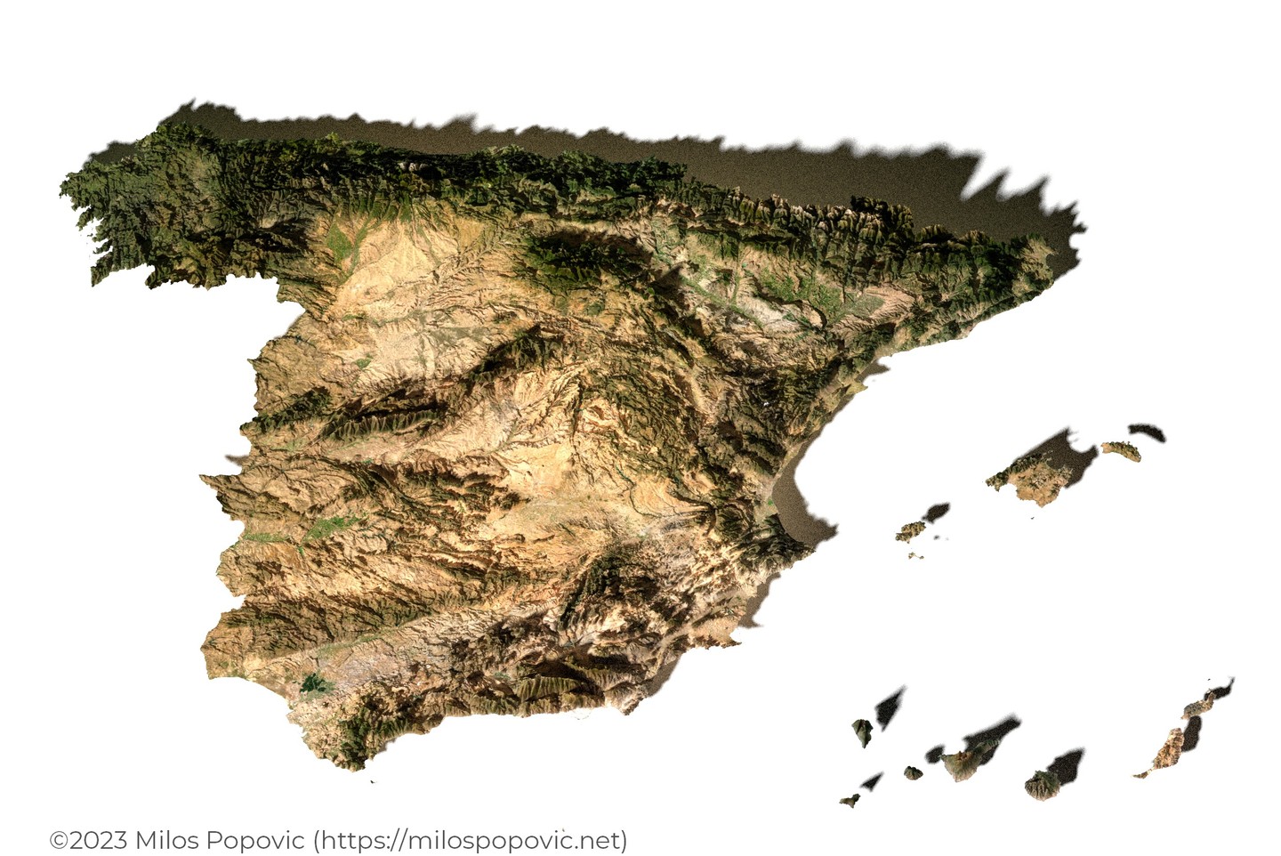
A 3D satellite imagery render of Spain and the Balearic Islands showing topography and land surface features.
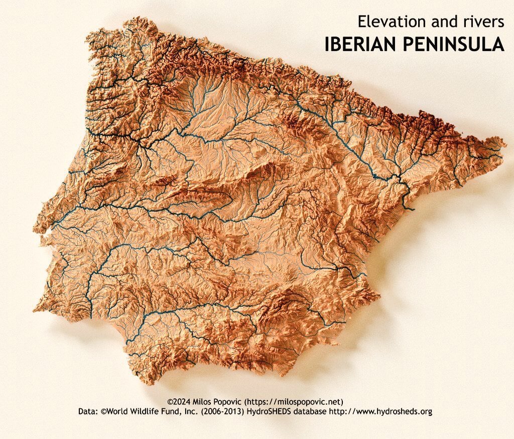
A relief map of the Iberian Peninsula showing elevation with river networks overlaid in blue, highlighting major watersheds.
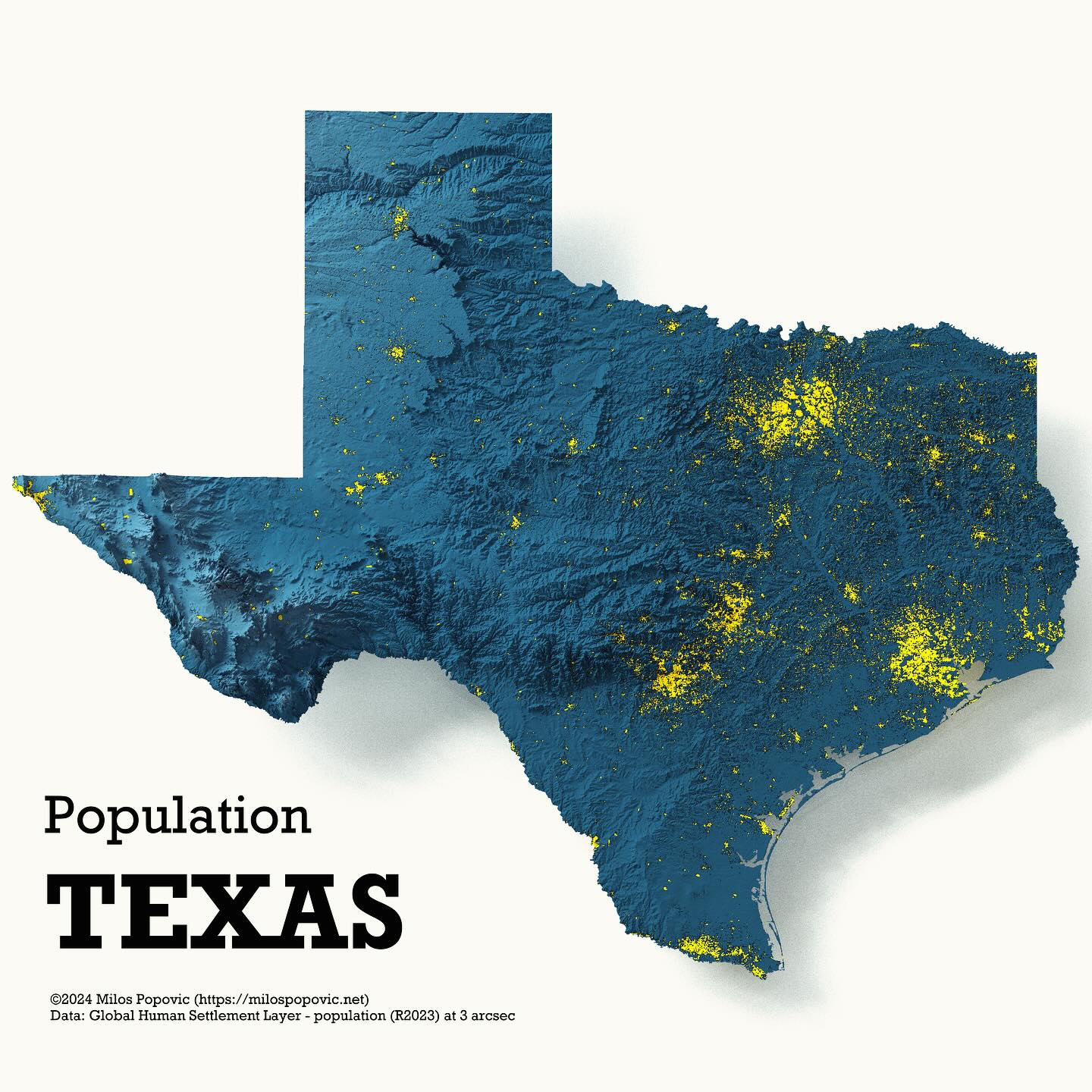
A 3D population density map of Texas showing population distribution with yellow highlights indicating populated areas on a blue relief background.
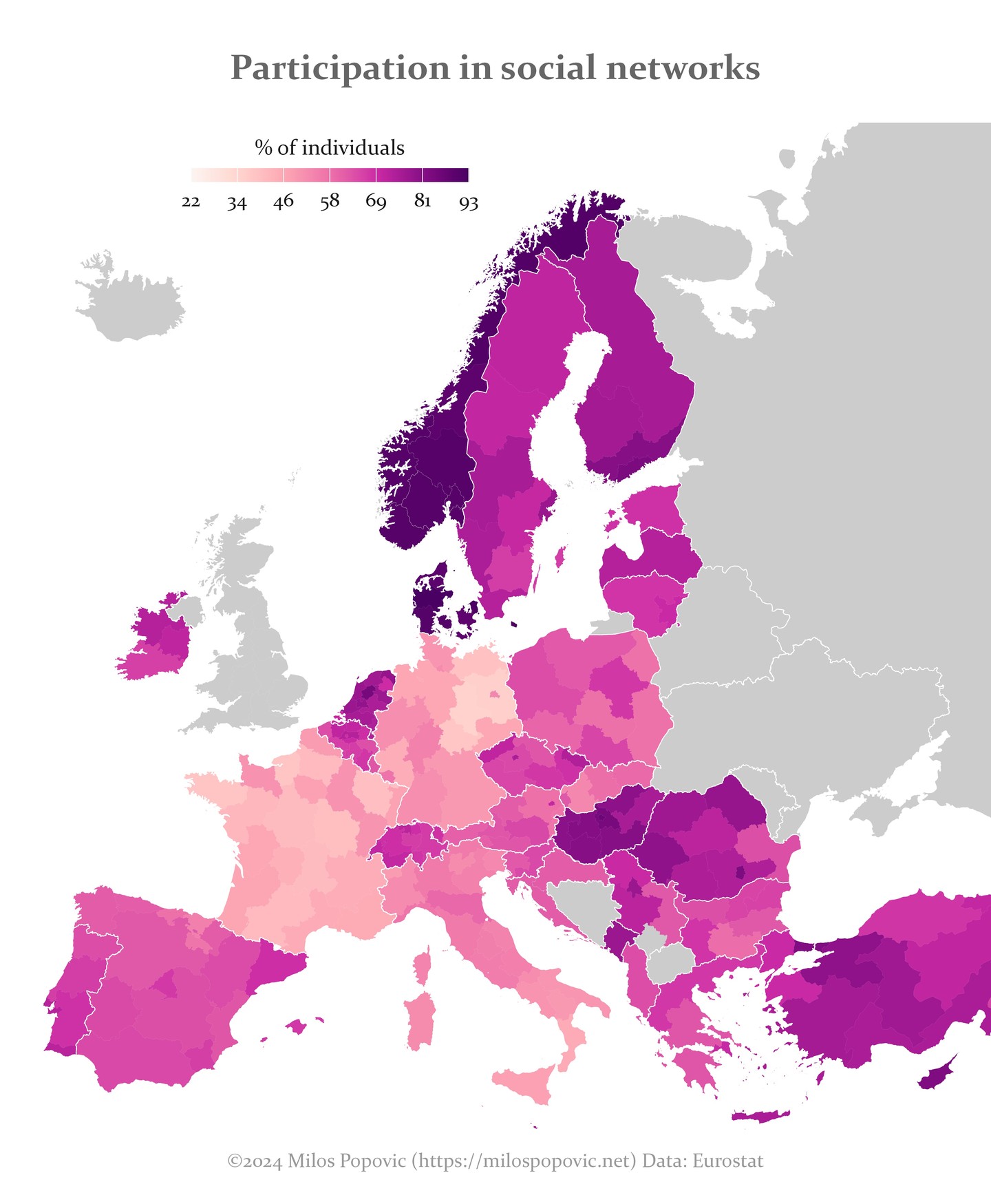
A choropleth map of Europe showing the percentage of individuals participating in social networks, ranging from 22% to 93%.
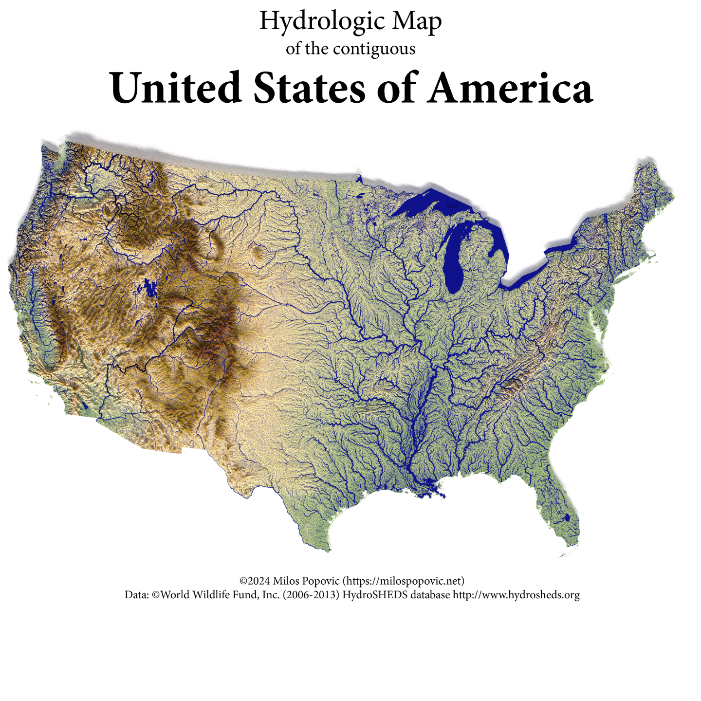
A hydrologic map showing the river networks and watersheds across the contiguous United States, with elevation coloring.
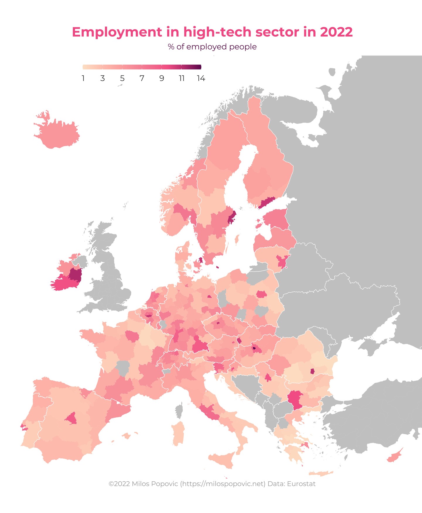
A choropleth map of Europe showing the percentage of employed people working in the high-tech sector, by region.
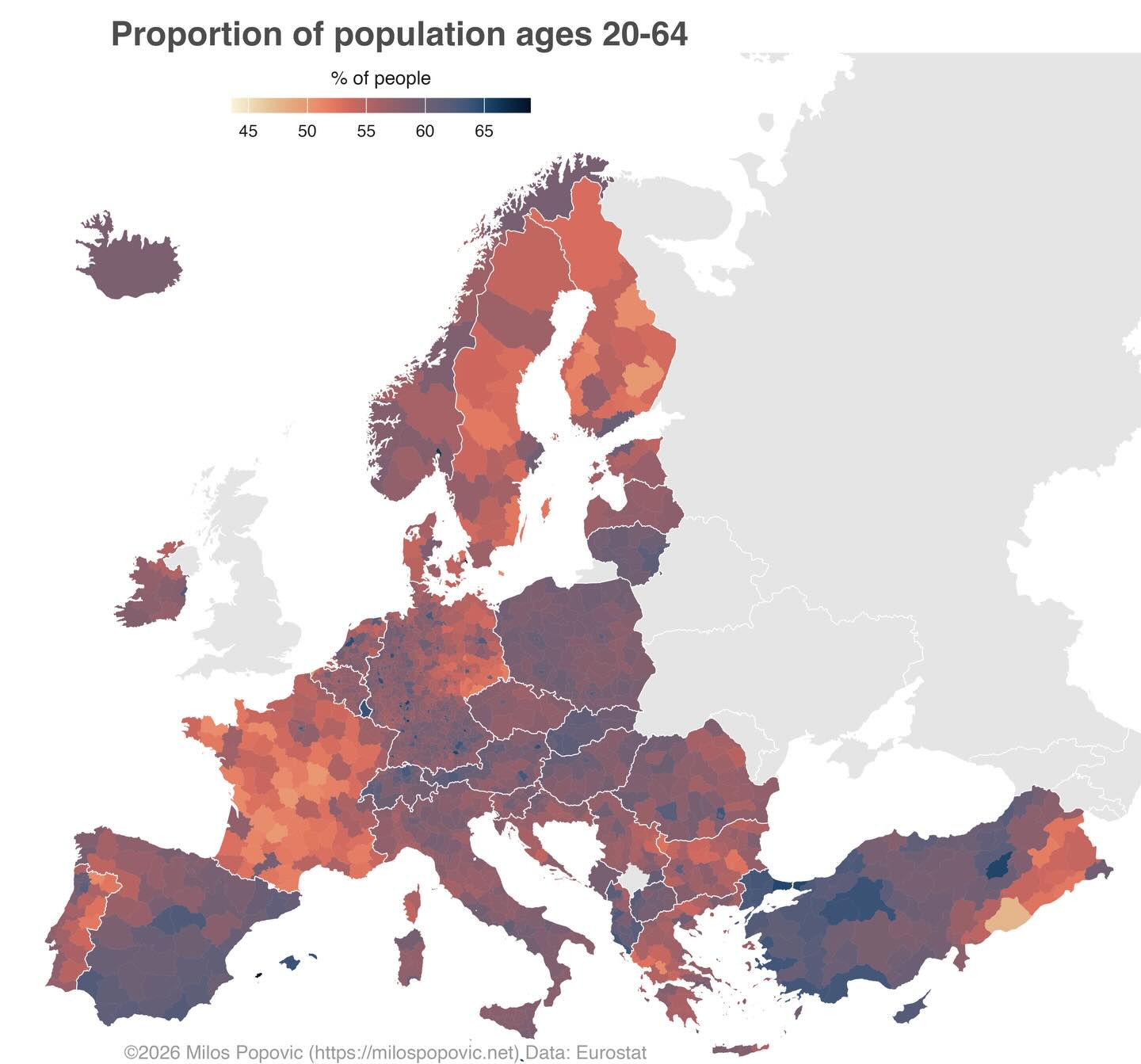
A choropleth map of Europe showing the percentage of working-age population (20-64) across different regions.
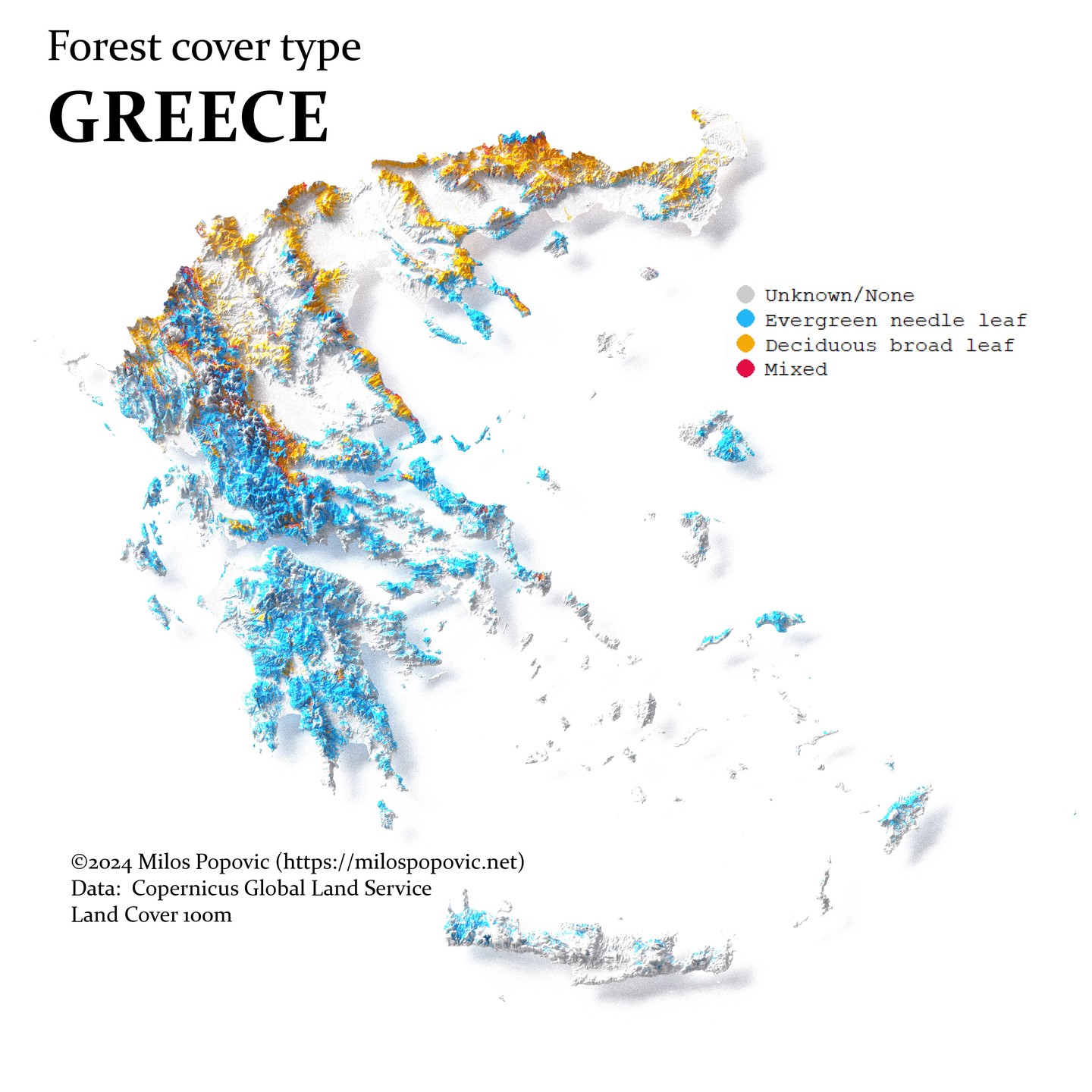
A 3D map of Greece showing forest cover types including evergreen needle leaf, deciduous broad leaf, and mixed forests.
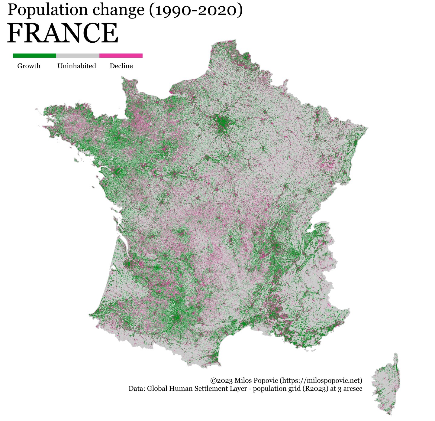
A map of France showing population change between 1990 and 2020, with green indicating growth and pink indicating decline.
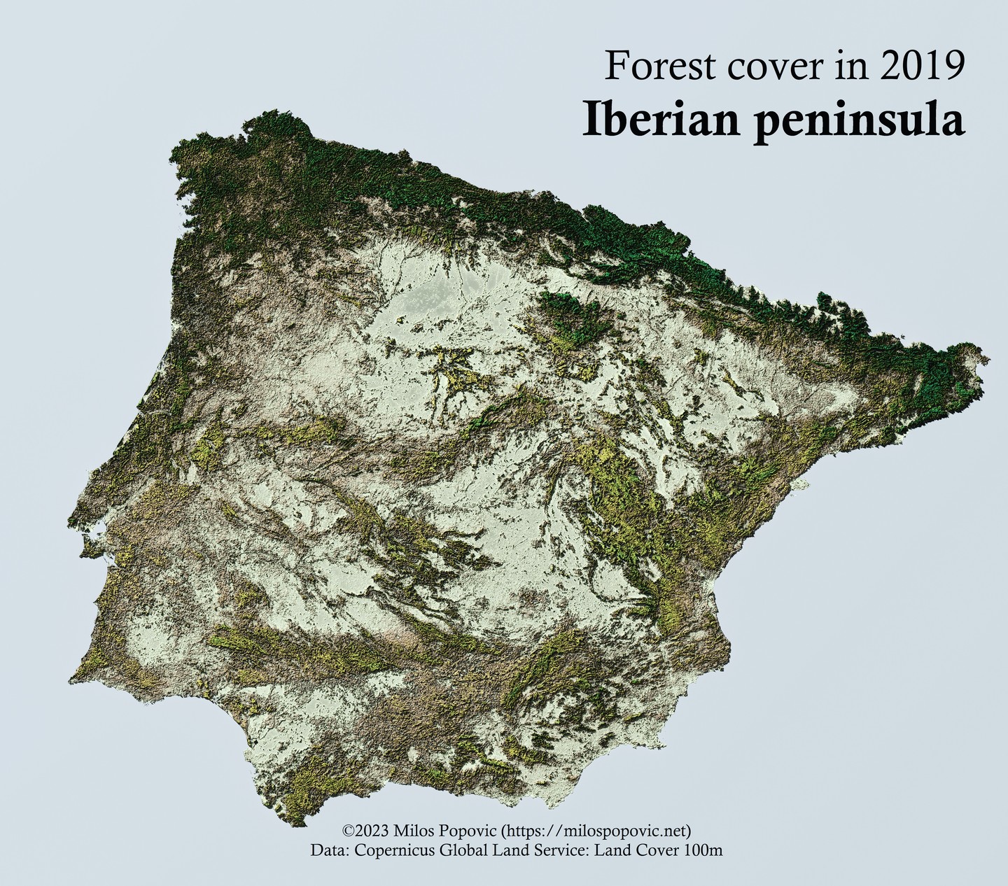
A 3D relief map of the Iberian Peninsula showing forest cover distribution in 2019.
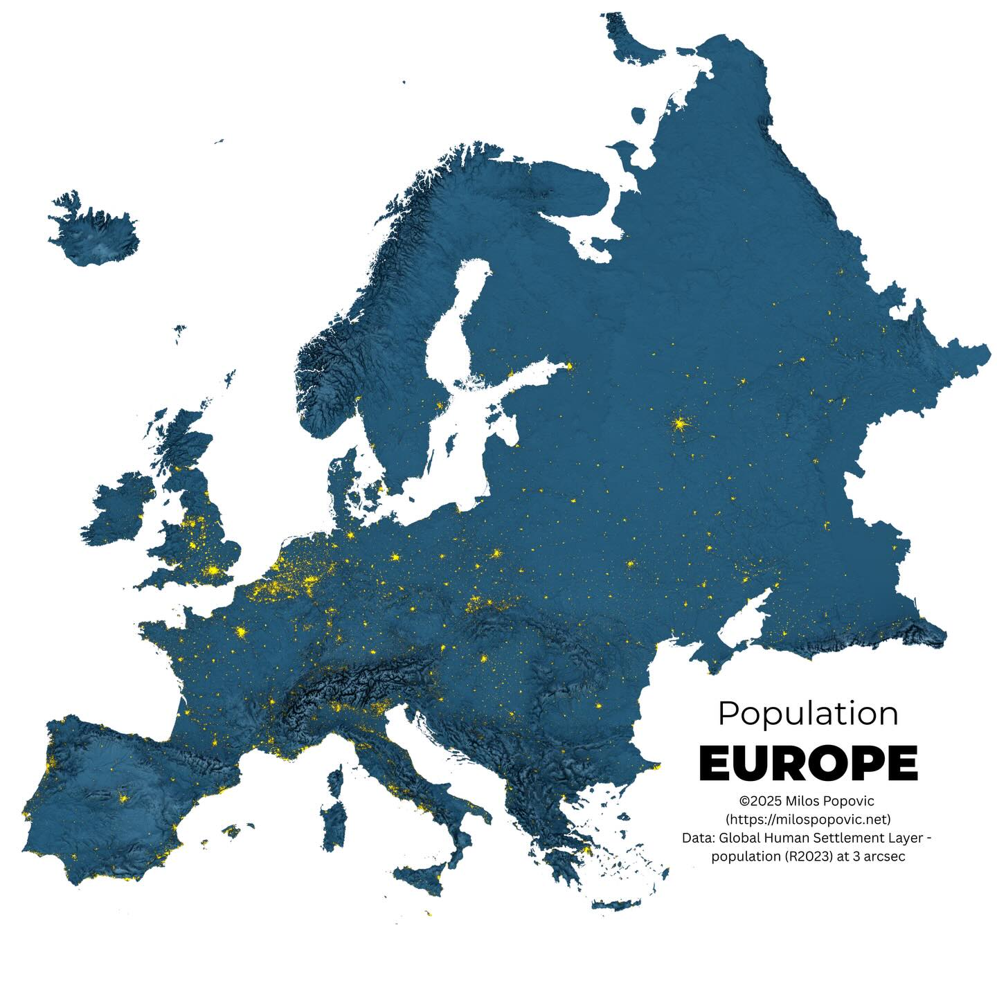
A 3D population density map of Europe showing population centers highlighted in yellow against a blue relief background.
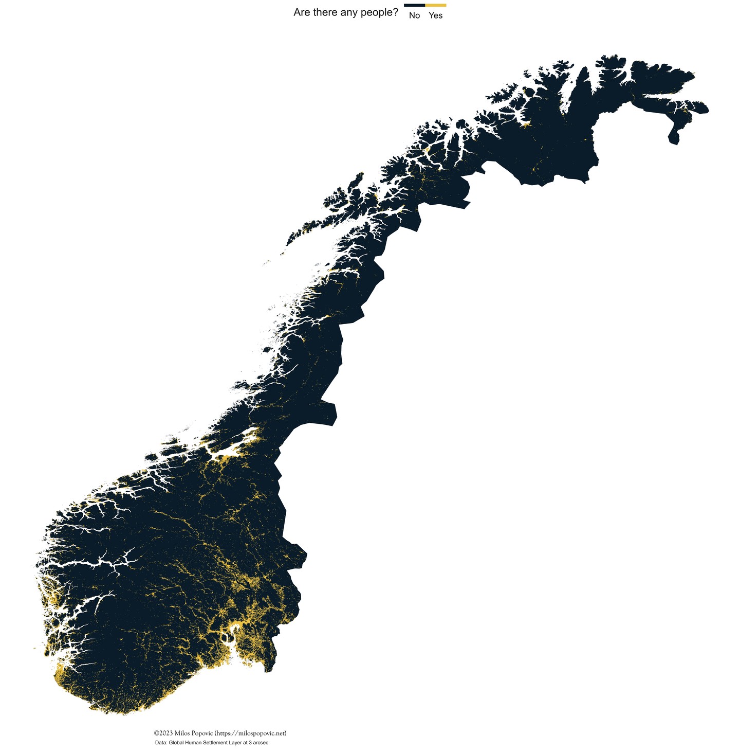
A population distribution map of Norway showing inhabited areas in yellow against a dark background, highlighting the sparse population in northern regions.

A colorful river network map of the Iberian Peninsula with different watersheds shown in distinct colors on a dark background.
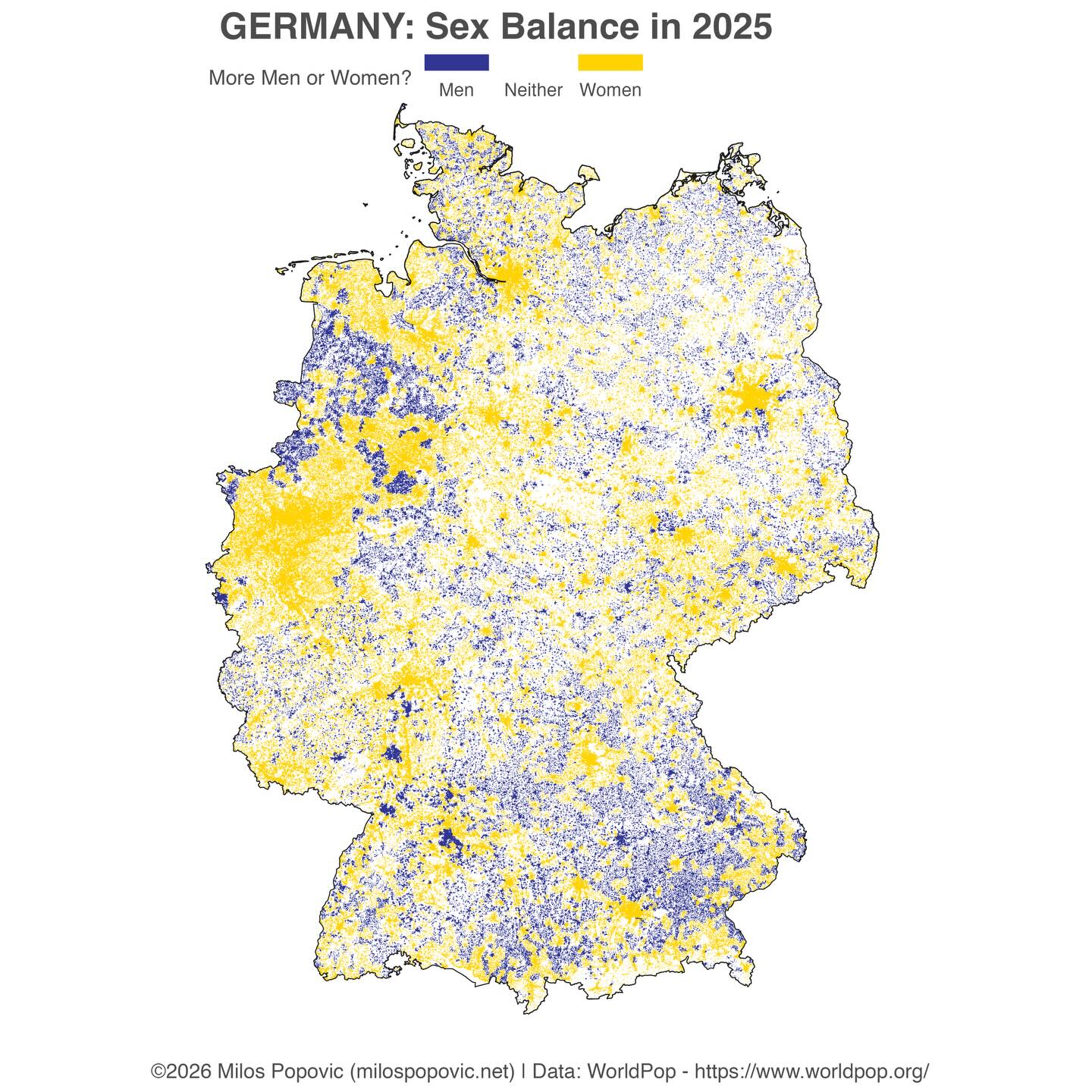
A map of Germany showing the sex ratio with areas having more men in blue and more women in yellow.
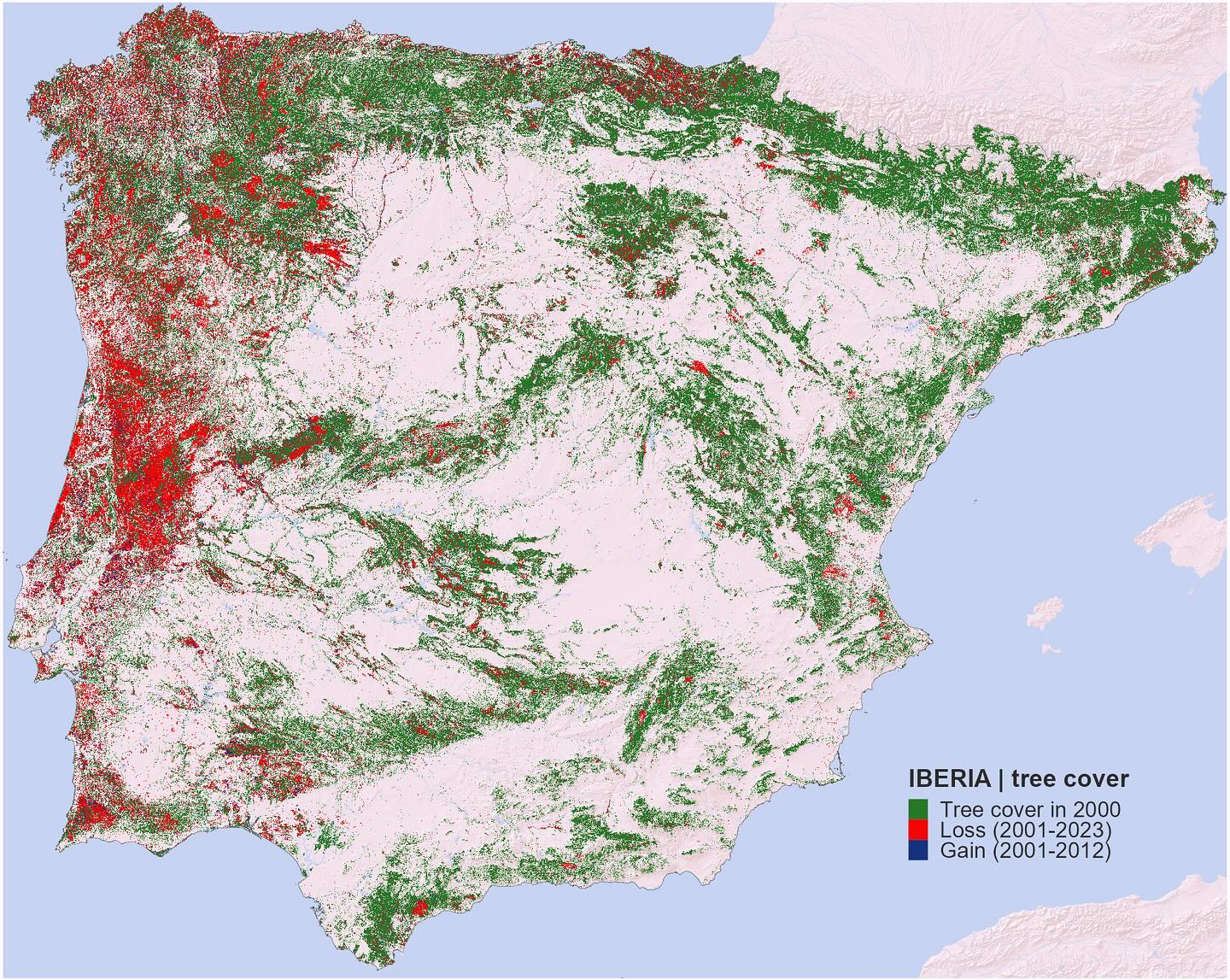
A map of the Iberian Peninsula showing tree cover in 2000 along with forest loss (2001-2023) in red and gain in blue.
Need a single map, a storytelling series, or a full spatial product prototype? Start with a consultation.
Popular content from my social channels.
A stunning 3D relief map of Egypt showing population distribution along the Nile River.
Hydrologic map showing river networks and watersheds across the contiguous United States with elevation colouring.
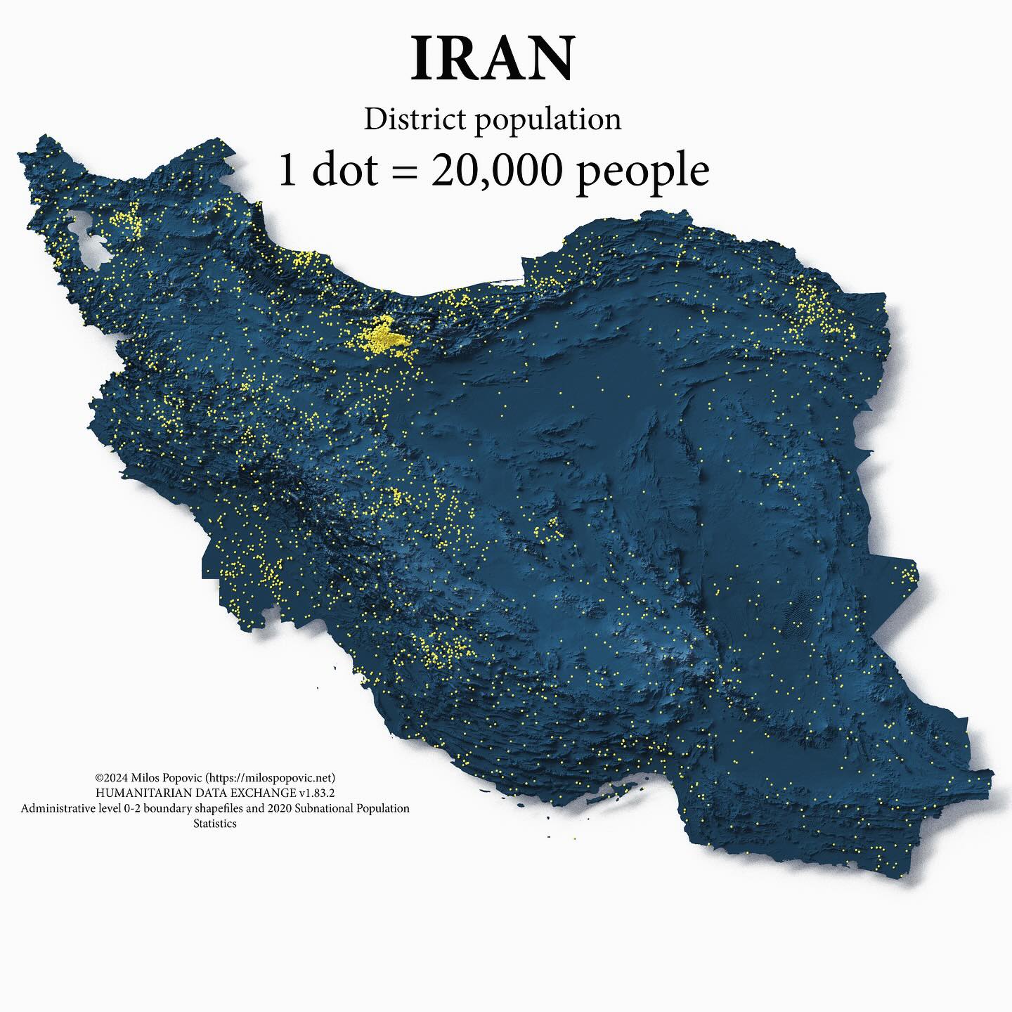
Dot density map of Iran where each dot represents 20,000 people.
A land cover map of Italy showing the distribution of water, trees, crops, built areas, and rangeland across the Italian peninsula and islands.