
Animated hexbin map of light pollution in Europe
January 02, 2022 | Milos Popovic
Let there be light: and there was light. But humans took the matter to extremes: a recent study shows that global light pollution has increased by at least 49% between 1992 and 2017. Even worse, this study finds that the actual increase in nightlight may be anywhere between 270% and 400% in specific regions after correcting for the inability of satellite sensors to detect blue lights from LED technology 😮. The global spread of light pollution is associated with human settlements and urban areas, industry and transport network. At the same time, artificial light is harmful to our health, wildlife and ecosystems as well as environment.
In this tutorial, we’ll illustrate the distribution of artificial light across Europe between 1992 and 2020. In one of my previous tutorials you learned how to overlay human settlement polygons over forest cover satellite data. Human settlements differ in size and larger polygons usually steal our attention due to their size. So, this time we’ll use a hexbin or grid map to equalize the importance of each part of the map.
We’ll make a grid over a national map of Europe, compute the average nighttime light (NTL) values and create a cool timelapse map. Our NLT data originates from the Harmonized DMSP and VIIRS nighttime light dataset. This dataset includes temporally calibrated time series data from The Defense Meteorological Program (DMSP) Operational Line-Scan System (OLS) for 1992-2013; and (2) transformed nighttime light dataset from the Visible Infrared Imaging Radiometer Suite (VIIRS) data (2014-2020). The DMSP-OLS nighttime light dataset is a cloud-free, nightlight dataset based on US Air Force sensitive light sensors that detect light emission from the earth surface at night, while the VIIRS dataset is the product of the Joint Polar Satellite System, which creates imagery of the surface in near real-time.
The DMSP component was calibrated and integrated to provide the temporally consistent and extended imagery between 1992 and 2013. For the remaining period (2014-2020) the authors simulated DMSP-like data from the VIIRS data using the NTL integration approach. Records in the DMSP NTL data are the digital number (DN) values, ranging from 0 to 63, and cover the whole globe 🤩.
Okay, let’s get down to business!
We’ll load the key libraries such as tidyverse and tidyr for data processing; giscoR, a fantastic package by Diego Hernan for fetching the latest country shapefile of Europe; sf for importing the shapefile to R; and grid and gridExtra for computing hexbin polygons of Europe. Next, we’ll load raster for loading satellite imagery in .tif format and exactextractr for computing weighted averages for nightlight DN values. Finally, we’ll import gganimate for animation while package classInt will come in handy for constructing our legend.
if(!require("sf")) install.packages("sf")
if(!require("tidyverse")) install.packages("tidyverse")
if(!require("grid")) install.packages("grid")
if(!require("gridExtra")) install.packages("gridExtra")
if(!require("raster")) install.packages("raster")
if(!require("exactextractr")) install.packages("exactextractr")
if(!require("gganimate")) install.packages("gganimate")
if(!require("transformr")) install.packages("transformr")
if(!require("tidyr")) install.packages("tidyr")
if(!require("giscoR")) install.packages("giscoR")
if(!require("classInt")) install.packages("classInt")
if(!require("gifski")) install.packages("gifski")

library(tidyverse, quietly=T) #data wrangling
library(tidyr, quietly=T) #data wrangling
library(sf, quietly=T) #geospatial analysis
library(grid, quietly=T) #make grid
library(gridExtra, quietly=T) #make grid
library(raster, quietly=T) # import raster files
library(exactextractr, quietly=T) # zonal statistics
library(gganimate, quietly=T) # animation
library(giscoR, quietly=T) #shapefile of Europe
library(classInt, quietly=T) #bins
library(gifski, quietly=T) #renderer

windowsFonts(georg = windowsFont('Georgia')) #font
We download the Europe shapefile on the national level in a 1:10 million scale to avoid too much deatail and longer processing time. Similar to my previous tutorials, we define a bounding box in order to get rid of the Asian parts of Russia. Finally, we transform our shapefile to the Lambert projection EPSG 3575 with meter units since we need to create a map with hexagons of equal size. I chose this projection based on the suggestion for suitable coordinate reference systems for transformation from the crsuggest library.
# 1. EUROPE SHAPEFILE
europe <- giscoR::gisco_get_countries(
  year = "2016",
  epsg = "4326",
  resolution = "10",
  region = "Europe"
)

# define longlat projection
crsLONGLAT <- "+proj=longlat +datum=WGS84 +no_defs +ellps=WGS84 +towgs84=0,0,0"

# create a bounding box of Europe based on longlat projection
bb <- st_sfc(
  st_polygon(list(cbind(
    c(-23.6, 47.3, 47.3, -23.6, -23.6), # x-coordinates (longitudes)
    c(30.5, 30.5, 71.05, 71.05, 30.5)     # y-coordinates (latitudes)
    ))), crs = crsLONGLAT)

# crop Europe by bounding box
eur <- st_crop(europe, st_bbox(bb))

# transform the shp into Lambert projection EPSG 3575 with meter units
eur2 <- eur %>% st_transform(3575)
In the following chunk, we make a 25 km hexagon grid (cellsize = 25000 meters). You could manipulate the cell size for a more or less detailed grid. Then we intersect the hexagons with the Europe sf object. Note that the grid pieces on the edges of the resulting object are not hexagons since they fit to the shape of the Europe map.
We select only polygons and mutlipolygons and transform everything into multipolygons. Finally, we transform our grid back into WGS84 degree projection to be able to compute the nightlight averages from raster files.
# Make grid 25 km
gr <- st_make_grid(eur2, cellsize = 25000, what = "polygons", square = F) %>%
  st_intersection(eur2) %>%
  st_sf() %>%
  mutate(id = row_number())

gg <- gr %>% filter(
  st_geometry_type(.)
  %in% c("POLYGON", "MULTIPOLYGON")) %>%
  st_cast("MULTIPOLYGON") #transform to multipolygons

g <- st_transform(gg, crs = crsLONGLAT) #transform back to longlat
We’re ready to download the nightlight data! Using the function from the rfigshare package we extract info on the dataset files (9828827 stands for the nightlight dataset Figshare id). In the following step, we store file names and URLs into a dataframe and create a downloadable link from the file location and file name columns. Since there is a calibrated DMSP raster file and simualted VIIRS for 2013 we only keep the former. We use a loop to download all the raster files as separate TIFs. Finally, we store the list of downloaded raster files into the rastfiles object.
# 2. NIGHTLIGHT DATA
# list of all nightlight raster files from FigShare
x = rfigshare::fs_details("9828827", mine = F, session = NULL)
urls = jsonlite::fromJSON(jsonlite::toJSON(x$files), flatten = T)
urls

# download harmonized nightlight data for 1992-2020
urls$download <- paste0(urls$download_url, "/", urls$name)
urls <- urls[-28,] # get rid of the 2013 duplicate
url <- urls[,5]

for (u in url){
  download.file(u, basename(u), mode="wb")
}

# enlist raster files, merge them into a single file and re-project
rastfiles <- list.files(path = getwd(),
    pattern = ".tif$",
    all.files=T,
    full.names=F)
Now we just have to load all the raster files as a list and compute weighted averages of nightlight for every raster in the list. We first create an empty list dd where we will store our raster files. Then we load every raster file, place them all into allrasters and apply exact_extract to compute weighted averages for every hexagon and year.
dd <- list()
# compute average nighlight DN values for every hexbin
for(i in rastfiles) dd[[i]] <- {
        allrasters <- raster(i)
        d  <- exact_extract(allrasters, g, "mean")
        d
}

dd <- do.call(rbind, dd) # pull them all together
a <- as.data.frame(t(dd)) #convert to data.frame and transpose
a$id <- 1:max(nrow(a)) # id for joining with sf object
This returns a populated dd list of nightlight values. We pull all the members of the list together, convert them to a data frame and transpose. We create an id for every row of the data frame so that we can easily merged it with our grid object. As you can see below, the column names of our newly minted table are raster files and rows are values for every hexagon field. This means that the table is in wide format. But we need it in the long format where rows are values for every year and hexagon field.
names(a)

[1] "Harmonized_DN_NTL_1992_calDMSP.tif"  "Harmonized_DN_NTL_1993_calDMSP.tif"
[3] "Harmonized_DN_NTL_1994_calDMSP.tif"  "Harmonized_DN_NTL_1995_calDMSP.tif"
[5] "Harmonized_DN_NTL_1996_calDMSP.tif"  "Harmonized_DN_NTL_1997_calDMSP.tif"
[7] "Harmonized_DN_NTL_1998_calDMSP.tif"  "Harmonized_DN_NTL_1999_calDMSP.tif"
[9] "Harmonized_DN_NTL_2000_calDMSP.tif"  "Harmonized_DN_NTL_2001_calDMSP.tif"
[11] "Harmonized_DN_NTL_2002_calDMSP.tif"  "Harmonized_DN_NTL_2003_calDMSP.tif"
[13] "Harmonized_DN_NTL_2004_calDMSP.tif"  "Harmonized_DN_NTL_2005_calDMSP.tif"
[15] "Harmonized_DN_NTL_2006_calDMSP.tif"  "Harmonized_DN_NTL_2007_calDMSP.tif"
[17] "Harmonized_DN_NTL_2008_calDMSP.tif"  "Harmonized_DN_NTL_2009_calDMSP.tif"
[19] "Harmonized_DN_NTL_2010_calDMSP.tif"  "Harmonized_DN_NTL_2011_calDMSP.tif"
[21] "Harmonized_DN_NTL_2012_calDMSP.tif"  "Harmonized_DN_NTL_2013_calDMSP.tif"
[23] "Harmonized_DN_NTL_2014_simVIIRS.tif" "Harmonized_DN_NTL_2015_simVIIRS.tif"
[25] "Harmonized_DN_NTL_2016_simVIIRS.tif" "Harmonized_DN_NTL_2017_simVIIRS.tif"
[27] "Harmonized_DN_NTL_2018_simVIIRS.tif" "Harmonized_DN_NTL_2019_simVIIRS.tif"
[29] "Harmonized_DN_NTL_2020_simVIIRS.tif" "id"
We pivot the columns with raster names and extract every year by getting rid of the extra strings.
ee <- pivot_longer(a, cols=1:29, names_to = "year", values_to = "value") #wide to long format
l <- ee %>% # extract year from raster name
     mutate_at("year", str_replace_all, c("Harmonized_DN_NTL_"="", "_simVIIRS"="", "_calDMSP"="", ".tif"=""))
Aaaand here it is!
head(l)

# A tibble: 6 x 3
     id year  value
  <int> <chr> <dbl>
1     1 1992   21.7
2     1 1993   21.7
3     1 1994   24.0
4     1 1995   26.0
5     1 1996   24.6
6     1 1997   26.4
In the final step before the mapping, we join the dataframe with the grid sf object and remove null features. Importantly, we transform the year column from a string to integer.
f <- left_join(l, gg, by="id") %>% # join with transformed sf object
     st_as_sf() %>%
     filter(!st_is_empty(.)) #remove null features

f$year <- as.numeric(as.character(f$year))
Let’s define the cutoffs based on Fisher-Jenks natural breaks classification. This classification identifies natural clusters of numbers that are in proximity while also accounting for the distance between the other clusters. We define 7 clusters and apply Fisher-Jenks bins to our dark blue-yellow color palette.
# bins
brk <- round(classIntervals(f$value,
              n = 6,
              style = 'fisher')$brks, 0)
vmax <- max(f$value, na.rm=T)
vmin <- min(f$value, na.rm=T)
# define the color palette
cols =c("#182833", "#1f4762", "#FFD966", "#ffc619")
newcol <- colorRampPalette(cols)
ncols <- 7
cols2 <- newcol(ncols)
We’re ready to make our light pollution timelapse map! We first plot the weighted averages using geom_sf. Note that we omit grid lines via color=NA to avoid intensive computation and a messy map. But we’ll add national boundaries using geom_sf(data=eur2, fill=NA, color=“white”, size=0.01). Next, we assign the color pallete and Fisher-Jenks breaks, including limits in order to keep our legend constant.
# animate the map
pp <- ggplot(f) +
  geom_sf(mapping = aes(fill = value), color = NA, size=0) +
  geom_sf(data=eur2, fill=NA, color="white", size=0.01) +
  scale_fill_gradientn(name="DN values",
                       colours=cols2,
                       breaks=brk,
                       labels=brk,
                       limits=c(vmin,vmax)) +
  guides(fill=guide_legend(
            direction = "horizontal",
            keyheight = unit(0.25, units = "mm"),
            keywidth = unit(4, units = "mm"),
            title.position = 'top',
            title.hjust = 0.5,
            label.hjust = .5,
            nrow = 1,
            byrow = T,
            reverse = F,
            label.position = "bottom"
          )
    ) +
  theme_minimal() +
  theme(text = element_text(family = "georg", color = "#22211d"),
    axis.line = element_blank(),
    axis.text.x = element_blank(),
    axis.text.y = element_blank(),
    axis.ticks = element_blank(),
    axis.title.x = element_blank(),
    axis.title.y = element_blank(),
    legend.position = c(.5, .005),
    legend.text = element_text(size=3, color="white"),
    legend.title = element_text(size=3, color="white"),
    panel.grid.major = element_line(color = "grey20", size = 0.2),
    panel.grid.minor = element_blank(),
    plot.title = element_text(face="bold", size=5, color="white", hjust=.5),
    plot.caption = element_text(size=2, color="white", hjust=.5, vjust=-10),
    plot.subtitle = element_text(size=8, color="#ffc619", hjust=.5),
    plot.margin = unit(c(t=0, r=0, b=0, l=0),"lines"), #added these narrower margins to enlarge maps
    plot.background = element_rect(fill = "grey20", color = NA),
    panel.background = element_rect(fill = "grey20", color = NA),
    legend.background = element_rect(fill = "grey20", color = NA),
    panel.border = element_blank())+
  labs(x = "",
         y = NULL,
         title = "Average nightlight values (1992-2020)",
         subtitle = 'Year: {as.integer(frame_time)}',
         caption = "©2021 Milos Popovic (https://milospopovic.net)\n Data: Li et al. (2020). A harmonized global nighttime light dataset 1992–2018. Scientific data, 7(1), 1-9.")
In the final chunk, we add year as our transition time as well as animation effects before fine-tuning the animation parameters and making our timelapse map.
pp1 = pp +
  transition_time(year) +
  ease_aes('linear') +
  enter_fade() +
  exit_fade()

p_anim <- animate(pp1,
  nframes = 140,
  duration = 25,
  start_pause = 5,
  end_pause = 30,
  height = 2140,
  width = 2830,
  res = 600)

anim_save("nightlight_1992_2020.gif", p_anim)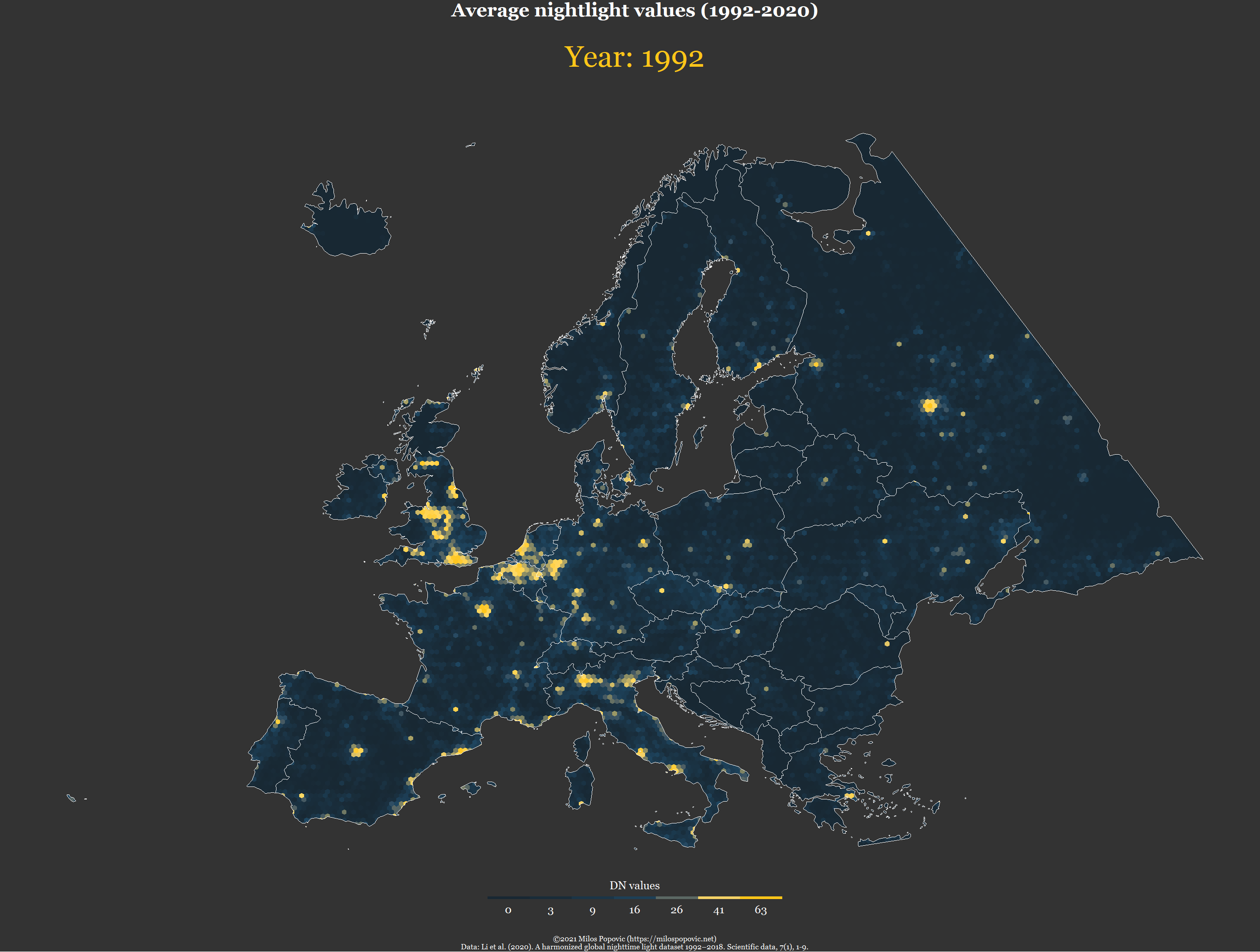
In this tutorial, I showed you how to compute weighted averages from sattelite data for a grid map using R and sf. Feel free to check the full code here, clone the repo and reproduce, reuse and modify the code as you see fit.
I’d be happy to hear your view on how this map could be improved or extended to other geographic realms. To do so, please follow me on Twitter, Instagram or Facebook!