How to map population Change with GHSL Data in R
November 12, 2023 | Milos Popovic
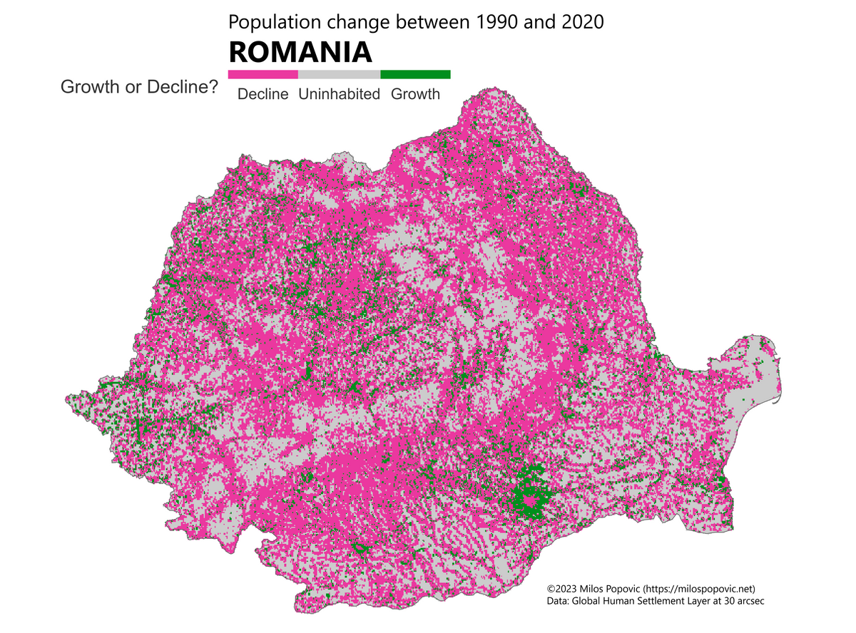
In this tutorial, I will show you how to use R and some awesome packages to download, load, crop, and calculate population difference from the Global Human Settlement Layer (GHSL) data, and how to visualize the results using ggplot2 and tidyterra. You will also learn how to categorize the population change into three groups: decline, uninhabited, and growth. Finally, we’ll create a crisp map that shows how the population of Romania has changed from 1990 to 2020.
If you’re a fan of video tutorials, check out how I create this map in my YouTube video:
Ready to get started? Let’s go!
Import packages
To follow this tutorial, you will need to have R installed on your computer. You will also need to install and load the following packages:
- tidyverse: a collection of packages for data manipulation and visualization
- terra: a package for spatial data analysis and raster algebra
- giscoR: a package for accessing geospatial data from the European Commission
- tidyterra: a package for integrating terra and ggplot2
You can install these packages using the following code:
libs <- c(
    "tidyverse", "terra",
    "giscoR", "tidyterra"
)

installed_libs <- libs %in% rownames(
    installed.packages()
)

if (any(installed_libraries == F)) {
    install.packages(
        libs[!installed_libs]
    )
}

invisible(
    lapply(
        libs, library,
        character.only = TRUE
    )
)
Download GHSL data
The GHSL data provides gridded population estimates for the years 1990 and 2020, based on census and satellite data. You can download the data from the [Joint Research Centre] website, or use the following code to download the zip files directly to your working directory:
urls <- c(
    "https://jeodpp.jrc.ec.europa.eu/ftp/jrc-opendata/GHSL/GHS_POP_GLOBE_R2023A/GHS_POP_E1990_GLOBE_R2023A_4326_30ss/V1-0/GHS_POP_E1990_GLOBE_R2023A_4326_30ss_V1_0.zip",
    "https://jeodpp.jrc.ec.europa.eu/ftp/jrc-opendata/GHSL/GHS_POP_GLOBE_R2023A/GHS_POP_E2020_GLOBE_R2023A_4326_30ss/V1-0/GHS_POP_E2020_GLOBE_R2023A_4326_30ss_V1_0.zip"
)

options(timeout = 300)

for (url in urls) {
    download.file(
        url = url,
        path = getwd(),
        destfile = basename(url)
    )
}

lapply(
    basename(urls),
    unzip
)
This will download and unzip two files: GHS_POP_E1990_GLOBE_R2023A_4326_30ss_V1_0.tif and GHS_POP_E2020_GLOBE_R2023A_4326_30ss_V1_0.tif. These are raster files that contain the population estimates for 1990 and 2020, respectively, in 30 arc-second resolution (approximately 1 km).
Load GHSL data
To load the raster files into R, you can use the terra::rast() function. This will create a SpatRaster object that you can manipulate and analyze using the terra package. You can use the list.files() function to get the file names of the raster files, and then use the lapply() function to load them into a list:
file_names <- list.files(
    path = getwd(),
    pattern = "tif$",
    full.names = T
)

pop_rasters <- lapply(
    file_names,
    terra::rast
)
The pop_rasters list will contain two elements: the first one is the raster for 1990, and the second one is the raster for 2020. You can check the properties of the rasters using the terra::describe() function:
lapply(
    pop_rasters,
    terra::describe
)
This will show you some information about the rasters, such as the number of rows, columns, layers, cells, extent, resolution, coordinate reference system, and values.
Country borders
To focus on the population change in Romania, you will need to get the country borders as a vector object. You can use the giscoR::gisco_get_countries() function to download the country boundaries from the GISCO database. You can specify the country code (RO for Romania) and the resolution (1 for 1:10 million) as arguments:
get_country_borders <- function() {
    country <- giscoR::gisco_get_countries(
        country = "RO",
        resolution = "1"
    )

    return(country)
}

country <- get_country_borders()
The country object will be a SpatVector object that contains the geometry and attributes of Romania.
Crop
To extract the population data for Romania, you will need to crop the rasters using the country borders. You can use the terra::crop() function to do this. You will also need to specify the snap argument as “in” to align the raster cells with the vector extent, and the mask argument as T to remove the values outside the vector boundaries:
country_pop_rasters <- lapply(
    pop_rasters,
    function(x) {
        terra::crop(
            x,
            terra::vect(country),
            snap = "in",
            mask = T
        )
    }
)
The country_pop_rasters list will contain two cropped rasters: the first one for 1990, and the second one for 2020.
Calculate population difference
To calculate the population difference between 1990 and 2020, you will need to subtract the first raster from the second raster. You can use the - operator to do this. If you are working with a European country, you should also project the rasters to a different coordinate reference system, such as the Lambert azimuthal equal area projection, to avoid distortion and preserve area. You can use the terra::project() function to do this. You can specify the projection parameters as a string, such as “+proj=laea +lat_0=52 +lon_0=10 +x_0=4321000 +y_0=3210000 +datum=WGS84 +units=m +no_defs”:
crs_lambert <- "+proj=laea +lat_0=52 +lon_0=10 +x_0=4321000 +y_0=3210000 +datum=WGS84 +units=m +no_defs"

pop_change <- (
    country_pop_rasters[[2]] - country_pop_rasters[[1]]
) |>
terra::project(crs_lambert)
The pop_change object will be a raster that contains the population difference between 2020 and 1990, in the Lambert projection. You can plot it using the terra::plot() function:
terra::plot(pop_change)This will show you the population change in Romania, with positive values indicating growth and negative values indicating decline.
Growth categories
To make the map more readable, we’ll categorize the population change into three groups: decline, uninhabited (or no change), and growth. You can use the terra::ifel() function to create conditional statements based on the raster values. You can assign the value 0 to the cells that have no population change, the value 1 to the cells that have positive population change, and the value -1 to the cells that have negative population change. You can then convert the raster to a factor using the as.factor() function:
get_categories <- function(x){
    terra::ifel(
        pop_change == 0, 0,
        terra::ifel(
            pop_change > 0, 1,
            terra::ifel(
                pop_change < 0, -1, pop_change
            )
        )
    )
}

pop_change_cats <- get_categories(pop_change) |>
    as.factor()
Map
To create a crisp map of the population change in Romania, we’ll call to rescue a function called geom_spatraster() from the tidyterra package. This function allows you to plot a raster object using the ggplot() function. You can also add the country borders as a vector layer using the geom_sf() function. We’ll customize the map appearance using some additional functions.
Here is the final chunk:
cols <- c(
    "#eb389f",
    "grey80",
    "#018f1d"
)

p <- ggplot() +
    tidyterra::geom_spatraster(
        data = pop_change_cats
    ) +
    geom_sf(
        data = country,
        fill = "transparent",
        color = "grey40",
        size = .5
    ) +
    scale_fill_manual(
        name = "Growth or decline?",
        values = cols,
        labels = c(
            "Decline",
            "Uninhabited",
            "Growth"
        ),
        na.translate = FALSE
    ) +
    guides(
        fill = guide_legend(
            direction = "horizontal",
            keyheight = unit(5, "mm"),
            keywidth = unit(40, "mm"),
            label.position = "bottom",
            label.hjust = .5,
            nrow = 1,
            byrow = T,
            drop = T
        )
    ) +
    coord_sf(crs = crs_lambert) +
    theme_void() +
    theme(
        legend.position = c(.5, .95),
        legend.title = element_text(
            size = 30, color = "grey20",
        ),
        legend.text = element_text(
            size = 25, color = "grey20",
        ),
        plot.caption = element_text(
            size = 20, color = "grey40",
            hjust = .5, vjust = 10
        ),
        plot.margin = unit(
            c(
                t = .5, b = -3,
                l = -3, r = -3
            ), "lines"
        )
    ) +
    labs(
        caption = "Global Human Settlement Layer at 30 arcsecs"
    )

w <- ncol(pop_change_cats)
h <- nrow(pop_change_cats)

ggsave(
    "romania-population-change.png",
    p,
    width = w * 5,
    height = h * 5,
    units = "px",
    bg = "white"
)
And here is a breakdown of what each line of code does:
- The first line defines a vector of colors for the population change categories: decline, uninhabited, and growth. The colors are pink, grey, and green, respectively.
- The second line creates an empty ggplot object that will be used to add layers of data and aesthetics.
- The third line adds a layer of raster data using the
tidyterra::geom_spatraster()function. This function takes the factor raster objectpop_change_catsas the data argument, and plots it using theggplot()function. - The fourth line adds a layer of vector data using the
geom_sf()function. This function takes theSpatVectorobjectcountryas the data argument, and plots it as a polygon with transparent fill, grey border, and 0.5 size. - The fifth line sets the color scale for the raster data using the
scale_fill_manual()function. This function takes the name, values, labels, and na.translate arguments to define the legend title, colors, labels, and whether to include NA values in the legend, respectively. - The sixth line modifies the legend appearance using the
guides()function. This function takes the fill argument to specify the legend for the raster data, and sets the direction, keyheight, keywidth, label.position, label.hjust, nrow, byrow, and drop arguments to define the orientation, size, position, alignment, number of rows, order, and removal of unused levels of the legend, respectively. - The seventh line sets the coordinate system for the map using the
coord_sf()function. This function takes the crs argument to specify the Lambert azimuthal equal area projection, which is the same as the raster data. - The eighth line removes the axes and grid lines from the map using the
theme_void()function. This function creates a minimal theme that only shows the data and the legend. - The ninth line further adjusts the map theme using the
theme()function. This function takes the legend.position, legend.title, legend.text, plot.caption, and plot.margin arguments to define the position, size, and color of the legend title and text, the caption text, and the plot margins, respectively. - The tenth line adds a caption to the map using the
labs()function. This function takes the caption argument to specify the source of the raster data, which is the Global Human Settlement Layer at 30 arcsecs. - The eleventh line gets the number of columns of the raster data using the
ncol()function, and assigns it to the variablew. - The twelfth line gets the number of rows of the raster data using the
nrow()function, and assigns it to the variableh. - The thirteenth line saves the map as a png file using the
ggsave()function. This function takes the file name, the plot object, the width, the height, the units, and the background color as arguments, and saves the map to the working directory.
Aaaaand, here’s the final map! 😎
That would be all folks! I really hope this example will help you kick-off your own mapping projects. Feel free to check the full code here, clone the repo and reproduce, reuse and modify the code as you see fit. The advantage of this code is that it allows you to create your own maps of population change for literally any country you want. I hope you enjoyed this tutorial and learned something new.
I’d be happy to hear your view on how this map could be improved or extended to other geographic realms. To do so, please follow me on X or Instagram and remember to subscribe to my YouTube channel!
Happy mapping! 😊

