
Inset graphs within map in R
February 13, 2022 | Milos Popovic
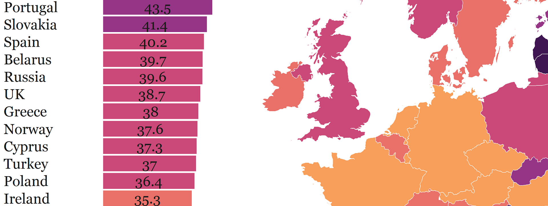
Last week UN marked the International Day of Women and Girls in Science. The purpose of this day is to celebrate female participation and achievements in science and remind us that many remain excluded from becoming scientists.
While EU aims to achieve full and equal access to science for women and girls, the richest European countries have the lowest proportion of female researchers. Wait a minute, this can’t be right 🤨. Believe it or not, it is! Last Friday, I mapped the proportion of female researchers in Europe using UNESCO data and the findings show that some of the most prominent members of the EU club like Netherlands, France and Germany are at the bottom of the list 😲.
The map went viral as soon as I posted it on Twitter and gave birth to numerous explanations.
Today is the International Day of Women and Girls in Science and I mapped the % of female researchers in Europe, according to UNESCO data. #women #science #womenintech #rstats #maps #dataviz #DataScience #WomenInScience pic.twitter.com/wr4dSKz8Q6
— Milos Popovic/Милош Поповић (@milos_agathon) February 11, 2022
In this tutorial, you’ll learn how to re-create this map with a focus on using inset graphs within a map in R.
Clean up arms data
Let’s import several libraries for data wrangling and visualization as well as Georgia font.
libs <- c("tidyverse", "sf", "grid", "gridExtra", "giscoR", "classInt")

installed_libs <- libs %in% rownames(installed.packages())
if (any(installed_libs == FALSE)) {
  install.packages(libs[!installed_libs])
}

invisible(lapply(libs, library, character.only = TRUE))
windowsFonts(georg = windowsFont('Georgia'))
To make the national map of Europe we first fetch a list of European countries, including Cyprus and Turkey as UNESCO regards them as the part of the European region.
We retrieve the list of European countries, including Cyprus and Turkey. Then we apply this list to our arms data to filter out non-European countries.
europeList <- function(urlfile, iso2) {
  urlfile <-'https://raw.githubusercontent.com/lukes/ISO-3166-Countries-with-Regional-Codes/master/all/all.csv'

  iso2 <- read.csv(urlfile) %>%
        filter(region=="Europe" | alpha.2 == "TR" | alpha.2 == "CY") %>%
        select("alpha.2") %>%
        rename(CNTR_ID = alpha.2)
  return(iso2)
}

countries <- europeList()
Then, we call giscoR to get the spatial object of Europe and Asia. We filter countries from the abovementioned list and correct for a mismatch in the codes for Greece and United Kingdom.
europeMap <- function(europe, eur) {

  europe <- giscoR::gisco_get_countries(
  year = "2016",
  epsg = "4326",
  resolution = "10",
  region = c("Europe", "Asia")
  ) %>%
  mutate(FID = recode(FID, 'UK'='GB')) %>%
  mutate(FID = recode(FID, 'EL'='GR'))

  eur <- europe %>% dplyr::filter(FID%in%countries$CNTR_ID)
  return(eur)
}

e <- europeMap()
We load the UNESCO data, which originates from the UNESCO Institute for Statistics database. Column womensci indicates the percentage of female researchers for every country.
# UNESCO data
UNESCOdata <- function(unesco_data_url, unesco_data) {
  unesco_data_url <- "https://raw.githubusercontent.com/milos-agathon/Inset-graph-within-map-in-R/main/data/women_in_science.csv"
  unesco_data <- read.csv(unesco_data_url) %>%
        rename(ISO3_CODE = ISO3) %>%
        select(ISO3_CODE, womensci)
  return(unesco_data)
}

df <- UNESCOdata()
Next, we’ll create a discrete scale for our measure because it’s much easier to distinguish among the colors when you have clear-cut categories and labels. We first compute the natural interval of our measure to get our cutpoints. I usually stick to 6-8 cutpoints to keep the colors discernible. Then we create labels based on the cutpoints and round them to get rid of the decimals. Finally, we carve out the categorical variable cat based on the cutpoints.
makeIntervals <- function(ni, labels, d, lvl) {
    d <- drop_na(df)
    # let's find a natural interval with jenks breaks
    ni <- classIntervals(d$womensci,
              n = 6,
              style = 'jenks')$brks
    # create categories
    labels <- c()
    for(i in 1:length(ni)){
      labels <- c(labels, paste0(round(ni[i], 0),
                             "–",
                             round(ni[i + 1], 0)))
    }
    labels <- labels[1:length(labels)-1]
    # finally, carve out the categorical variable
    # based on the breaks and labels above
    d$cat <- cut(d$womensci,
              breaks = ni,
              labels = labels,
              include.lowest = T)
    levels(d$cat) # let's check how many levels it has (6)
    # label NAs, too
    lvl <- levels(d$cat)
    lvl[length(lvl) + 1] <- "No data"
    d$cat <- factor(d$cat, levels = lvl)
    d$cat[is.na(d$cat)] <- "No data"
    levels(d$cat)
  return(d)
}

w <- makeIntervals()
Join data
Once we loaded the data it’s prime time to join the spatial object and the data frame. We apply left_join and transform the resulting object into a sf object. Note that we’ll stick to Lambert projection as in my previous tutorials. One optional thing is to shorten the official country names of Bosnia and Herzegovina, Russian Federation, North Macedonia and the United Kingdom to have more space for our inset graph.
crsLAEA <- "+proj=laea +lat_0=52 +lon_0=10 +x_0=4321000 +y_0=3210000 +datum=WGS84 +units=m +no_defs"

spatialJoin <- function(shp, data, sf_data) {
  shp <- e
  data <- w
  sf_data <- shp %>% left_join(data, by="ISO3_CODE") %>%
      st_as_sf() %>%
      st_transform(crs = crsLAEA) %>%
      drop_na() %>%
      select(NAME_ENGL, womensci, cat, geometry) %>%
      mutate(NAME_ENGL = replace(NAME_ENGL, str_detect(NAME_ENGL, "Bosnia and Herzegovina"), "BIH")) %>%
      mutate(NAME_ENGL = replace(NAME_ENGL, str_detect(NAME_ENGL, "Russian Federation"), "Russia")) %>%  #shorten names
      mutate(NAME_ENGL = replace(NAME_ENGL, str_detect(NAME_ENGL, "North Macedonia"), "N. Macedonia")) %>%
      mutate(NAME_ENGL = replace(NAME_ENGL, str_detect(NAME_ENGL, "United Kingdom"), "UK"))
  return(sf_data)
}

sfd <- spatialJoin()
Bounding box
We’re almost there! Before diving into plotting we’ll limit the view of our map via a bounding box. Let’s create a bounding box and reproject the coordinates to Lambert projection. First, we define the WGS84 projection as crsLONGLAT. Next, we run st_sfc to create a bounding box conveniently labeled bb with the latitude and longitude coordinates under the WGS84 definition. Finally, we transform bb into the Lambert projection using st_transform and make a bounding box b with reprojected coordinates by running st_bbox(laeabb).
crsLONGLAT <- "+proj=longlat +datum=WGS84 +no_defs"

bbox <- function(bb, laeabb, b) {

bb <- st_sfc(
  st_polygon(list(cbind(
    c(-10.6600, 33.00, 33.00, -10.6600, -10.6600),
    c(32.5000, 32.5000, 71.0500, 71.0500, 32.5000)
    ))),
  crs = crsLONGLAT)

  laeabb <- st_transform(bb, crs = crsLAEA)
  box <- st_bbox(laeabb)
  return(box)
}

b <- bbox()
Boxplot
Since we’d like a horizontal boxplot with values organized in ascending fashion, it’s essential to order the table by the percentage of female researchers before venturing forth.
orderDF <- function(a, aa) {
  a <- sfd %>% st_drop_geometry()
  a$womensci <- as.numeric(as.character(a$womensci))
  a <- subset(a, !is.na(womensci))
  attach(a)
  a <- a[order(NAME_ENGL, womensci),]
  return(a)
}

nd <- orderDF()
We can finally make the boxplot 🤓! The purpose of the boxplot in our graph is to rank the countries in descending fashion and display figures that are otherwise absent from our map. We also want to paint every box based on the category to which a corresponding country belongs. That’s easy-peasy: we just supply fill=cat argument to the ggplot function.
But making fonts visible on the background is tricky because our sequential color palette becomes darker as the percentage of female researchers increases. So, we ideally want the fonts to be darker on a lighter background and vice versa. That’s why we define two geom_text functions: one for values below 45 and another for values above 45. Also, we print those values in the middle of every bar using position_stack(vjust = .5) but you could also move the values to the far left (vjust = 0) or far right side of the plot (vjust = 1).
women_science_boxplot <- function(l) {
  dat <- nd
  l <- ggplot(dat, aes(x=reorder(NAME_ENGL, womensci),
    y=womensci, fill=cat)) +
    geom_bar(stat='identity') +
  geom_text(data=subset(dat, womensci<45),
    aes(label = womensci),
      position = position_stack(vjust = .5),
      hjust=0.5,
      size=2.75,
      color="grey10",
      family="georg") +
  geom_text(data=subset(dat, womensci>45),
    aes(label = womensci),
      position = position_stack(vjust = .5),
      hjust=0.5,
      size=2.75,
      color="white",
      family="georg") +
  scale_fill_manual( guide = guide_legend(),
    values = rev(c("#3f1651", "#612b70", "#963586", "#cb4978", "#e9716a", "#f89f5b")),
    name=""
    ) +
  theme(panel.background = element_blank(),
        panel.grid.minor = element_blank(),
        panel.grid.major=element_blank(),
              panel.border=element_blank(),
              text = element_text(family = "georg"),
              strip.text = element_text(size=12),
              axis.title.x = element_blank(),
              axis.title.y = element_blank(),
              axis.line   = element_line(colour=NA),
              axis.line.x = element_blank(),
              axis.line.y = element_blank(),
              axis.text.y = element_text(margin = unit(c(3, 0, 0, 0), "mm"),colour="grey10", size=8, hjust=0),
              axis.text.x = element_blank(),
              axis.ticks = element_blank(),
        legend.title = element_text(),
        plot.title = element_text(size=8, color="grey20", hjust=.5),
        legend.key=element_rect(fill=NA),
        legend.position="none", legend.direction="horizontal") +
        xlab("") +
        ylab("") +
        coord_flip()
  return(l)
}

boxp <- women_science_boxplot()
And here is the first piece of the puzzle! Now onto the map 🙌.

Map
In the chunk below, we use the standard template for map-making that you encountered in my previous tutorials with one exception. Because we want to inset the boxplot within the map we have to make some room for the newcomer. That means adding more blank space to the left using plot.margin = unit(c(t=-4, r=0, b=-4, l=10), “lines”)
women_science_map <- function(p) {
  shp_data <- sfd

  p <-
    ggplot() +
    geom_sf(data=shp_data,
      aes(fill=cat),
        color="white",
        size=0.15) +
    coord_sf(crs = crsLAEA,
      xlim = c(b["xmin"], b["xmax"]),
      ylim = c(b["ymin"], b["ymax"])) +
    labs(y="", subtitle="",
      x = "",
      title="Female researchers as a % of total researchers\n(2019 or latest year available)",
      caption="©2022 Milos Popovic https://milospopovic.net\nSource: UNESCO Institute for Statistics, June 2019.\nhttp://uis.unesco.org/sites/default/files/documents/fs55-women-in-science-2019-en.pdf")+
    scale_fill_manual(name= "",
      values = rev(c("grey80", "#3f1651", "#612b70", "#963586", "#cb4978", "#e9716a", "#f89f5b")),
      drop=F)+
    guides(fill=guide_legend(
      direction = "horizontal",
      keyheight = unit(1.15, units = "mm"),
      keywidth = unit(15, units = "mm"),
      title.position = 'top',
      title.hjust = 0.5,
      label.hjust = .5,
      nrow =1,
      byrow = T,
      reverse = F,
      label.position = "bottom"
        )
      ) +
    theme_minimal() +
    theme(text = element_text(family = "georg"),
      panel.background = element_blank(),
      legend.background = element_blank(),
      legend.position = c(.45, -.02),
      panel.border = element_blank(),
      panel.grid.minor = element_blank(),
      panel.grid.major = element_blank(),
      plot.title = element_text(size=14, color="#3f1651", hjust=0.5, vjust=1),
      plot.subtitle = element_text(size=11, color="#7a2b41", hjust=0.5, vjust=0, face="bold"),
      plot.caption = element_text(size=8, color="grey60", hjust=0, vjust=-6),
      axis.title.x = element_text(size=10, color="grey20", hjust=0.5, vjust=-6),
      legend.text = element_text(size=9, color="grey20"),
      legend.title = element_text(size=11, color="grey20"),
      strip.text = element_text(size=12),
      plot.margin = unit(c(t=-4, r=0, b=-4, l=10), "lines"),
      axis.title.y = element_blank(),
      axis.ticks = element_blank(),
      axis.text.x = element_blank(),
      axis.text.y = element_blank())
  return(p)
}

map <- women_science_map()
And, here is the output!

Inset boxplot within map
In the final step, we inset the boxplot within our map. First, we create a viewport, which is basically a rectangular region where we’ll plug in our boxplot and map. The viewport has the height, width and the center defined via x and y coordinates. Creating a viewport requires the simultaneous manipulation of these features. So, defining an appropriate viewport is a matter of error and trial. Once we identified a solid viewport let’s clear the current graphic device. Finally, we print the map followed by the boxplot and select vp object for our viewport.
InsetGraphMap <- function(m, bp, vp) {
  m <- map
  bp <- boxp
  vp <- viewport(width=0.3, height=0.85, x=0.15, y=0.5)
  png("female_researchers.png", height=4200, width=4000, res=600)
  grid.newpage()
  print(m)
  print(bp+labs(title=""), vp=vp)
  dev.off()
  return()
}

InsetGraphMap()

In this tutorial, I showed you a few data tricks that would hopefully help you maker your dataviz projects more appealing and useful.
Feel free to check the full code here, clone the repo and reproduce, reuse and modify the code as you see fit.
I’d be happy to hear your view on how this map could be improved or extended to other geographic realms. To do so, please follow me on Twitter, Instagram or Facebook.