
Animated map and lineplot with R
November 21, 2021 | Milos Popovic
Before the pandemic became the key horseman of the Apocalypse, ISIS dominated the headlines with its notorious beheadings of civilians and prisoners of war. In my past life, I explored why militant groups like ISIS use such gruesome acts of violence against civilians. You would be surprised to learn that militant groups are not as smart as usually portrayed in the media. Their use of indiscriminate violence against civilians often creates a backlash against them. With beheadings and spectacular terrorist attacks in Belgium and France, ISIS poked too many powerful actors with a stick, leading to a global coalition against the group and, ultimately, its demise.
In this post we’ll explore the global spread of violence against civilians since 2001. Most importantly, I’ll show you how to map violence and its key perpetrators. This tutorial will demonstrate how to effortlessly combine these two graphs into a single animated plot 😎. We’ll use one of the most popular datasets on political violence in conflict studies, the UCDP Georeferenced Event Dataset. This dataset includes information on individual events of lethal violence in civil conflicts and is geo-coded down to the level of individual villages. Cool stuff 😮!
Let’s start off by loading the necessary packages for data processing.
if(!require("tidyverse")) install.packages("tidyverse")
if(!require("plyr")) install.packages("plyr")
if(!require("data.table")) install.packages("data.table")
if(!require("tweenr")) install.packages("tweenr")
if(!require("animation")) install.packages("animation")
if(!require("rgeos")) install.packages("rgeos")
if(!require("rgdal")) install.packages("rgdal")
if(!require("maptools")) install.packages("maptools")
if(!require("scales")) install.packages("scales")
if(!require("gridExtra")) install.packages("gridExtra")
if(!require("rmapshaper")) install.packages("rmapshaper")
if(!require("sp")) install.packages("sp")
if(!require("grid")) install.packages("grid")
if(!require("ggrepel")) install.packages("ggrepel")
if(!require("extrafont")) install.packages("extrafont")

library(tidyverse, quietly=T)
library(plyr, quietly=T)
library(data.table, quietly=T)
library(tweenr, quietly=T)
library(animation, quietly=T)
library(rgeos, quietly=T)
library(rgdal, quietly=T)
library(maptools, quietly=T)
library(scales, quietly=T)
library(gridExtra, quietly=T)
library(rmapshaper, quietly=T)
library(sp, quietly=T)
library(grid, quietly=T)
library(ggrepel, quietly=T)
library(extrafont, quietly=T)

set.seed(20211114)
We kick off this tutorial by downloading, unzipping, loading, and inspecting the UCDP data.
u <- "https://ucdp.uu.se/downloads/ged/ged211-csv.zip"
download.file(u, basename(u), mode="wb")
unzip("ged211-csv.zip")
a <- read.csv("ged211.csv", header=T)
names(a)

[1] "id"                "relid"             "year"
[4] "active_year"       "code_status"       "type_of_violence"
[7] "conflict_dset_id"  "conflict_new_id"   "conflict_name"
[10] "dyad_dset_id"      "dyad_new_id"       "dyad_name"
[13] "side_a_dset_id"    "side_a_new_id"     "side_a"
[16] "side_b_dset_id"    "side_b_new_id"     "side_b"
[19] "number_of_sources" "source_article"    "source_office"
[22] "source_date"       "source_headline"   "source_original"
[25] "where_prec"        "where_coordinates" "where_description"
[28] "adm_1"             "adm_2"             "latitude"
[31] "longitude"         "geom_wkt"          "priogrid_gid"
[34] "country"           "country_id"        "region"
[37] "event_clarity"     "date_prec"         "date_start"
[40] "date_end"          "deaths_a"          "deaths_b"
[43] "deaths_civilians"  "deaths_unknown"    "best"
[46] "high"              "low"               "gwnoa"
[49] "gwnob"
Every UCDP dataset is organized in dyadic fashion: there is side_a, which is usually a government of country and side_b, which is a non-state armed group fighting the government. The government of country is always side_a unless a conflict is between two non-state armed groups. The column type_of_violence indicates three types: 1) conflicts in which governments and militant groups kill each other; 2) conflicts that feature only militant groups fighting each other; and 3) instances of violence against civilians. We are interested in 3). This dataset is fine-grained and includes geo coordinates of violent events (longitude and latitude) as well as the place of incident (where_coordinates) and year of incident (year). Finally, civilian death count is also available under deaths_civilians.
As we are interested only in civilian deaths at the hands of militant groups, we filter only incidents where militant groups were side_a in the conflict and incidents that involved one-sided violence against civilians. Also, we select only the necessary columns for our dataviz exercise.
b <- subset(a, year>=2001)
c <- subset(b, !grepl("Government", b[[15]]), drop = TRUE)
d <- subset(c, type_of_violence == 3) %>%
     select(year, side_a, deaths_civilians, where_coordinates, latitude, longitude)
Now we can download the world shapefile using Eurostat data. We filter out Antarctica to enlarge our final plot. So long, Antarctica 😉.
url <- "https://gisco-services.ec.europa.eu/distribution/v2/countries/download/ref-countries-2013-01m.shp.zip"
download.file(url, basename(url), mode="wb")
unzip("ref-countries-2013-01m.shp.zip")
unzip("CNTR_RG_01M_2013_4326.shp.zip")

world <- readOGR(getwd(),
        "CNTR_RG_01M_2013_4326",
         verbose = TRUE,
         stringsAsFactors = FALSE) %>%
        subset(NAME_ENGL!="Antarctica")
Importantly, we’ll be using the Robinson projection for our map. So, let’s declare the new projection and transform our shapefile.
prj <- "+proj=robin +lon_0=0 +x_0=0 +y_0=0 +ellps=WGS84 +datum=WGS84 +units=m +no_defs"
wrld <- spTransform(world, CRS(prj))
w <- fortify(wrld)
Next, we’ll aggregate the main table by place and year of incident and retrieve the coordinates as well as the sum of civilian deaths.
b1 <- ddply(d, c("where_coordinates", "year"), summarise,
	lat=max(latitude),
	long=max(longitude),
	attack=sum(deaths_civilians))
Remember that we transformed our map to Robinson projection. We need to make sure that our points use the same projection! After re-projecting the coordinates of violent events, we merge them with other columns into a new table.
bb <- project(cbind(b1$long, b1$lat), prj)
bb1 <- data.frame(place=b1$where_coordinates, year=b1$year, long=bb[,1], lat=bb[,2], attack=b1$attack)
Our current table includes info on death count for specic years. But, we need a cummulative sum of civilian deaths to make a timelapse map of civilian deaths. In the following chunk, we group the table by place and year of incident and calculate the cummulative sum of deaths.
cc <- ddply(bb1, c("place", "year"), summarise,
  long=max(long),
  lat=max(lat),
  attacks=sum(attack)) %>%
as_tibble() %>%
group_by(place) %>%
dplyr::mutate(attacks = cumsum(attacks))
Now keep in mind that some places have no civilian deaths for certain years so we need to backfill these cases. We first create a range of all years based on our main table, which is from 2001 until 2020.
year_range <- seq(min(cc$year), max(cc$year), by=1)
data_expand <- expand.grid(year_range, cc$place)
colnames(data_expand) <- c("year", "place")
Next, we merge the year range with our data to populate the table with missing years. We also populate the coordinates for every place and newly added year. Finally, we take the last available count of civilian deaths.
dd <- merge(cc, data_expand, by=c("place", "year"), all.y = T)%>%
ddply(c("place", "year"),
	summarise,
	year=max(year),
	long=max(long),
	lat=max(lat),
	value=max(attacks))
Our map data is nearly ready for plotting! One final step is to fill the missing values for every place and year.
df <- dd %>%
group_by(place) %>%
complete(year = seq(min(year), max(year), by=1)) %>%
fill(value)%>%
fill(long)%>%
fill(lat)%>%
ungroup()
In the final step, we split our table by year and apply tween_states to create smooth transitions between states of our table. These states are years and every year should have the same number of rows for this function to work. We achived this in the previous steps where we added the missing year ranges and backfilled the missing rows. Other important components of tween_states are tweenlength (the length of our transition from one year to another); statelength (the length of the break at each year); ease (the form of transitions where display_ease() would return a list of all available easing functions); and nframes (number of frames where the actual number of frames varies depending on tweenlength and statelength).
x <- split(df, df$year)

tm <- tween_states(x,
	tweenlength= 2,
	statelength=3,
	ease=rep('cubic-in-out', 50),
	nframes=59) %>%
  data.table()
We round years so that we don’t display decimal values for every transition. Also, we declare no death count as missing to avoid displaying 0s on our map. Next, we define the variables for minimum and maximum death count to be used in limiting the legend display. We wrap up the map-making part by creating a variable times, which will set 0.15 seconds as the length of every frame, except for the last frame, which we set to last for 5 seconds so that our gif is frozen at the end. You could play a bit with the length of your transition and make your animation faster or slower.
tm$year <- round(tm$year, 0)
tm$value[tm$value==0] <- NA
vmin <- min(tm$value, na.rm=T)
vmax <- max(tm$value, na.rm=T)
times <- c(rep(0.1, max(tm$.frame)-1), 5)
So far, we produced an animated bubble plot of civilian deaths. But sometimes it’s also worth investigating aggregated trends, e.g. death count by militant group over year. If we highlight the most violent (or most notorious) actors we offer more fine-grained information to our audience. So let’s add an animated plot to the map and synchronize everything. We first aggregate our main, filtered table by militant group and sum civilian deaths using dplyr::summarise(attack = sum(deaths_civilians)). Then we calculate cummulative deaths for every group and year using the next line in our code.
e <- d %>% select(side_a, year, deaths_civilians)  %>%
group_by(side_a, year) %>%
dplyr::summarise(attack = sum(deaths_civilians)) %>%
dplyr::mutate(attacks = cumsum(attack)) %>%
select(side_a, year, attacks)
Just to show you that we successfully created cummulative deaths per group and year, here is an example of the Islamic State (IS).
e %>% filter(side_a == 'IS')
# A tibble: 17 x 3
# Groups:   side_a [1]
   side_a  year attacks
   <chr>  <int>   <int>
 1 IS      2004      88
 2 IS      2005     806
 3 IS      2006    1197
 4 IS      2007    2732
 5 IS      2008    3243
 6 IS      2009    3859
 7 IS      2010    4377
 8 IS      2011    4681
 9 IS      2012    5446
10 IS      2013    6919
11 IS      2014   10494
12 IS      2015   16644
13 IS      2016   20835
14 IS      2017   23326
15 IS      2018   25092
16 IS      2019   26565
17 IS      2020   29014
As with our map data, we have groups that were inactive in certain years. We first plug in the missing years for every group using a range of all whole numbers between 2001 and 2020.
data_expand <- expand.grid(year_range, e$side_a)
colnames(data_expand) <- c("year", "side_a")
f <- merge(e, data_expand, by=c("side_a", "year"), all.y = T) %>%
ddply(c("side_a", "year"),
  summarise,
  year=max(year),
  value=max(attacks))
By filtering only IS rows we notice that the group was inactive prior to 2004 and that civilian deaths are missing.
f %>% filter(side_a == 'IS')
   side_a year value
1      IS 2001    NA
2      IS 2002    NA
3      IS 2003    NA
4      IS 2004    88
5      IS 2005   806
6      IS 2006  1197
7      IS 2007  2732
8      IS 2008  3243
9      IS 2009  3859
10     IS 2010  4377
11     IS 2011  4681
12     IS 2012  5446
13     IS 2013  6919
14     IS 2014 10494
15     IS 2015 16644
16     IS 2016 20835
17     IS 2017 23326
18     IS 2018 25092
19     IS 2019 26565
20     IS 2020 29014
We fill those instances with 0. But there are also instances where a group becomes inactive after years of killing civilians. We fill those missing year with last available info on deaths using the chunk below.
ff <- f %>%
group_by(side_a) %>%
complete(year = seq(min(year), max(year), by=1)) %>%
fill(value)%>%
ungroup()
ff$value[is.na(ff$value)] <- 0
Let’s choose a few groups to display in our lineplot. We may want to inspect the most violent groups by the total civilian deaths that they caused.
ff %>%
  group_by(side_a) %>%
  dplyr::summarise(sum_attacks = sum(value)) %>%
  arrange(desc(sum_attacks)) %>%
  print(n=25)

  # A tibble: 186 x 2
   side_a                                     sum_attacks
   <chr>                                            <dbl>
 1 IS                                              185318
 2 LRA                                              90294
 3 Jama'atu Ahlis Sunna Lidda'awati wal-Jihad       62949
 4 al-Qaida                                         57625
 5 Janjaweed                                        49533
 6 AUC                                              42633
 7 UPC                                              35355
 8 FNI                                              28684
 9 Kashmir insurgents                               28272
10 Patani insurgents                                24849
11 FRPI, RCD-K-ML                                   22800
12 TTP                                              22556
13 UNITA                                            21454
14 CPN-M                                            19576
15 CPI-Maoist                                       19475
16 FARC                                             18422
17 Taleban                                          18007
18 FDLR                                             16799
19 anti-Balaka                                      15729
20 RCD                                              11877
21 GIA                                              10993
22 LURD                                             10204
23 LeJ                                               9416
24 Al-Shabaab                                        9022
25 Palipehutu-FNL                                    8150
# ... with 161 more rows
There is a plethora of groups that don’t ring a bell. So, let’s stick with a few extremists that you probably encountered in the media such as IS, al-Qaida, Lord’s Resistance Army (LRA), Al-Shabaab and the Taleban.
groups <- c("Al-Shabaab", "IS", "LRA", "Taleban", "al-Qaida")
h <- subset(ff, side_a%in%groups)
Now we enumerate years to be used for animation and declare a linear function for our transition stages.
k <- h %>% dplyr::select(year, side_a, value) %>%
mutate(num=as.numeric(year-min(year)+1), ease="linear")
In the next stage, we define our animation elements, including the number of frames. Note that we set nframes to the number of frames in our map table because we want the two to be synchronized.
s <- tween_elements(k, time = "num",
  group="side_a",
  ease="ease",
  nframes = as.numeric(max(tm$.frame)))
We then determine when lines and points will appear based on the time variable.
td <- tween_appear(s,
  time='num',
  nframes = as.numeric(max(tm$.frame)))
Also, we extend every time frame by 1 so that it doesn’t abruptly disappear after running its course.
td$.frame <- td$.frame + 1Finally, we log transform civilian deaths to reduce skewness, since we are dealing with large outliers like IS.
td$value_log <- log(td$value)
td$value_log[td$value_log=="-Inf"] <- 0
# capitalize group name
td$.group <- toupper(td$.group)
Alright, we are ready to put everything together 🤩! Let’s dissect that huge chunk below. First we create our animated map followed by the lineplot and finally we wrap everything into a function and save as gif using package animation.
In the map-making stage, we first need to declare our point coordinates as the main aesthetic of each plot. Next, we draw our world map using geom_map. We paint country polygons in lightgray and national borders in white. The geom_point function will display the bubble size according to value. We’ll specify the alpha value, breaks, range and limits of our circles using scale_size. If you prefer larger bubbles, feel free to toy with range argument.
To show a year for every frame we’ll create a subtitle with a string that includes “Year of” (not necessary), followed by a blank space and a year string filtered for current frame. We, therefore, write subtitle=paste0(“Year of”, ” ” ,as.character(as.factor(tail(tm %>% filter(.frame==i),1)$year))).
Moving to the lineplot in our wrapper, we create lines using the rows that have appeared in a frame (non-negative age value). For points, we filter only the maximum year in frame so that each point always comes at the end of a line. We also set x- and y-axis limits as well as the colorblind-friendly palette with the help of Adobe Color Wheel.
saveGIF({
for(i in 1:max(tm$.frame)) {
  map <-
    tm %>% filter(.frame==i) %>%
    ggplot(aes(x=long, y=lat)) +
geom_map(data = w, map = w,
             aes(map_id = id),
             color = "white", size = 0.01, fill = "grey80") +
geom_point(aes(size=value),
	fill="#AA4499",
	alpha = .45,
	col="#AA4499",
	stroke=.25) +
    scale_size(breaks=c(1, 10, 100, 1000, 2753),
    	labels=c(1, 10, 100, 1000, 3000),
    	range = c(2, 10),
    	limits = c(vmin,vmax),
    	name="Attacks:")+
guides(size = guide_legend(override.aes = list(alpha = 1),
            direction = "vertical",
            title.position = 'top',
            title.hjust = 0.5,
            label.hjust = 0,
            byrow = T,
            reverse = F,
            label.position = "right"
          )
	) +
    coord_equal() +
  labs(y="", x="",
         title="Civilian Killings by Militant Organizations (2001-2020)",
         subtitle=paste0("Year of", " " ,as.character(as.factor(tail(tm %>% filter(.frame==i),1)$year))),
         caption="©2021 Milos Popovic https://milospopovic.net\nData: UCDP, https://ucdp.uu.se/")+
theme_minimal() +
  theme(text=element_text(family="georg"),
        legend.position = c(.1, .4),
  	    plot.margin=unit(c(1,-4.5,-4.5,-4.5), "cm"),
        legend.text = element_text(size=12, color="grey20"),
        legend.direction = "horizontal",
        legend.title = element_text(size=14, color="grey20", face="bold"),
        panel.border = element_blank(),
        panel.grid.major = element_line(color = "white", size = 0.1),
        panel.grid.minor = element_blank(),
	      plot.background = element_rect(fill = "white", color = NA),
        panel.background = element_rect(fill = "white", color = NA),
        legend.background = element_rect(fill = "white", color = NA),
        plot.title = element_text(size=20, color="grey20", hjust=0, vjust=0),
	      plot.caption = element_text(size=12, color="grey20", hjust=.85, vjust=10),
	      plot.subtitle = element_text(size=32, color="#AA4499", face="bold", hjust=0),
        strip.text = element_text(size=12),
        axis.title.x = element_blank(),
        axis.title.y = element_blank(),
        axis.ticks = element_blank(),
        axis.text.x = element_blank(),
        axis.text.y = element_blank())

p <- td %>% filter(.frame==i, .age> -3.5) %>%
ggplot()+
  geom_line(aes(x=year, y=value_log, group=.group, color=.group), size=1.5)+
  geom_point(data=. %>% filter(year==max(year)), mapping=aes(x=year, y=value_log, color=.group, fill=.group), size=3)+
  geom_point(data=. %>% filter(year==max(year)), mapping=aes(x=year, y=value_log, color=.group, fill=.group), size=2)+
  geom_text_repel(data=. %>% filter(year==max(year)), mapping=aes(x=year, y=value_log,label=.group, color=.group), hjust=.75, fontface="bold")+
  theme_minimal()+
  scale_color_manual(values=c("#D65D00", "#481FBF", "grey10", "#ED0C6E", "#25E30B")
  	)+
    scale_x_continuous(limits = c(2001,2021), breaks=c(2002:2020, 2))  +
    scale_y_continuous(limits=c(2.302585, 10.40895),
    	breaks=c(2.302585, 4.60517, 6.907755, 9.21034, 10.30895),
    	labels=c(10, 100, 1000, 10000, 30000
    		   		))+
    theme(text=element_text(family="georg"),
    	    plot.margin=unit(c(2,0,0,1), "cm"),
          legend.position="none",
          axis.text.y = element_text(size=14),
          axis.text.x = element_text(size=14),
		      axis.title.y = element_text(face="bold",size=16,angle=0, vjust=.5),
          axis.title.x = element_text(face="bold",size=16,angle=0, vjust=-.15, hjust=.5),
          plot.title=element_text(size=18, vjust=-5),
          plot.caption=element_text(hjust=0),
          panel.grid.major.x = element_line(color="grey80", linetype="dotted", size=.5),
          panel.grid.minor.x = element_line(color="grey80", linetype="dotted", size=.5),
          panel.grid.major.y = element_line(color="grey80", linetype="dotted", size=.5),
          panel.grid.minor.y = element_line(color="grey80", linetype="dotted", size=.5))+
    labs(x="Year",
    	y="Killings",
         title="Civilian Killings by Deadliest Groups\n(logarithmic scale)",
         subtitle="",
         caption="")

print(paste(i,"out of", max(td$.frame)))
ani.pause()
gg <- grid.arrange(map, p, ncol = 1, nrow = 2)
print(gg)
;}

},movie.name="violence_vs_civilians.gif",
interval = times,
ani.width = 1024,
ani.height = 768,
other.opts = " -framerate 10  -i image%03d.png -s:v 1024x768 -c:v libx264 -profile:v high -crf 20  -pix_fmt yuv420p")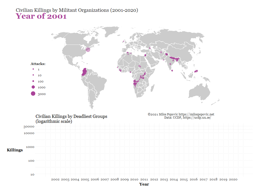
Thank you very much for stopping by and taking the time to read my tutorial on creating an animated map and a lineplot in one single graph. I really hope that this post will inspire you to create awesome animated plots.
Feel free to check the full code here, clone the repo and reproduce, reuse, and modify the code as you see fit. I trust that you’ll be able to produce lots of cool maps with a slight modification of this code.
I’d be happy to hear your view on how this map could be improved or extended to other realms. So, let’s catch up on Twitter, Instagram or Facebook!