
Create animated bubble map of Confucius Institutes in R like a pro
May 31, 2021 | Milos Popovic
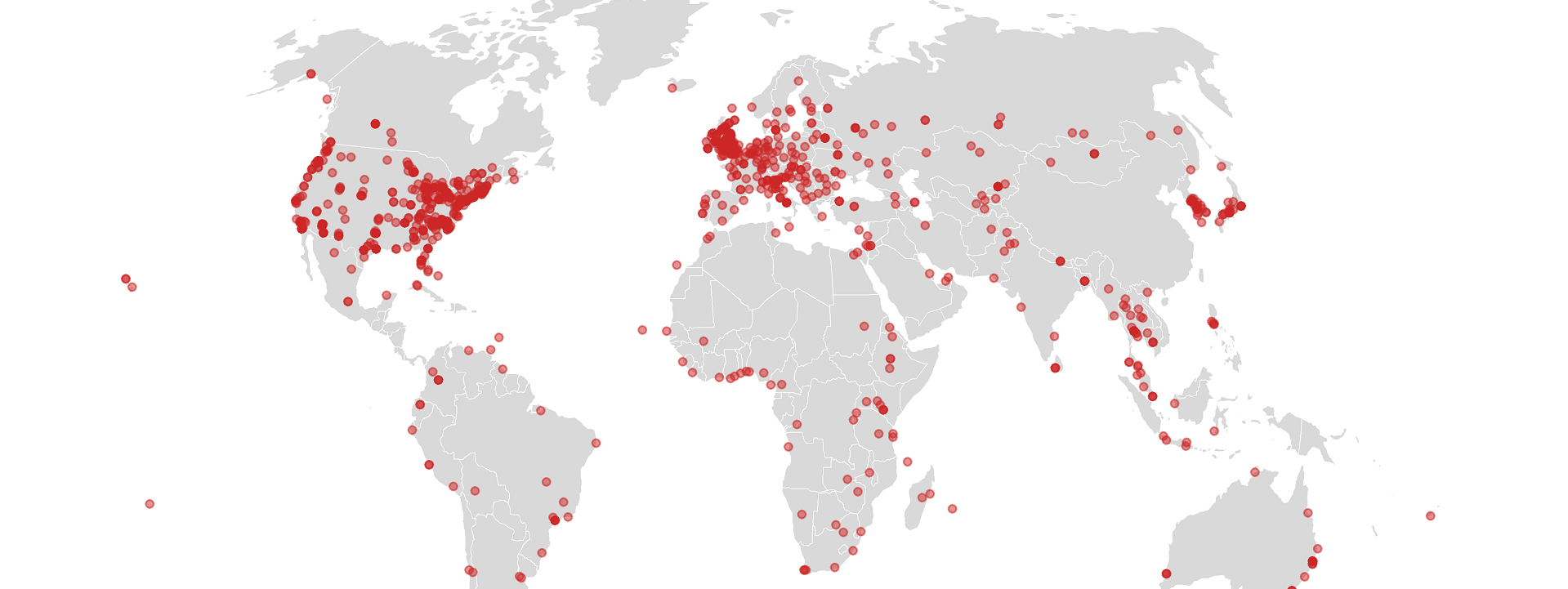
Did you know that China has invested at least US$500 million since 2004 to establish 530 Confucius Institutes at partnering universities and colleges and 631 Confucius Classrooms in primary and secondary schools in 127 countries 🤯? According to my data, the countries with the most Confucius Institutes and Confucius Classrooms were the US (470), UK (141), Australia (49), Canada (33), Italy (31) and South Korea (26) for the period 2004-2015. Officially, these institutes were established to promote Chinese language, culture, and history, and enable China to “disseminate modern Chinese values and show the charm of Chinese culture to the world”. Li Changchun, the propaganda head of the Chinese Communist Party (CCP), put it more bluntly, stating that the institutes were “an important part of China’s overseas propaganda set-up.” Beijing clearly hoped that the institutes would serve as a beachhead to spread the country’s political and cultural influence around the world.
But the insane proliferation of Confucius Institutes generated a backlash in Western societies. As of January 2020, at least 29 of these institutes in the United States have closed over charges of academic censorship while a number of other Western universities, including McMaster University in Toronto, the Université de Sherbrooke in Quebec, the Université de Lyon, Pennsylvania State University and Stockholm University have closed their Confucius Institutes, citing issues ranging from human rights to security concerns. In my co-authored study we find that the institutes generated a backlash because China has disproportionately placed them at prestigious universities in democratic countries that do not share China’s political or cultural values. Big mistake if you ask Joseph Nye and other scholars of cultural diplomacy!
In this post, I’ll walk you through the process of mapping Confucius institutes over time so that you can get a better sense of their expansion across the globe. Let’s start by loading essential libraries for data processing (tidyverse, plyr, and dplyr), geospatial analysis (rgdal, rmapshaper and sp) and plotting (ggplot2). Most importantly, we’ll use libraries tweenr and animation to animate our map. Let’s begin!
library(tidyverse, quietly=T)
library(plyr, quietly=T)
library(dplyr, quietly=T)
library(rgdal, quietly=T)
library(rmapshaper, quietly=T)
library(sp, quietly=T)
library(ggplot2, quietly=T)
library(tweenr, quietly=T)
library(animation, quietly=T)
We’ll draw on an original cross-national dataset on Confucius Institutes/Confucius Classrooms for the period 2004–2015, which I collected back in 2017. My key data source was the website of Hanban, a government entity affiliated with the Chinese Ministry of Education in charge of managing Confucius Institutes abroad. I manually collected the data on the name of host university, the year of establishment as well as the geographic latitude and longitude of each institute from Google Maps. We are talking about more than 1,100 rows. Let’s download the dataset from my dropbox repo and import it into R.
# download and unzip replication data
url <- "https://www.dropbox.com/s/e7zljq0r5vr2k3s/data_confucius_FEB18.csv?dl=1"
download.file(url, destfile="data_confucius_FEB18.csv", method="auto")
#load the dataset
a <- read.csv("data_confucius_FEB18.csv")
Here’s the snapshot of the dataset itself. You’ll notice that the main unit is the city and year of establishment of institutes. There is a plenty of other useful info. For example, you’ll notice the host country, geographic coordinates of the host university as well as a bunch of demographic and socio-economic indicators on the national level that we used in our analysis. For our mapping purpose, we’ll use city (place of establishment), start (year of establishment), and geographic coordinates (lat and long).
head(a)
         country iso3 ccode start        city     lat     long ccity citypop
1        Denmark  DNK   DEN  2009     Aalborg 57.0500   9.9167     1  196096
2 United Kingdom  GBR   UKG  2008    Aberdeen 57.1526  -2.1100     2  228990
3 United Kingdom  GBR   UKG  2009    Aberdeen 57.1526  -2.1100     2  228990
4 United Kingdom  GBR   UKG  2013    Aberdeen 57.1526  -2.1100     2  228990
5  United States  USA   USA  2015    Aberdeen 39.5103 -76.1692   690   16371
6 United Kingdom  GBR   UKG  2012 Aberystwyth 52.4140  -4.0810     3   13040
  end                   sponsor                       host instit suspicious
1  NA Beijing Normal University         Aalborg University      1          0
2  NA                              Moray & Angus Academies      0          0
3  NA Tianjin Haihe High School          Hazlehead Academy      0          0
4  NA          Wuhan University The University of Aberdeen      1          0
5  NA                            Northern State University      1          0
6  NA  Beijing Union University            Penglais School      0          0
  transl sum minor size      export   import  gdphost polity dem distanc contig
1      0   5     0   NA  1926708.94  5326848 57895.50     10   1 4507.96      0
2     NA 141     0   NA  9065641.31 58220696 45167.74     10   1 4848.96      0
3      0 141     0   NA  8053612.75 52101299 37076.65     10   1 4848.96      0
4      0 141     0   NA 18119204.81 57587865 41776.76     10   1 4848.96      0
5     NA 470     0   NA                   NA       NA     NA  NA 5390.75      0
6     NA 141     0   NA 15688190.98 56267400 41050.77     10   1 5137.91      0
  africa asia americas europe oceania
1      0    0        0      1       0
2      0    0        0      1       0
3      0    0        0      1       0
4      0    0        0      1       0
5      0    0        1      0       0
6      0    0        0      1       0
We need a sum of institutes for every city and year so we’ll use ddply to aggregate our key columns. For lat and long we use the average value although we could have computed minimum or maximum coordinates since these values don’t change for the same town. We return the sum of all institutes per city and year using the unique length of city.
#aggregate the dataset, return sum of institutes ('ci')
b1 <- ddply(a, c("city", "start"), summarise,
	lat=mean(lat),
	long=mean(long),
	ci=length(city))
Before venturing forth, we’ll transform our coordinates to the Robinson projection, which is a compromise projection used for world maps. I used Mercator projection in my early days but I learned that the maps produced with this projection become distorted as one moves away from the equator. We first assign the projection and datum to object prj and then apply reproject our coordinates and store them in the bb matrix object. Finally, we merge the reprojected coordinates together with columns from our data frame b1 and create a new data frame bb1. We’ll also relabel city to place and start to year.
# transform data coordinates to Robinson
prj <- "+proj=robin +lon_0=0 +x_0=0 +y_0=0 +ellps=WGS84 +datum=WGS84 +units=m +no_defs"
bb <- project(cbind(b1$long, b1$lat), prj)
bb1 <- data.frame(place=b1$city, year=b1$start, long=bb[,1], lat=bb[,2], ci=b1$ci)
In order to make bubbles grow as the number of institutes increases in a specific location, we have to calculate the sum of institutes from the moment of the establishment of the first institute until a certain position in time. This is called cumulative sum and, in the following chunk, we use cumsum to compute value and store it together with our previous columns into a new data frame c. We’ll also remove rows with missing years.
# get cumulative institute sum
c <- bb1 %>%
group_by(place) %>%
dplyr::mutate(value = cumsum(ci)) %>%
na.omit()
While we have cumulative sum for every location, we won’t be able proceed further until we populate the dataset with the 2004-2015 year range. We create a sequence of numerical values from 2004 until 2015 (year_range). Then we use expand.grid to multiply every location with year range and return data_expand data frame. We’ll have to rename its columns to year and place in order to be able to merge this expanded dataframe with our data frame with coordinates and cumsum value. After merging the original and expanded dataset into d we get rid of the duplicates by aggregating the dataset by year and place and keeping the maximum values for every unique row.
# extend the data from min year to max year
year_range <- seq(min(c$year), max(c$year), by=1)
data_expand <- expand.grid(year_range, c$place)
colnames(data_expand) <- c("year", "place")
d <- merge(c, data_expand, by=c("place", "year"), all.y = T) %>%
ddply(c("place", "year"),
	summarise,
	year=max(year),
	long=max(long),
	lat=max(lat),
	value=max(value))
The resulting dataset has missing values for the cumsum and coordinates even after a place had at least one institute opened. For example, when we inspect the last six observations in our newly created data frame we notice that Zanzibar City has one institute opened by 2010 but the subsequent coordinates and values are missing as if this location suddenly lost all of its institutes 🤨. If we left things as they are, then a circle for Zanzibar would have popped up for the 2010 frame only to disappeared thereafter.
tail(d)
        place year    long       lat value
8887 Zanzibar 2010 3707162 -655968.2     1
8888 Zanzibar 2011      NA        NA    NA
8889 Zanzibar 2012      NA        NA    NA
8890 Zanzibar 2013      NA        NA    NA
8891 Zanzibar 2014      NA        NA    NA
8892 Zanzibar 2015      NA        NA    NA
To avoid this confusion, we want to update every subsequent row with fresh info on the coordinates and values from the previous row. We do so by using tidyverse to update the missing values for value, long and lat with information from a previous row for every unique location within our year range.
# populate the extended data with info on coordinates and institute count
df <- d %>%
group_by(place) %>%
complete(year = seq(min(year), max(year), by=1)) %>%
fill(value)%>%
fill(long)%>%
fill(lat)%>%
ungroup()
As you’ll notice below, the coordinates and cumsum value for Zanzibar have been updated for subsequent years, allowing us to proceed with animation. Hurray 🥳!!!
tail(df)
        place year    long       lat value
8887 Zanzibar 2010 3707162 -655968.2     1
8888 Zanzibar 2011 3707162 -655968.2     1
8889 Zanzibar 2012 3707162 -655968.2     1
8890 Zanzibar 2013 3707162 -655968.2     1
8891 Zanzibar 2014 3707162 -655968.2     1
8892 Zanzibar 2015 3707162 -655968.2     1
We’ll pre-process our data using tweenr and to be able to do so, we first need to create a list of years available in our data frame. Then we’ll use tween_states to create a new data frame that will be an updated version of df with info on the number of frames and transition stage. There is a few parameters that you can set using this function such as the length of the transitions between each state or tweenlength; tween_states showing the length of the pause at each state; ease, which is the easing functions to use for the transitions; and nframes indicating The number of frames to generate. I like to use the cubic-in-out option for a smooth animation and here you can check how it operates in practice. Also, I tend to assign five or more frames per year so we’ll set 50 for the number of frames.
# split data into frames
x <- split(df, df$year)
# prepare for animation
tm <- tween_states(x,
	tweenlength= 2,
	statelength=3,
	ease=rep('cubic-in-out', 50),
	nframes=50)
Below you see the glimpse of our pre-processed tm data frame. Notice the last three columns that tween_states generated in the previous chunk. These denote the phase of the animation, image id and frame, respectively.
head(tm)
        place year long lat value .phase .id .frame
1     Aalborg 2004   NA  NA    NA static   1      1
2    Aberdeen 2004   NA  NA    NA static   1      1
3 Aberystwyth 2004   NA  NA    NA static   1      1
4     Abidjan 2004   NA  NA    NA static   1      1
5   Abu Dhabi 2004   NA  NA    NA static   1      1
6       Accra 2004   NA  NA    NA static   1      1
One more thing: our column year was also tranformed into a decimal format to denote specific frame. Since we want to print specific years on our map we’ll remove the decimal format.
tm$year <- round(tm$year, 0) # get rounded years for gifFinally, let’s download the world shapefile from Eurostat, get rid of Antarctica to have a larger map and read the shapefile into R.
#download and unrar free world shapefile from Eurostat
url <- "https://gisco-services.ec.europa.eu/distribution/v2/countries/download/ref-countries-2013-01m.shp.zip" # location on the Eurostat website
download.file(url, basename(url), mode="wb") #download Eurostat country shapefiles
unzip("ref-countries-2013-01m.shp.zip") # unzip the boundary data
unzip("CNTR_RG_01M_2013_4326.shp.zip")

#load shapefile
world <- readOGR(getwd(),
        "CNTR_RG_01M_2013_4326",
         verbose = TRUE,
         stringsAsFactors = FALSE) %>%
        subset(NAME_ENGL!="Antarctica") # get rid of Antarctica
Remember that we re-projected our point coordinates to the Robinson projection at the outset. Now we need to reproject our world shapefile, too. We do so by applying spTransform to our object and assigning “+proj=robin”. Lastly, we turn the spatial object into a data frame using fortify.
# transform shp to Robinson projection
wrld <- spTransform(world, CRS("+proj=robin"))
w <- fortify(wrld)
OK, we are ready to plot! We want our legend to be fixed and denote a range of values from the minimum to the maximum number of institutes. That’s why we’ll store this info in objects vmin and vmax and plug them into ggplot2 in a minute. Also, I’ll assign 0.1 second length to every frame and “freeze” the last one by setting its length to 5 secs.
# set limits to make legend fixed
vmin <- min(tm$value, na.rm=T)
vmax <- max(tm$value, na.rm=T)
#0.1 sec for all but the last frame, which is set to 5 secs
times <- c(rep(0.1, max(tm$.frame)-1), 5)
The following chunk draws on useful tips from Len Kiefer’s fantastic blog. I’m thankful to Len for helping me learn more about data animation! To create our animated map, we’ll create a map for every frame and put everything together into a gif using package animation. In a nutshell, we create a map for every frame in our dataset in ggplot2 and wrap it all in saveGIF function.
Let’s decompose the map-making phase. We first need to declare our point coordinates the main aesthetic of each plot using ggplot(aes(x=long, y=lat)). Next, we draw our world map using geom_map. We paint country polygons in lightgray and national borders in white. The geom_point function will display the bubble size according to value. Here I use pink to accentuate the institues against a pale background of the world map. We’ll specify the alpha value, breaks, range and limits of our circles using scale_size. If you prefer larger bubbles, feel free to toy with range argument.
We modify the legend to our taste using guides. Because size is the main denominator of our bubbles, we’ll make modifications to our legend based on the size. In specific, we set the alpha value of the bubbles to 100% using size = guide_legend(override.aes = list(alpha = 1) to display the true color. If we didn’t set this paramter, we would have ended up with the 50% alpha value that we set earlier in geom_point. The remaining attributes arrange the legend in vertical fashion along five rows. Very important thing to note: if you specify a projection other than Mercator’s, it’s necessary to use coord_equal() to display the map in your chosen projection.
Since we’d like to display a year for every frame we’ll use a smart solution from Len Kiefer. We’ll make a subtitle with a string that includes “Year of” (not necessary) followed by a blank space and a year string filtered for current frame. We, therefore, write subtitle=paste0(“Year of”, ” ” ,as.character(as.factor(tail(tm %>% filter(.frame==i),1)$year))). Cool!
# plot!
saveGIF({
for(i in 1:max(tm$.frame)) {
map <-
    tm %>% filter(.frame==i) %>%
    ggplot(aes(x=long, y=lat)) +
geom_map(data = w, map = w,
             aes(map_id = id),
             color = "white", size = .25, fill = "grey80") +
geom_point(aes(size=value),
	fill="#F30D8C",
	alpha = .5,
	col="#F30D8C",
	stroke=.25) +
scale_size(breaks=c(1, 2, 5, 10, 26),
  range = c(1, 8),
  limits = c(vmin,vmax),
  name="Institutes")+
guides(size = guide_legend(override.aes = list(alpha = 1),
            direction = "vertical",
            title.position = 'top',
            title.hjust = 0.5,
            label.hjust = 0,
            nrow = 5,
            byrow = T,
            reverse = F,
            label.position = "right"
          )
	) +
    coord_equal() +
  labs(y="", x="",
         title="Confucius Classrooms & Institutes (2004-2015)",
         subtitle=paste0("Year of", " " ,as.character(as.factor(tail(tm %>% filter(.frame==i),1)$year))),
         caption="©2021 Milos Popovic https://milospopovic.net\nData: https://doi.org/10.7910/DVN/CWVIYV/D8QLGY, Harvard Dataverse, V2")+
theme_minimal() +
  theme(legend.position = c(.1, .2),
  	plot.margin=unit(c(0,0,0,0), "cm"),
    legend.text = element_text(size=18, color="grey20"),
    legend.direction = "horizontal",
    legend.title = element_text(size=20, color="grey20", face="bold"),
    panel.border = element_blank(),
    panel.grid.major = element_line(color = "white", size = 0.1),
    panel.grid.minor = element_blank(),
	  plot.background = element_rect(fill = "white", color = NA),
    panel.background = element_rect(fill = "white", color = NA),
    legend.background = element_rect(fill = "white", color = NA),
    plot.title = element_text(size=30, color="grey20", hjust=.5, vjust=0),
	  plot.caption = element_text(size=18, color="grey20", hjust=.5, vjust=10),
	  plot.subtitle = element_text(size=50, color="#F30D8C", face="bold", hjust=.5),
    text = element_text(family = "georg"),
    strip.text = element_text(size=12),
    axis.title.x = element_blank(),
    axis.title.y = element_blank(),
    axis.ticks = element_blank(),
    axis.text.x = element_blank(),
    axis.text.y = element_blank())
As we run our code, we might want to track the progress and have R inform us when every map is created. We use print(paste(i,“out of”, max(tm$.frame))) to print the current frame of the total number of frames.
print(paste(i,"out of", max(tm$.frame)))
ani.pause()
print(map)
;}
We make our final touch by putting all the plots together and tranforming them into a gif by specifying the name of our file, interval range as well as the output height and width.
},movie.name="ci.gif",
interval = times,
ani.width = 1200,
ani.height = 900,
other.opts = " -framerate 10  -i image%03d.png -s:v 1200x900 -c:v libx264 -profile:v high -crf 20  -pix_fmt yuv420p")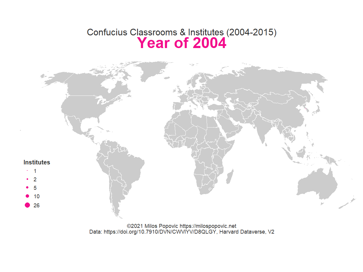
That’s all folks! I really hope this short ans sweet tutorial will encourage you to make your own animated bubble maps. Feel free to check the full code here, clone the repo and reproduce, reuse and modify the code as you see fit. The advantage of this code is that it allows you to produce neat maps directly from R instead of manually downloading the data.
I’d be happy to hear your view on how this map could be improved or extended to other geographic realms. To do so, please follow me on Twitter, Instagram or Facebook!