6 easy ways to map population density in R
January 22, 2023 | Milos Popovic
Our world has reached 8 billion people last November, according to the United Nations! 😯 And this report expects the world to become a host to nearly 10 billion people by 2050, and over 11 billion in 2100. In the coming years, the growth will be concentrated in 9 countries in Africa, Americas and Asia.
In this tutorial, I’ll show you 6 easy ways to map population with R. Mapping population comes in different forms and it’s one of the most popular social media topics. Some would even argue that nearly every map is a population map. If I had a penny for every time this popped up in my feed, I’d be filthy rich 😁.
Anyways, we’ll use Eurostat’s latest population data on the NUTS3 level (caveat reader, it’s not what you think) to map the population of Germany🇩🇪. These data are organized on the regional level, allowing us to chart out the within-country variation.
We start off with several standard techniques such as polygons, points and cartogram and conclude with coooler alternatives such as the dot-density plot and spike map.
Buckle up, this is going to be a long one!
Load packages
In this tutorial, we first summon several essential packages: tidyverse and sf for spatial analysis and data wrangling; package classInt will help us construct fine breaks based on equally sized data points; cartogram package assists us in creating pretty cartogram maps while rayshader is instrumental for making spike maps, which we have already used here; finally, we’ll use giscoR and eurostat library to import Eurostat boundaries and data into R.
# libraries we need
libs <- c(
    "tidyverse", "sf", "classInt",
    "cartogram", "rayshader",
    "giscoR", "eurostat"
)

# install missing libraries
installed_libs <- libs %in% rownames(installed.packages())
if (any(installed_libs == F)) {
    install.packages(libs[!installed_libs])
}

# load libraries
invisible(lapply(libs, library, character.only = T))
Defining constants
Since this tutorial will cover 6 techniques let’s lay the foundations for our tutorial. First, we define our base projection, longlat, which we will use throughout the tutorial, and Lambert projection that will come in handy when we make the cartogram.
# CONSTANTS
#------------
# define projections
# longlat
crsLONGLAT <- "+proj=longlat +datum=WGS84 +no_defs +ellps=WGS84 +towgs84=0,0,0"
# Lambert
crsLAEA <- "+proj=laea +lat_0=52 +lon_0=10 +x_0=4321000 +y_0=3210000 +datum=WGS84 +units=m +no_defs"
Second, we create our own ggplot2 theme to avoid repetition. We opt for a minimal appearance with a subtle beige background and the horizontal legend placed on the top of the graph and all that wrapped into a function under magnificent name theme_for_the_win.
# ggplot2 theme
theme_for_the_win <- function() {
    theme_minimal() +
        theme(
            text = element_text(family = "Montserrat"),
            axis.line = element_blank(),
            axis.text.x = element_blank(),
            axis.text.y = element_blank(),
            axis.ticks = element_blank(),
            axis.title.y = element_blank(),
            legend.position = c(.5, .99),
            legend.text = element_text(size = 60, color = "grey20"),
            legend.title = element_text(size = 70, color = "grey20"),
            legend.spacing.y = unit(0.25, "cm"),
            panel.grid.major = element_blank(),
            panel.grid.minor = element_blank(),
            plot.margin = unit(
                c(t = 0, r = 0, b = 0, l = 0), "lines"
            ),
            plot.background = element_rect(fill = "#f5f5f2", color = NA),
            panel.background = element_rect(fill = "#f5f5f2", color = NA),
            legend.background = element_rect(fill = "#f5f5f2", color = NA),
            panel.border = element_blank(),
        )
}
Finally, we use a customized colorblind-friendly color palette with vivid colors.
# colors
cols <- rev(c(
    "#140e26", "#451a40",
    "#7d1d53", "#b32957", "#ccaead",
    "#eb804e", "#ffdc58"
))
Fetch population data
Eurostat collects info on population for EU/EEA and EU candidate countries as well as appropriate administrative boundaries for mapping purposes.
In the following code, we import the shapefile of Germany on the NUTS3 level. Note that we use ISO2 code “DE” to retrieve the subnational boundaries of Germany but you could choose other countries instead. For the full list of available countries check this doc!
# get NUTS3 shapefile
deu_nuts3 <- giscoR::gisco_get_nuts(
    year = "2021",
    epsg = "4326",
    resolution = "3",
    nuts_level = "3",
    country = "DE"
)
We easily access population data using the chunk below. We consider total population count for all ages in Germany and the latest available year.
# get population data
pop_df <- eurostat::get_eurostat("demo_r_pjangrp3",
    time_format = "num"
) |>
    dplyr::filter(
        sex == "T" &
            unit == "NR" &
            age == "TOTAL" &
            grepl("DE", geo) &
            time == 2021
    ) |>
    dplyr::select(geo, values)

names(pop_df)[1] <- "NUTS_ID"
Finally, we merge Germany’s subnational boundaries and population data.frame into a single object.
# merge shp and data.frame
df <- deu_nuts3 |>
    left_join(pop_df, by = "NUTS_ID")
We are ready to start mapping!
Choropleth map
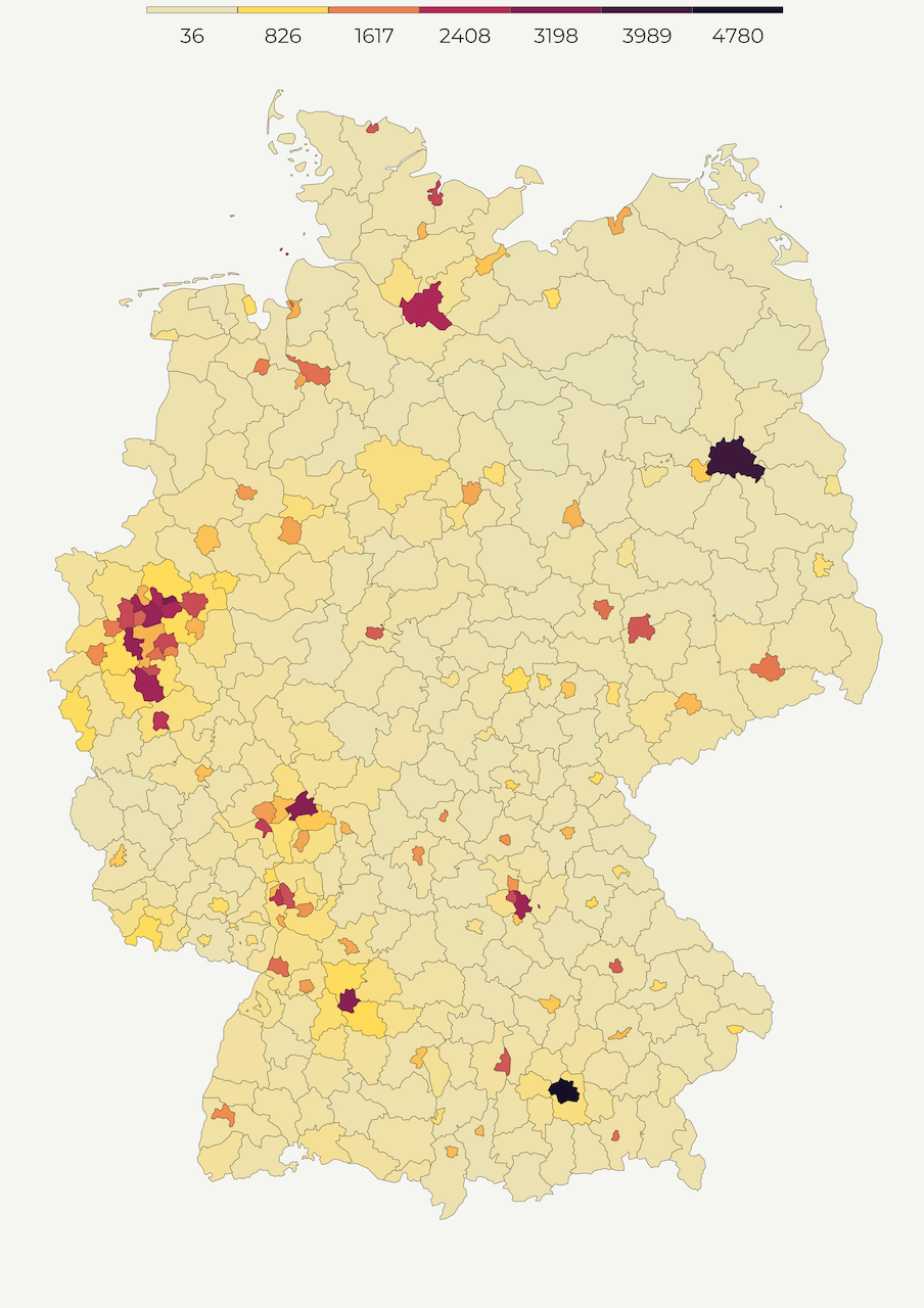
One of the most common ways of mapping population density is a choropleth map. Choropleth maps are thematic maps composed of colored, shaded or patterned polygons that show quantity of a feature. For example, below we create the population density map of Germany with light-colored regions showing lower, and dark-colored regions displaying higher density. This is an intuitive way of presenting densely populated areas because you can easily associate color values with specific geographic areas.
Since regions vary by size, choropleth maps work best when the measurement is adjusted to a notionally common scale (i.e. ratios, percentages). In our case, we adjust population count by territorial size to compute population per square kilometer. Using sf::st_area we calculate the size of every polygon and divide population count by its area size.
# 1. POLYGONS
#------------
get_polygon <- function() {
    # st_area returns square meters so we get square km by dividing the result by 1000
    df$area_sqkm <- as.numeric(sf::st_area(df) / 1000000)

    deu_polygon <- df |>
        dplyr::mutate(pop_per_sqr_km = values / area_sqkm)

    return(deu_polygon)
}

deu_polygon <- get_polygon()
We define the breaks based on equally sized data points and insert the minimum and maximum values at the beginning and end of the vector, respectively.
# min/max values
vmin <- min(deu_polygon$pop_per_sqr_km, na.rm = T)
vmax <- max(deu_polygon$pop_per_sqr_km, na.rm = T)

# bins
brk <- round(classIntervals(deu_polygon$pop_per_sqr_km,
    n = 6,
    style = "equal"
)$brks, 0) |>
    head(-1) |>
    tail(-1) |>
    append(vmax)

# breaks
breaks <- c(vmin, brk)
In the final step, we pass our polygon object to geom_sf and specify legend limits and breaks. Notice that we pass the fill option to aesthetics in order to paint the interior of our polygons. We set the color option to constant value to delineate the boundaries of our polygons.
make_polygon_map <- function() {
    p1 <-
        ggplot(deu_polygon) +
        geom_sf(aes(fill = pop_per_sqr_km),
            color = "grey20",
            size = .1
        ) +
        scale_fill_gradientn(
            name = "",
            colours = cols,
            breaks = breaks,
            labels = round(breaks, 0),
            limits = c(vmin, vmax)
        ) +
        guides(fill = guide_legend(
            direction = "horizontal",
            keyheight = unit(1.15, units = "mm"),
            keywidth = unit(15, units = "mm"),
            title.position = "top",
            title.hjust = 0.5,
            label.hjust = .5,
            nrow = 1,
            byrow = T,
            reverse = F,
            label.position = "bottom"
        )) +
        theme_for_the_win() +
        labs(
            y = "",
            subtitle = "",
            x = "",
            title = "",
            caption = ""
        )
    return(p1)
}

map1 <- make_polygon_map()
Hurray, here is the polygon map! 😍
Bubble map
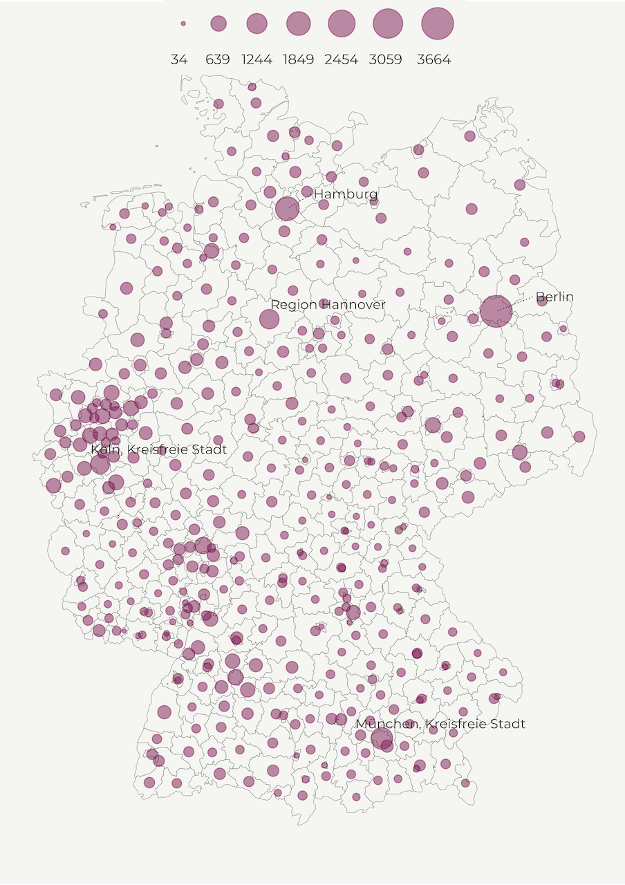
Another common way to display population density is a bubble map. Similar to choropleth maps, bubbles visualize the size of geographic coordinates or larger geographic units. In our case, we will use circles to represent regions. Every circle is going to be centered on their respective region to show population size.
This helps us reduce the bias caused by different area size in choropleth maps where big regions tend to steal our attention. So, instead of population per square kilometer we use population count. For simplicity’s sake, we transform it to thousands and define the limits and breaks.
# 2. POINTS
#-----------
# normalize population size
df$pop_1000s <- df$values / 1000

# min/max values
vmin <- min(df$pop_1000s, na.rm = T)
vmax <- max(df$pop_1000s, na.rm = T)

# bins
brk <- round(classIntervals(df$pop_1000s,
    n = 6,
    style = "equal"
)$brks, 0) |>
    head(-1) |>
    tail(-1) |>
    append(vmax)

# breaks
breaks <- c(vmin, brk)
Then we create centroids for every region; we’ll draw circles around them in a bit.
deu_points <- df |>
    sf::st_centroid()
But first, let’s create the data.frame with lebels for the most populated regions in Germany. We create a table with longitude/latitude values based on the centroids, and include region names. Finally, we order the population count in descending order so that we can filter the first few rows.
deu_coords <- deu_points |>
    dplyr::mutate(
        long = unlist(map(geometry, 1)),
        lat = unlist(map(geometry, 2))
    ) |>
    dplyr::select(NAME_LATN, long, lat, pop_1000s) |>
    sf::st_drop_geometry() |>
    dplyr::as_tibble() |>
    dplyr::arrange(desc(pop_1000s))
We will use ggrepel to label top 5 most populous German regions. In the function below, we define several options such as the label color and size, family font as well as the size and the placement of the callout line. We also slightly tilt the labels in order to make the names visible in the sea of points. Feel free to toy with these options!
# function for labelling regions
label_regions <- function() {
    ggrepel::geom_text_repel(deu_coords[1:5, ],
        mapping = aes(x = long, y = lat, label = NAME_LATN),
        colour = "grey20",
        family = "Montserrat",
        size = 20,
        segment.colour = "grey20",
        segment.alpha = .9,
        segment.linetype = 3,
        segment.size = .25,
        nudge_x = .95,
        nudge_y = .15,
        direction = "x"
    )
}
Finally, we are ready to create the bubble map! We also use polygons in the background though some of you may want to remove this line. Next, we use the size as the main aesthetics feature and select a color value from our palette.
Another option would be to define the color as the aesthetics feature and use the whole palette. But be mindful that the colors might not correspond to the point sizes since we use a continuous scale and the two features can vary independently of each other. To avoid this confusion, we opt for a single color value and allow the bubble size to vary.
In the current setup, we also manually decrease the alpha value of our points to 0.5 to create transparent bubbles. This is a good practice if you have multiple overlapping points.
make_point_map <- function() {
    p2 <-
        ggplot() +
        geom_sf(
            data = deu_polygon,
            fill = "transparent",
            color = "grey20",
            size = .1
        ) +
        geom_sf(
            data = deu_points,
            mapping = aes(
                size = pop_1000s,
                geometry = geometry
            ), color = cols[5],
            alpha = .5
        ) +
        label_regions() +
        scale_size(
            breaks = breaks,
            range = c(1, 10),
            labels = round(breaks, 0),
            limits = c(vmin, vmax),
            name = ""
        ) +
        guides(
            color = "none",
            size = guide_legend(
                direction = "horizontal",
                title.position = "top",
                title.hjust = 0.5,
                label.hjust = 0,
                nrow = 1,
                byrow = F,
                reverse = F,
                label.position = "bottom"
            )
        ) +
        theme_for_the_win() +
        labs(
            y = "",
            subtitle = "",
            x = "",
            title = "",
            caption = ""
        )
    return(p2)
}

map2 <- make_point_map()
Aaaand, this our bubble map! 😍
Cartogram
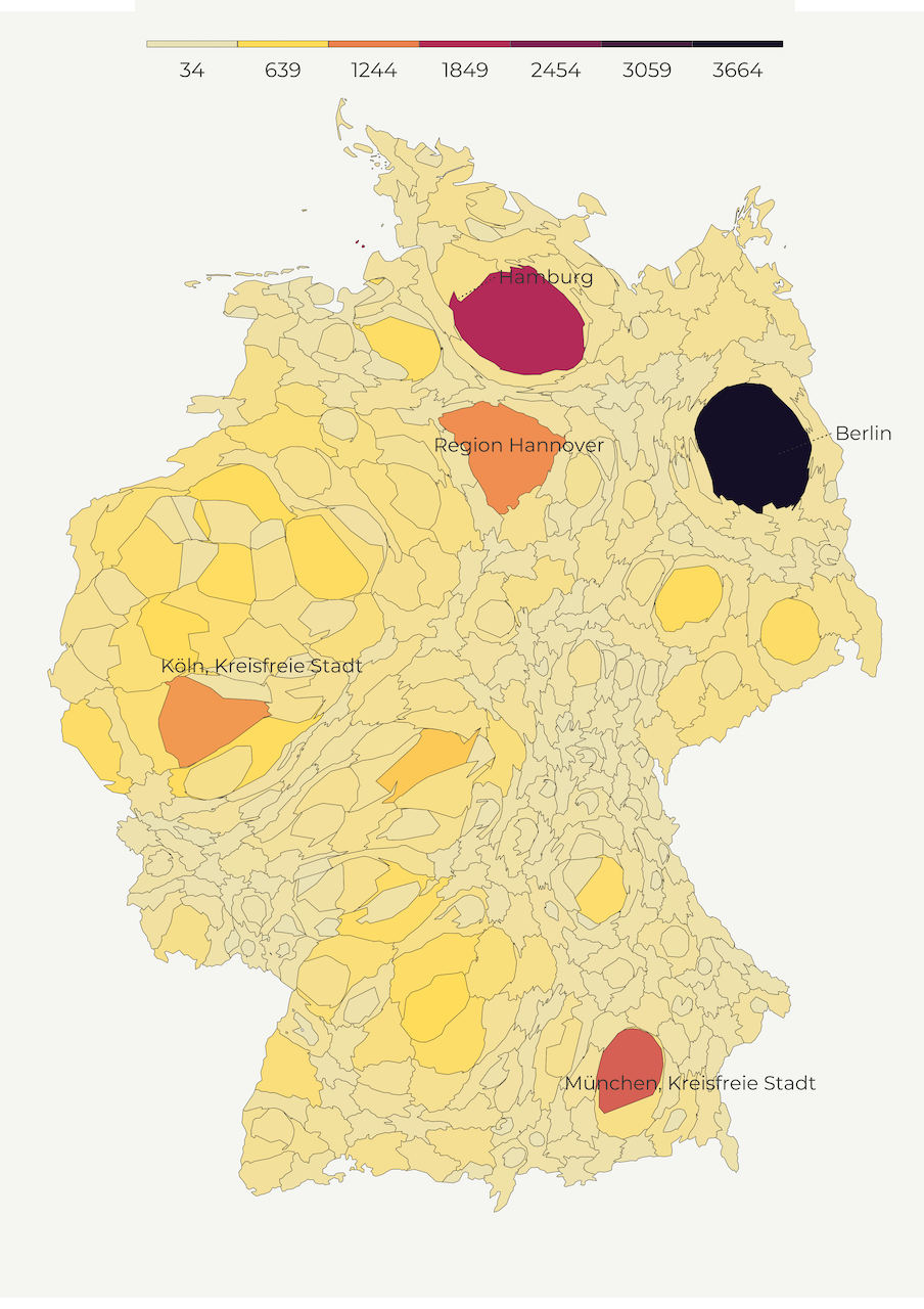
So far, we created maps with regular shapes but cartograms do the opposite. A cartogram is the type of map that distorts the shape of polygon to depict the quantity of a feature. Higher quantity goes hand in hand with enlarged polygons while smaller values correspond to shrinking geometries. This helps us minimize the tendency to attach more importance to territorially greater areas.
There are several types of cartograms such as contiguous, non-contiguous, and graphical. In the following lines, we mainly focus on contiguous cartograms. We use a convenient cartogram package that creates the distortion with a blink of an eye. We only need to pass the weights (pop_1000s feature) as well as the number of iterations for the cartogram algorythm. One thing to keep in mind is that this package doesn’t work with the coordinate reference systems based on degrees so you first need to transform your shapefile into another system.
# 3. CARTOGRAM
#-------------

get_cartogram <- function() {
    deu_cart <- df |>
        sf::st_transform(crs = crsLAEA) |>
        cartogram::cartogram_cont(
            weight = "pop_1000s",
            itermax = 5
        ) |>
        sf::st_transform(crs = crsLONGLAT)
    return(deu_cart)
}

deu_cart <- get_cartogram()
And, we are ready to map! Interestingly, the code doesn’t differ from the one where we used polygons. We just pass the modified cartogram object into geom_sf and define the usual ggplot2 functions.
make_cartogram <- function() {
    p3a <-
        ggplot(deu_cart) +
        geom_sf(aes(fill = pop_1000s),
            color = "grey20",
            size = .1
        ) +
        label_regions() +
        scale_fill_gradientn(
            name = "",
            colours = cols,
            breaks = breaks,
            labels = round(breaks, 0),
            limits = c(vmin, vmax)
        ) +
        guides(fill = guide_legend(
            direction = "horizontal",
            keyheight = unit(1.15, units = "mm"),
            keywidth = unit(15, units = "mm"),
            title.position = "top",
            title.hjust = 0.5,
            label.hjust = .5,
            nrow = 1,
            byrow = T,
            reverse = F,
            label.position = "bottom"
        )) +
        theme_for_the_win() +
        labs(
            y = "",
            subtitle = "",
            x = "",
            title = "",
            caption = ""
        )
    return(p3a)
}

map3a <- make_cartogram()
Below is our cartogram map!
If you’d like to make the other two types of cartograms, non-contiguous and Dorling cartogram have a look at my full code here.
Dot density maps
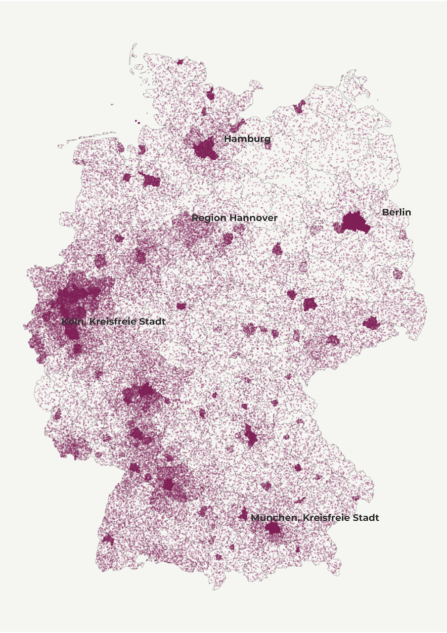
Up to this point we used different shapes to display population size but we didn’t really show population density. With dot-density maps we display the distribution of quantities within a polygon (i.e. country, region, community) using randomly distributed dots.
A dot can denote one individual and that’s a one-to-one dot density map. But mapping population in such a way is resource-intensive because it requires allocating millions of data points. So we frequently use a dot to represent 100, 1000 or more individuals (one-to-many dot density map). In this tutorial, we use this type of dot-density mapping with one dot representing 1000 inhabitants. My experience suggests that when mapping millions of dots over a few hundred polygons it’s better to define a larger ratio.
The chunk below is inspired by Paul Campbell’s blog post on dot-density maps in R.
We first define the number of dots for every German region. Then we randomly distribute our sample based on the number of dots within each region. Next we transform the dot shapefile into a data.frame with longitude and latitude columns. Finally, we apply this function to each element of the vector, using the map_df wrapper.
get_dot_density <- function() {
    num_dots <- ceiling(dplyr::select(as.data.frame(df), pop_1000s))
    deu_dots <- map_df(
        names(num_dots),
        ~ sf::st_sample(df, size = num_dots[, .x], type = "random") |>
            sf::st_cast("POINT") |>
            sf::st_coordinates() |>
            as_tibble() |>
            setNames(c("long", "lat"))
    )
    return(deu_dots)
}

deu_dots <- get_dot_density()
In the mapping section, we first display the regional polygons as a background layer. We then map the dots with the help of geom_point. We use a color from our pre-defined palette and lower alpha and size values in order to discern density patterns among countless dots. Feel free to play with these options!
make_dot_density_map <- function() {
    p4 <-
        ggplot(deu_dots) +
        geom_sf(
            data = deu_nuts3, fill = "transparent",
            color = "grey20", size = .1
        ) +
        geom_point(
            data = deu_dots, aes(x = long, y = lat),
            color = cols[5], size = .1, shape = 19, alpha = .2
        ) +
        label_regions() +
        theme_for_the_win() +
        labs(
            y = "",
            subtitle = "",
            x = "",
            title = "",
            caption = ""
        )
    return(p4)
}

map4 <- make_dot_density_map()
And here is our dot-density map!
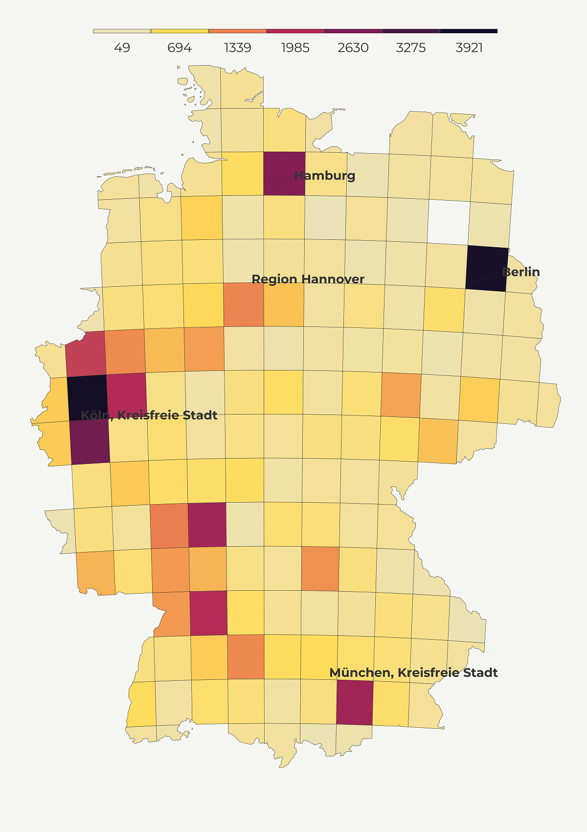
Grid map
Another way to keep the area size constant is through a grid map. The basic idea of grid maps is to divide the space into equally sized cells and estimate the value of each cell based on the existing data points. Grid maps reduce the size bias, are more neat than dot density maps and rely on color palette to denote values. Since the color is critical to convey accurate info we should always use a color-blind friendly palette.
Grid maps come in different shapes (dots, hexagons and squares). In this tutorial, I’ll show you how to make a square grid and if you are interested in hexagons check this tutorial.
First things first, we’ll fetch a shapefile of Germany and transform it into a metric coordinate reference system because grids cannot be accurately computed using the degree-based CRS.
# 5. GRID MAP
#------------
# get Germany shapefile
    deu_sf <- giscoR::gisco_get_countries(
        year = "2020",
        epsg = "4326",
        resolution = "3",
        country = "Germany"
    )
We choose 50 square km for our grid cell size. This is a somewhat arbitrary part and it depends on the size of the regions. In our case, we are aware that the spatial grid should be large enough so that no regional centroid is ommitted but not too large so that we end up with too many centroids per cell.
In the following steps, we carve out the gridded map using st_intersection, assign a unique id to each cell and transform it back to long-lat CRS. The unique id will help us identify where each centroid falls and the transformation into long-lat will help us do the spatial join with centroids, which are already in this CRS.
get_grid <- function() {

    deu_sf_transf <- deu_sf |>
        sf::st_transform(3575)

    deu_grid <- deu_sf_transf |>
        sf::st_make_grid(cellsize = 50 * 1000) |>
        sf::st_intersection(deu_sf_transf) |>
        st_cast("MULTIPOLYGON") |>
        sf::st_sf() |>
        dplyr::mutate(id = row_number()) |>
        sf::st_transform(crs = crsLONGLAT)


    return(deu_grid)
}

deu_grid <- get_grid()
In the next step, we spatially join the grid and centroids. Once we determined the cell of origin for every centroids, we sum up the population by id and label it pop_sum. Finally, we again transform the new object into a lat-long projection.
get_aggregated_grid <- function() {
    deu_grid_final <- deu_grid |>
        sf::st_join(deu_points) |>
        dplyr::group_by(id) |>
        dplyr::summarise_at(
            vars(pop_1000s),
            list(pop_sum = sum)
        ) |>
        drop_na(pop_sum) |>
        sf::st_sf() |>
        sf::st_transform(crs = crsLONGLAT)
    return(deu_grid_final)
}

deu_grid_final <- get_aggregated_grid()
Since some of the grids may have accommodated more than one centroid we re-created the breaks and limits for our plot.
# min/max values
vmin <- min(deu_grid_final$pop_sum, na.rm = T)
vmax <- max(deu_grid_final$pop_sum, na.rm = T)

# bins
brk <- round(classIntervals(deu_grid_final$pop_sum,
    n = 6,
    style = "equal"
)$brks, 0) |>
    head(-1) |>
    tail(-1) |>
    append(vmax)

# breaks
breaks <- c(vmin, brk)
And we are ready to create our grid map of German population! As you may notice we recycle the code for the polygon map but using the gridded data.frame.
make_grid_map <- function() {
    p5 <-
        ggplot(deu_grid_final) +
        geom_sf(aes(fill = pop_sum),
            color = "grey20",
            size = .1
        ) +
        scale_fill_gradientn(
            name = "",
            colours = cols,
            breaks = breaks,
            labels = round(breaks, 0),
            limits = c(vmin, vmax)
        ) +
        label_regions() +
        guides(fill = guide_legend(
            direction = "horizontal",
            keyheight = unit(1.15, units = "mm"),
            keywidth = unit(15, units = "mm"),
            title.position = "top",
            title.hjust = 0.5,
            label.hjust = .5,
            nrow = 1,
            byrow = T,
            reverse = F,
            label.position = "bottom"
        )) +
        theme_for_the_win() +
        labs(
            y = "",
            subtitle = "",
            x = "",
            title = "",
            caption = ""
        )
    return(p5)
}

map5 <- make_grid_map()
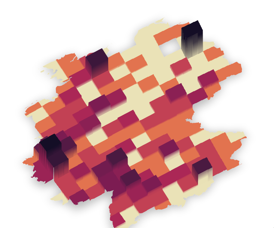
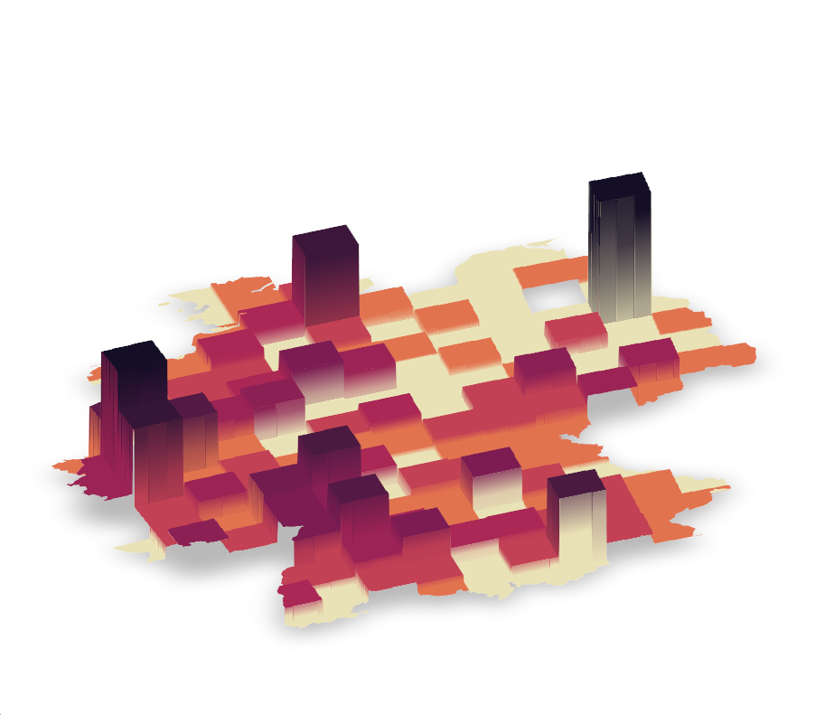
Spike map
Spike maps helps us understand most populated places with a blink of an eye by mapping a feature to elevation. Thanks to Tyler Morgan Wall, we are able to make them, using library rayshader. This versatile library works with shapefile, raster or data.frame inputs, allowing us to render a spike map in various environments. In this tutorial, we will turn our gridded data into a raster before transforming it into a spike map. If you are interested in using rayshader in combination with ggplot2 have a look at this tutorial.
In the following chunk, we first rasterize the spatial grid of German population and choose a higher resolution so that we don’t end up with a Lego-like map of Germany. Because rayshader works with matrices, we turn our raster into a matrix just as we did here.
# Create the initial 3D object
make_raster_matrix <- function() {
    pop_rast <- terra::rasterize(
        deu_grid_final,
        terra::rast(deu_grid_final, resolution = .01),
        deu_grid_final$pop_sum
    ) |> terra::na.omit()

    pop_mat <- rayshader::raster_to_matrix(pop_rast)

    return(pop_mat)
}

pop_mat <- make_raster_matrix()
Once you run the last line, the package will return the dimensions of your matrix (height x width), which you should use to designate the size of your final plot.
"Dimensions of matrix are: 762x916"

h <- 762
w <- 916
With rayshader, we can create more colors from our palette so that most populated areas don’t stand out much. Keep in mind that adding more colors would produce a different map from its gridded predecessor. For example, we opt for 3 times more colors in our spike map.
texture <- grDevices::colorRampPalette(cols, bias = 3)(21)Finally, we let rayshader do its magic via plot_3d, which takes the matrix and transforms it into an isometric graph. If you are curious about the options used below have a look at the library’s rich documentation.
# Create the initial 3D object
pop_mat |>
    rayshader::height_shade(texture = texture) |>
    rayshader::plot_3d(
        heightmap = pop_mat,
        solid = F,
        soliddepth = 0,
        z = 20,
        shadowdepth = 0,
        shadow_darkness = .75,
        windowsize = c(w, h),
        phi = 65,
        zoom = .6,
        theta = -30,
        background = "white"
    )
This is the map we get!
Now if you’d like to change the angle and give it a more isometric look we can run the line below.
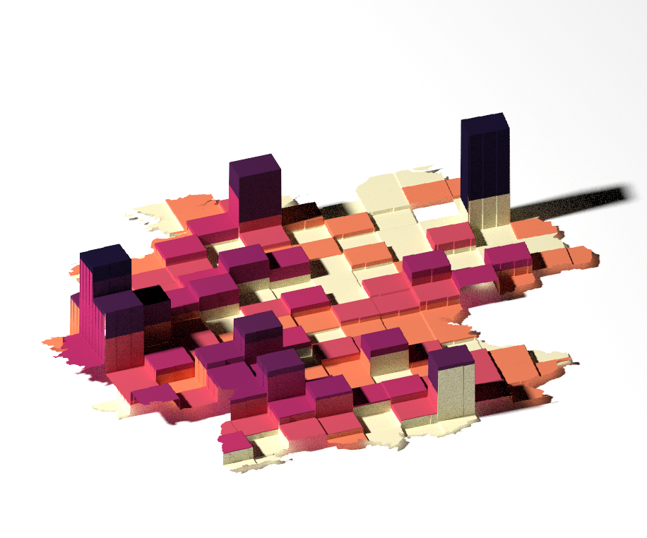
rayshader::render_camera(phi = 35, zoom = .6, theta = -20)Finally, we let rayshader render a high-resolution map with added light and shadows using render_highquality. If you are curious about the options used below have a look at the library’s rich documentation.
rayshader::render_highquality(
    filename = "germany_population_3d.png",
    samples = 500,
    preview = T,
    light = T,
    lightdirection = -90,
    lightcolor = "white",
    lightintensity = 1000,
    interactive = F,
    width = w, height = h
)
This produces a spike map!
And, that’s all, folks! In this tutorial, you learned 6 ways to make population maps using Eurostat data and all that in R! Feel free to check the full code here, clone the repo and reproduce, reuse and modify the code as you see fit.
I’d be happy to hear your view on how this map could be improved or extended to other geographic realms. To do so, please follow me on Twitter, Instagram or Facebook! Also, feel free to support my work by buying me a coffee here!
